The network for creativity
Join 1.25M professional creatives like you
Connect with clients, get discovered, and run your business 100% commission-free
Creatives on Contra have earned over $150M and we are just getting started

The network for creativity
Join 1.25M professional creatives like you
Connect with clients, get discovered, and run your business 100% commission-free
Creatives on Contra have earned over $150M and we are just getting started



Related posts

A dashboard with a lot of data doesn’t have to feel overwhelming.
The focus here was on clear hierarchy, easy-to-scan risk alerts, and making complex payment data feel simple and intuitive. Dark UI, structured analytics, and just enough color to guide attention where it matters.
What do you think of this direction?
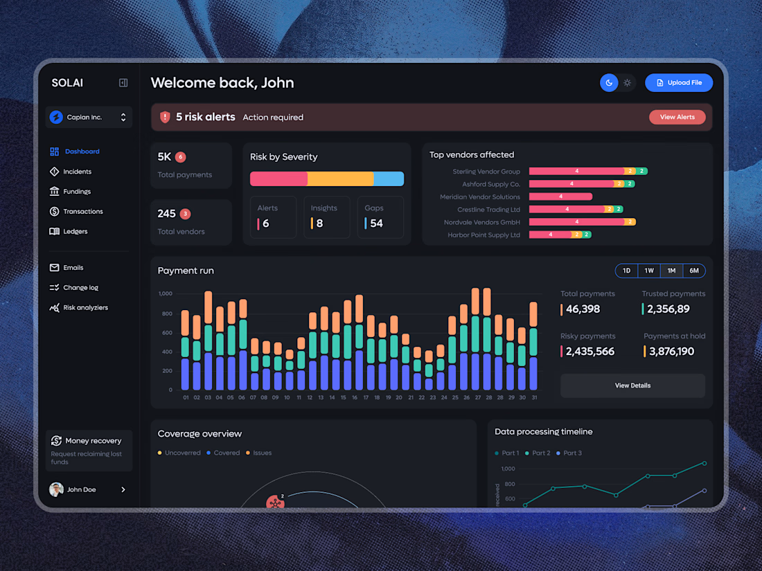

Looks so clean! Love it 👏

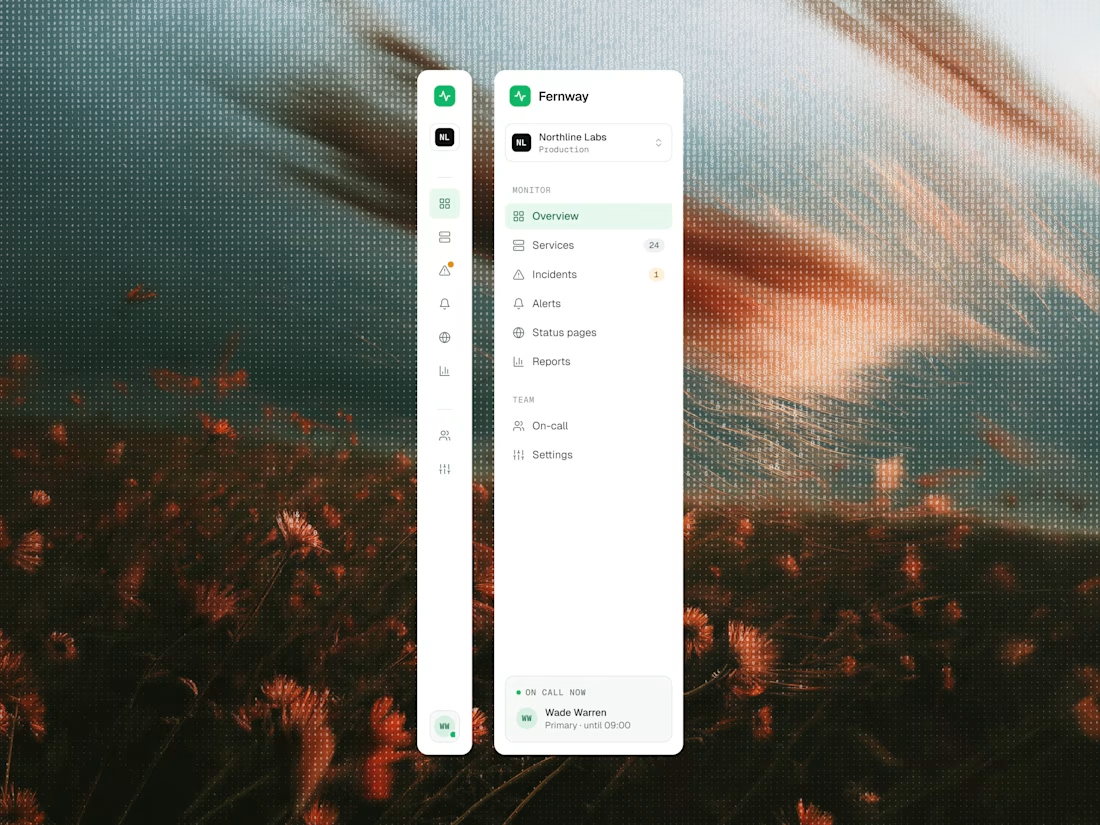

Such a tidy sidebar.

Redesign concept for Carbonate, where I designed a few screens early in my career. The dashboard helps HR teams see the day at a glance and know who to follow up with. It isn't the live product.
What I worked on:
- Dashboard layout: daily metrics, people table, weekly trend and follow-up card
- UX copy that keeps the tone human, like "Let's check in with them"
- Component-based UI in Figma, with one consistent icon set across the screen

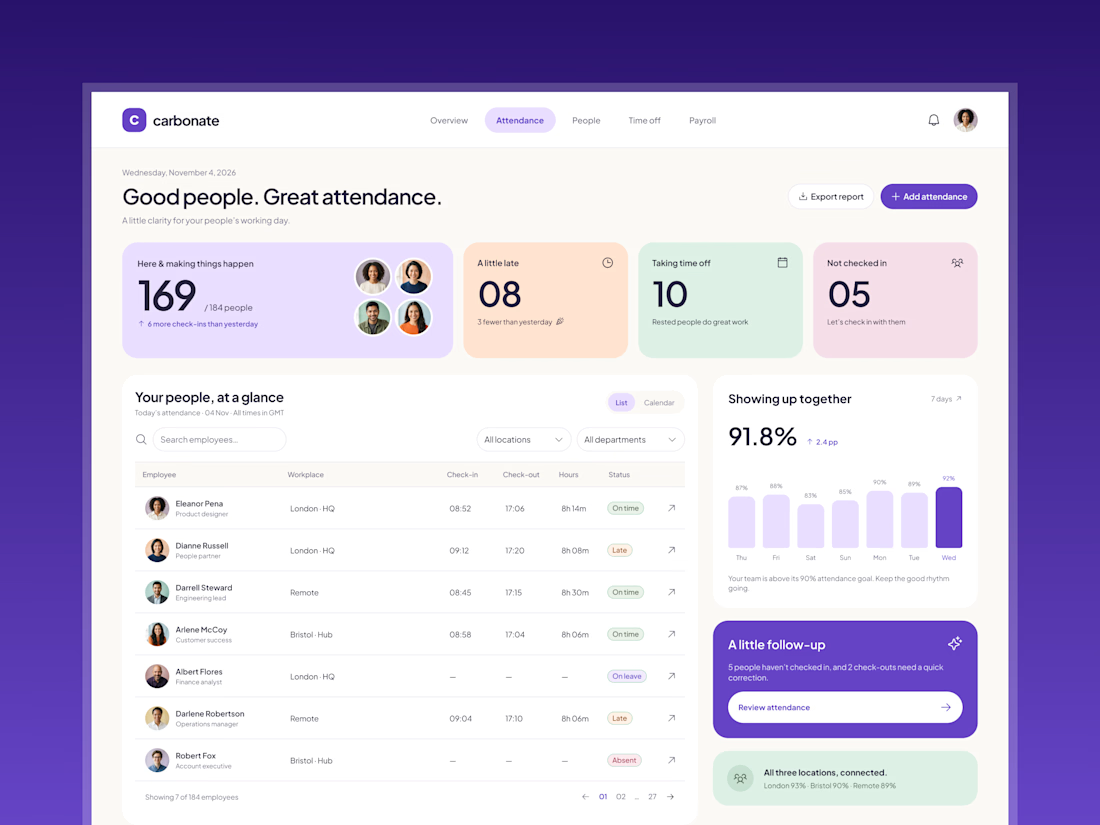
These pastel cards work so well.