The network for creativity
Join 1.25M professional creatives like you
Connect with clients, get discovered, and run your business 100% commission-free
Creatives on Contra have earned over $150M and we are just getting started
Back to feedPost
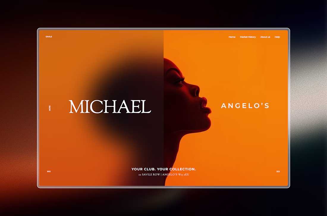
Taste Test
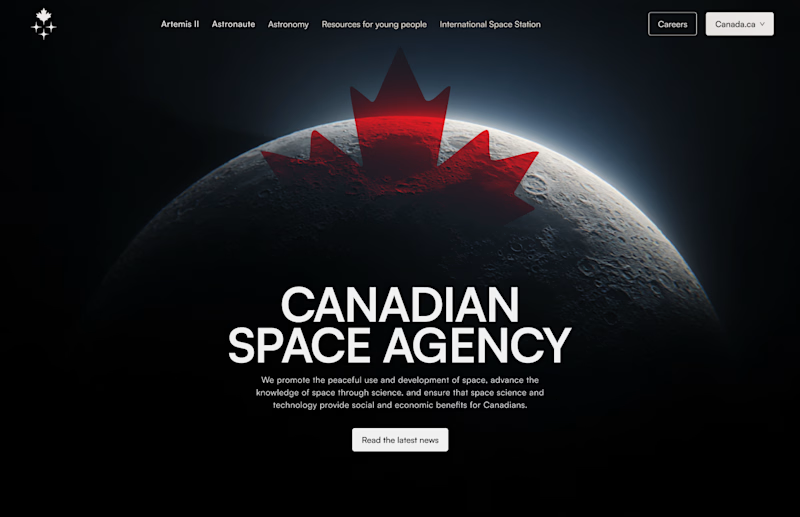
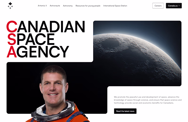
After watching the Artemis mission I decided take a look at the Canadian Space Agency website and decided to redo it for fun.
The goal was to modernize the web site and create something that would get people interested in learning more about it.
Here are some hero section explorations I created for it.
15 voted
71%
6 voted
29%
21 votes
Closed
Hero 1 tells the story better and the choice of image is clean. I'm curious, why did you make the nav bar CTA a dropdown?
Because on the original website it’s a drop down to the rest of the pages of the Canada.ca website, I wanted to keep the exact information they have at the moment!
Nice!
Thank you!🙏
Hero 1 will actually tell the story better.
I think so too, I think it conveys the message better!
Yeah😊
The network for creativity
Join 1.25M professional creatives like you
Connect with clients, get discovered, and run your business 100% commission-free
Creatives on Contra have earned over $150M and we are just getting started
Related posts
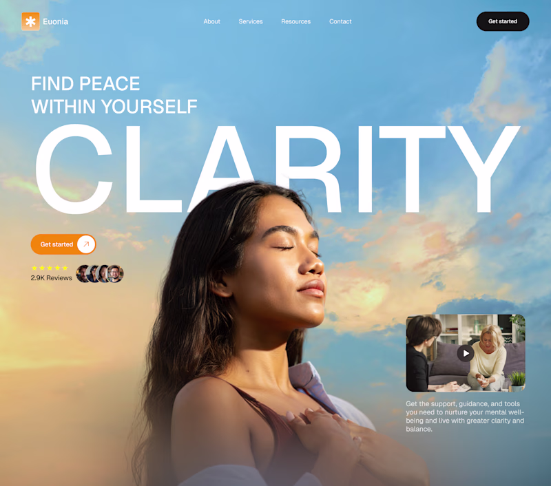
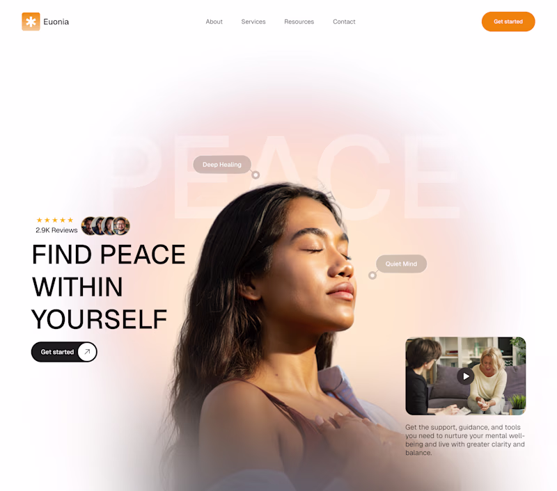
Which hero section best captures a Wellness website
A or B?
42 voted
81%
10 voted
19%
52 votes
Closed
"B"
Update on Building in Public • 6-month challenge 🚀
Decided to go with this direction for the hero section of my first Framer template.
Lots of iterations ahead, but I'm excited to see where this goes.
More updates coming soon. 👨💻
This is living rent-free in my head.
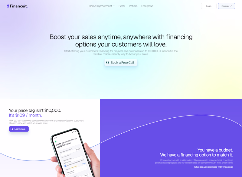
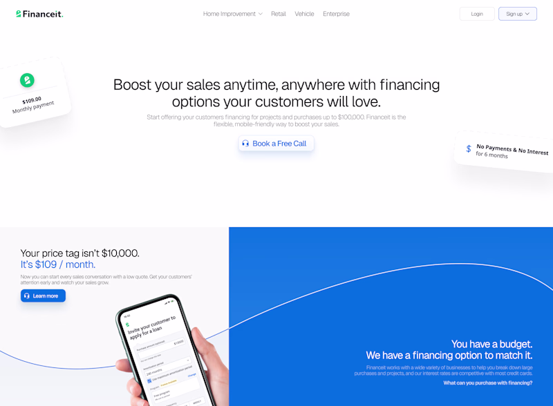
I attempted to redesign a website's hero section and can't decide between these. Do you prefer the subtle gradient or the simple and informative?
5 voted
36%
9 voted
64%
14 votes
Closed
Simple
Trending
Claude
Claude has entered the design space. How are you using Claude Design?
Contra University
Learn from expert creatives how to earn more using next-gen AI tools.
fifaworldcup2026
The World Cup is here and the whole world's watching. How are you designing for the world stage?
creativeaiflow
Creative AI workflows are evolving. What tools do you use, and what are their strengths and weaknesses?
freelancerlife
Freelancer life is wins, pivots, and everything in between. What’s yours right now?