The network for creativity
Join 1.25M professional creatives like you
Connect with clients, get discovered, and run your business 100% commission-free
Creatives on Contra have earned over $150M and we are just getting started
Back to feedPost

Good gameplay is rarely discovered instantly.
Most of it comes from:
test → tweak → repeat.
Lately, I’ve been spending more time refining gameplay feel, player flow, and interaction systems inside Unreal Engine.
The more I prototype, the more I realize:
small gameplay decisions create massive player experience differences.
#GameDesign #UnrealEngine #GameplaySystems #IndieDev


The network for creativity
Join 1.25M professional creatives like you
Connect with clients, get discovered, and run your business 100% commission-free
Creatives on Contra have earned over $150M and we are just getting started


Related posts

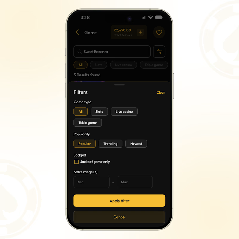
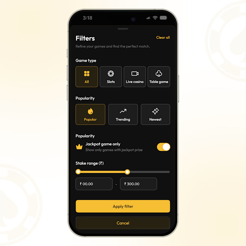
Finding the right game should feel as smooth as playing it. 🎮
A look at our latest gaming app filter UI - designed around quick choices, clear visual hierarchy, and fewer steps between browsing and playing.
From game type and popularity to jackpot preferences and stake range, every control is designed to keep the experience simple and intuitive.
Compact filter or full-screen filter - which would you choose?

7 votes
Ends in 19h

Cutting steps between browsing and playing is the right goal. Grouping stake range with jackpot preferences makes sense, since players think about them together. Voting for the one with the clearer primary filters.

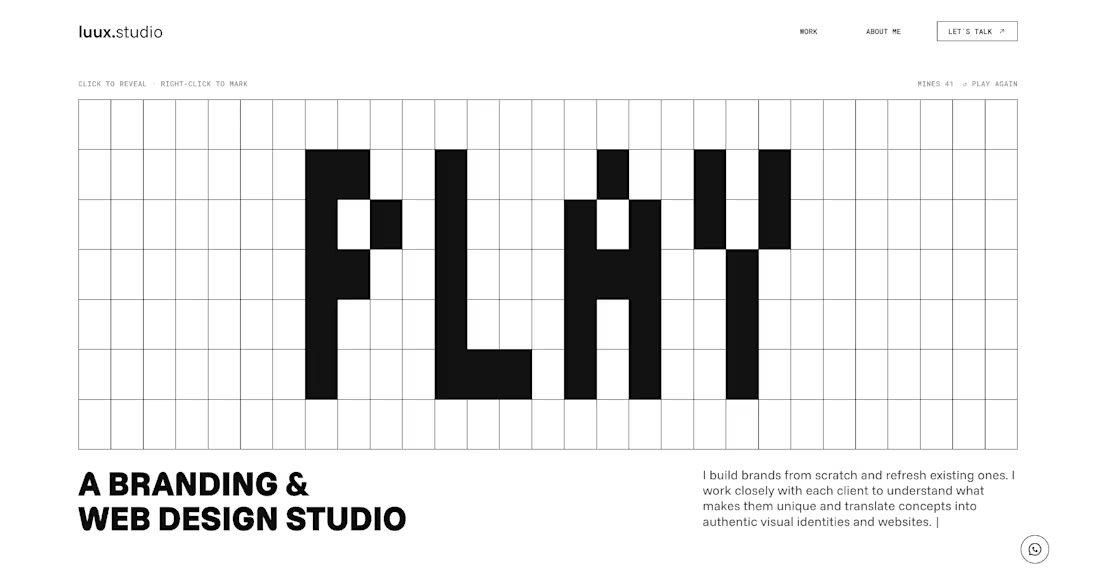
The new luux.studio website is live.
I rebuilt my site around one idea that guides how I work:
⚡️ every project starts by bringing light to what’s hidden ⚡️
So the homepage is a game.
A full-screen minesweeper where you explore the grid, read the clues and, eventually, find the spark. Hit a mine and it explodes, literally, into a “Start your project” button.
What else is new:
→ Three clear services: Brand Strategy, Visual Identity and Website & E-commerce
→ A work index where every project comes to life on hover
→ One person behind it all, from the first idea to launch
Designed and built in Framer, with a few custom code components for the game and the details.
Go play: luux.studio
How many clicks did it take you to find the spark?
Please, leave your feedback below 🫶🏻


Good work, very polished.


Feels good amongst generic stuff
Quick sneak peek from a recent launch video