The network for creativity
Join 1.25M professional creatives like you
Connect with clients, get discovered, and run your business 100% commission-free
Creatives on Contra have earned over $150M and we are just getting started
Back to feedPost
Spent weeks redesigning the solar energy monitoring experience for Contra. Here are the 3 product decisions that mattered most to keep users powered up.
#UI #UX #Casestudy
🧵 🔽
This looks exceptionally clean and minimal. Great work!
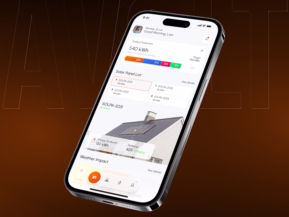
The main dashboard view. Built around scannable, high-priority metrics, like current production versus your daily target, instead of overwhelming users with raw numbers right away.
(2/5)
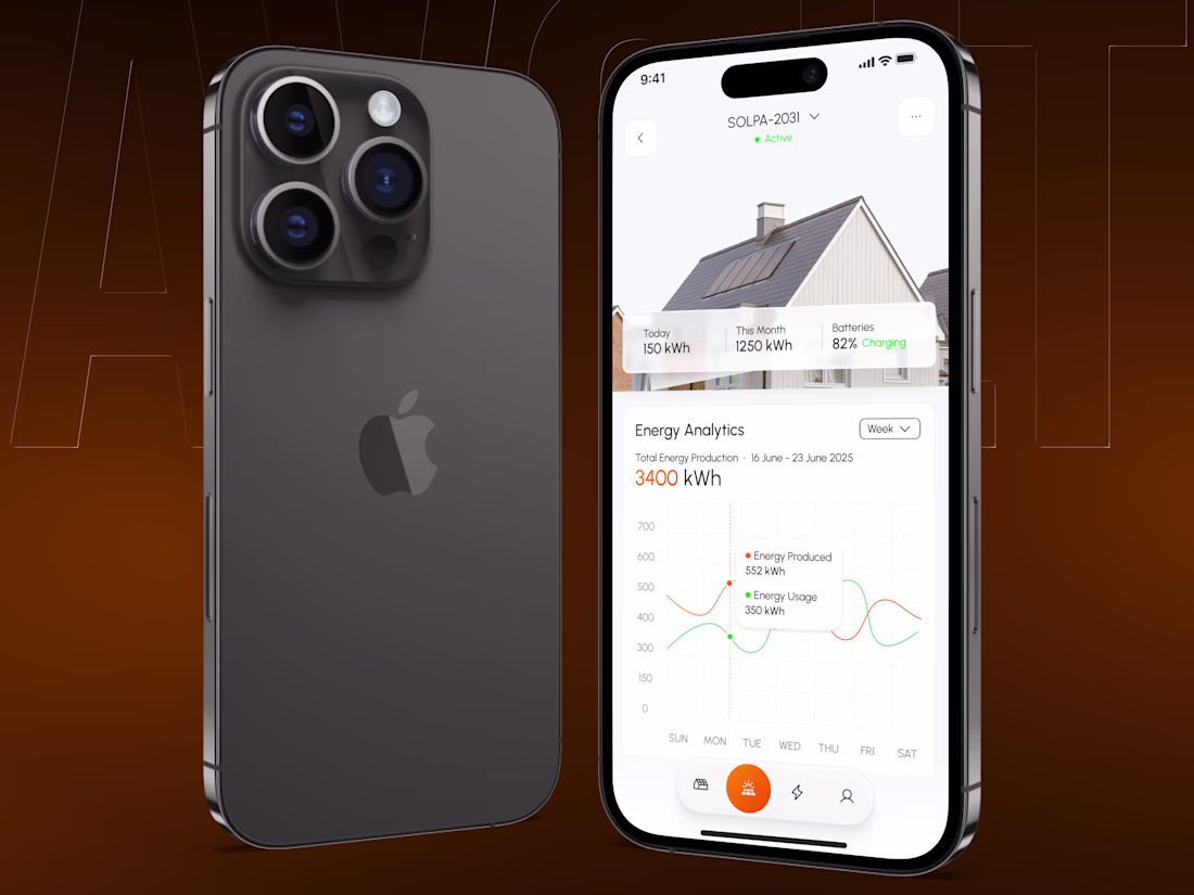
On real devices. We paired clean interactive analytics with historical weekly data so homeowners can track usage vs. production trends at a single glance during their morning routine.
(3/5)
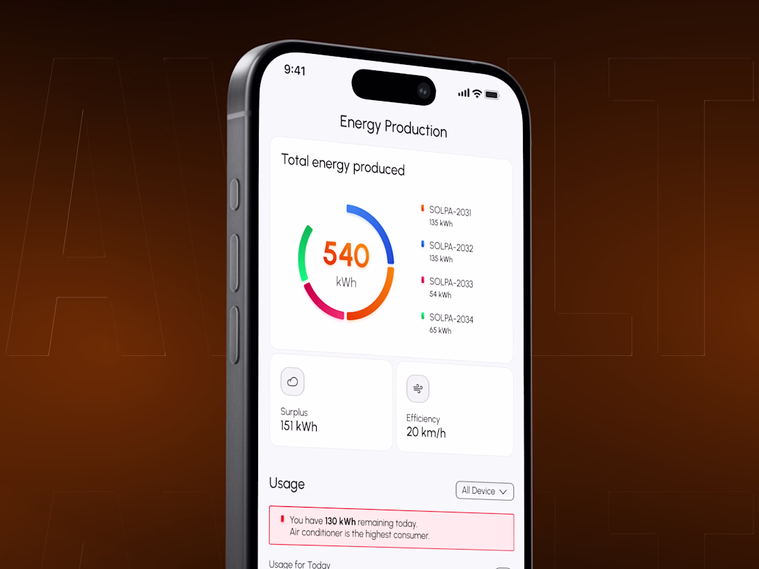
Granular visibility, simplified. A clean progress ring breaks down real-time performance panel-by-panel, automatically flagging high-consuming appliances to help prevent unexpected grid drains.
(4/5)
The network for creativity
Join 1.25M professional creatives like you
Connect with clients, get discovered, and run your business 100% commission-free
Creatives on Contra have earned over $150M and we are just getting started
Related posts
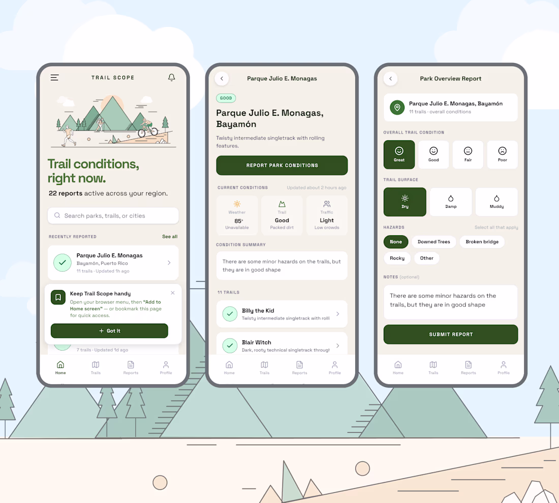
I joined the Config Makeathon.
Our challenge was to design and build something that makes a difference, to use Figma's new tools and test them out.
I built Trail Scope - a community-powered, mobile-first web app that lets outdoor enthusiasts in Puerto Rico check and report trail conditions in seconds — no group chat required. It took a week o design and develop this app using Figma + Figma Make.
Overview
Problem statement: Outdoor enthusiasts in Puerto Rico — trail builders, mountain bikers, hikers, and runners — have no centralized way to know the current conditions of our local trails. Unpredictable tropical weather forces community members to contact multiple social media groups to get a trail status update which may take hours or days. This uncertainty leads to plans being changed or canceled last minute, and in more serious cases, exposes users to hazardous or impassable trail conditions.
Opportunity: By creating a community-powered, mobile-first trail condition reporting app, Trail Scope can become the single source of truth for trail status in Puerto Rico — with the foundation to scale globally. Reducing friction in getting and sharing real-time trail information increases safety, improves the outdoor experience, and strengthens the local trail community.
Users & audience
Primary persona — the active outdoor enthusiast Mountain bikers, hikers, trail runners, and trail builders based in Puerto Rico. They are mobile-first, active on social media, and currently rely on WhatsApp groups or Facebook to get trail updates. Their biggest pain points are uncertainty before heading out and wasted trips due to poor conditions.
Secondary persona — the trail steward Trail builders and maintainers who want to alert the community about hazards, closures, or recent work done on a trail. They are proactive contributors who care about trail safety and community trust.
Link to live prototype: https://sans-party-16392973.figma.site
Link to Figma Make file: https://www.figma.com/make/lwCzP7lQkPJYDkuNtwtcJ5/Config-Makeathon?t=7WjJvLBOnb98rMZ4-1
Trail Scope is a genuinely useful idea. The problem you're solving is real, hikers getting stuck with outdated info from scattered WhatsApp groups is a safety issue, not just an inconvenience. The nature illustration style fits the outdoor context really well too.
Here are couple outputs of an e-Flyer design for a Solar business I designed for. Which one would you choose from the two?
I'd appreciate your vote and feedbacks.
4 voted
50%

4 voted
50%
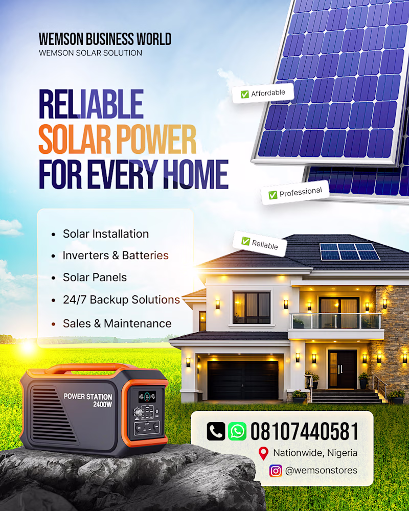
8 votes
Closed
A looks more aesthetic
Trending
Claude
Claude has entered the design space. How are you using Claude Design?
Contra University
Learn from expert creatives how to earn more using next-gen AI tools.
MagicPath
The canvas is infinite, and exploration is becoming the workflow. How are you using MagicPath?
creativeaiflow
Creative AI workflows are evolving. What tools do you use, and what are their strengths and weaknesses?
freelancerlife
Freelancer life is wins, pivots, and everything in between. What’s yours right now?