The network for creativity
Join 1.25M professional creatives like you
Connect with clients, get discovered, and run your business 100% commission-free
Creatives on Contra have earned over $150M and we are just getting started
Back to feedPost

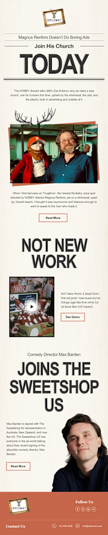
📩 Recent Work | Email Newsletter Design for Diplomatreps
Recently completed an email newsletter design for Diplomatreps, focused on turning important updates and information into a clean, engaging, and easy-to-navigate digital experience.
The design was built around clear content hierarchy, strong typography, balanced layouts, and strategic use of visuals so readers can quickly understand the key messages while maintaining a professional and consistent brand presence.
I also focused on creating a flexible structure that can be adapted for future newsletters and ongoing email communications.
Project: Email Newsletter Design
Client: Diplomatreps
Services: Newsletter Design • Email Design • Layout & Typography • Visual Communication • Brand Design
Another project where thoughtful design helps make information clearer, more engaging, and easier to connect with.
#EmailNewsletter #NewsletterDesign #EmailDesign #GraphicDesign #DigitalDes
The network for creativity
Join 1.25M professional creatives like you
Connect with clients, get discovered, and run your business 100% commission-free
Creatives on Contra have earned over $150M and we are just getting started

Challenges
View all


Related posts



Creative design 🤩


Which Plushie Email Verification Design Do You Prefer?
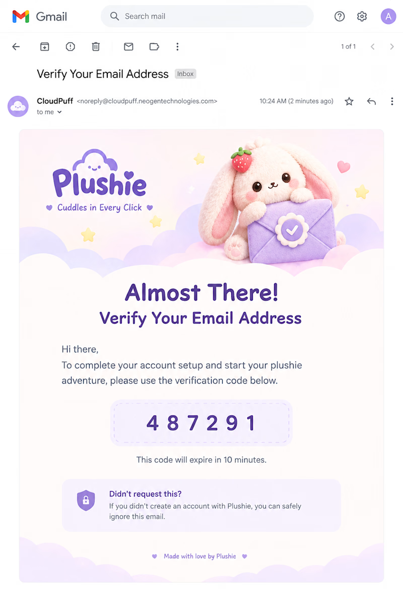
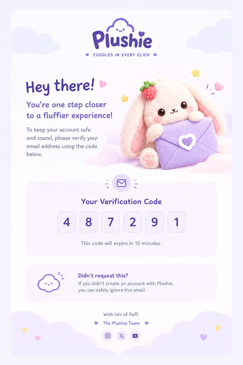
I explored a couple of directions for Plushie’s email verification experience, keeping the core idea the same while experimenting with different layouts, visual hierarchy, and ways to make the verification code feel more playful.
Version 01 - Visual-first, with a strong hero illustration
Version 02 - More structured, clean, and email-focused
Both follow the same soft, plushie-inspired visual language.
Which version would you choose for Plushie? 👀
Drop your pick below, 1 or 2?
0 voted
0%
5 voted
100%
5 votes
Closed

Version 02, mostly because showing it inside the actual email client chrome builds more trust that this is really landing in the inbox. Version 01's illustration is charming but it's competing with the code for attention.

Editorial, Brochure & Print Layout Design (Editorial & Publication)