The network for creativity
Join 1.25M professional creatives like you
Connect with clients, get discovered, and run your business 100% commission-free
Creatives on Contra have earned over $150M and we are just getting started
Back to feedPost
Taste Test

Features sections are where most SaaS landing pages lose me. Six icons, six vague lines, and I'm already scrolling past.
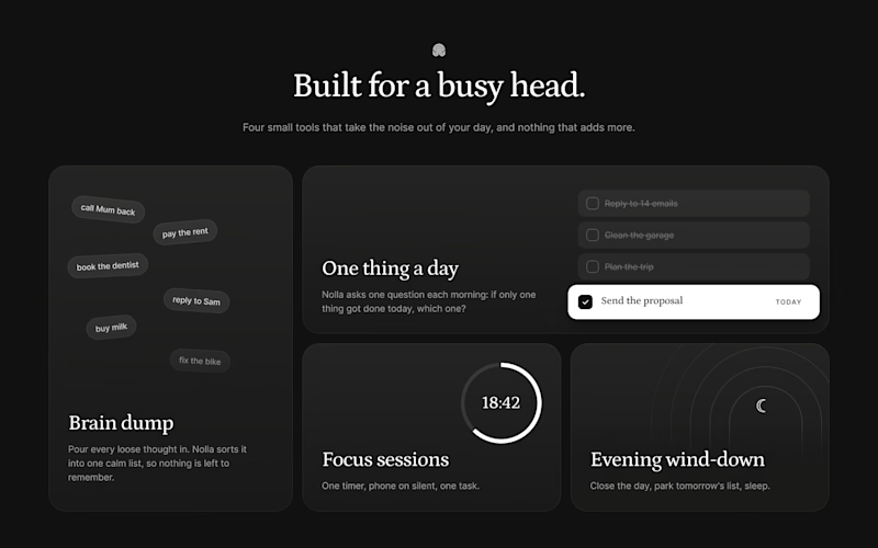
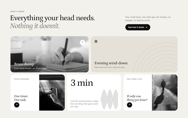
So for Nolla, my concept app for busy heads, I tried two ways to make each feature show itself.
A is a dark bento. Every card shows the tool doing its job: thoughts piling up, a list with one task picked, a focus timer running.
B is light and editorial. Real photos, one big number, and the arches from the logo used as a quiet pattern.
Designed in Figma. The winner is the one I build in Webflow.
Which one would keep you scrolling?


2 votes
Ends in 18h
The network for creativity
Join 1.25M professional creatives like you
Connect with clients, get discovered, and run your business 100% commission-free
Creatives on Contra have earned over $150M and we are just getting started


Related posts
Quick one for SaaS founders and designers: which homepage hero would make you book a demo?
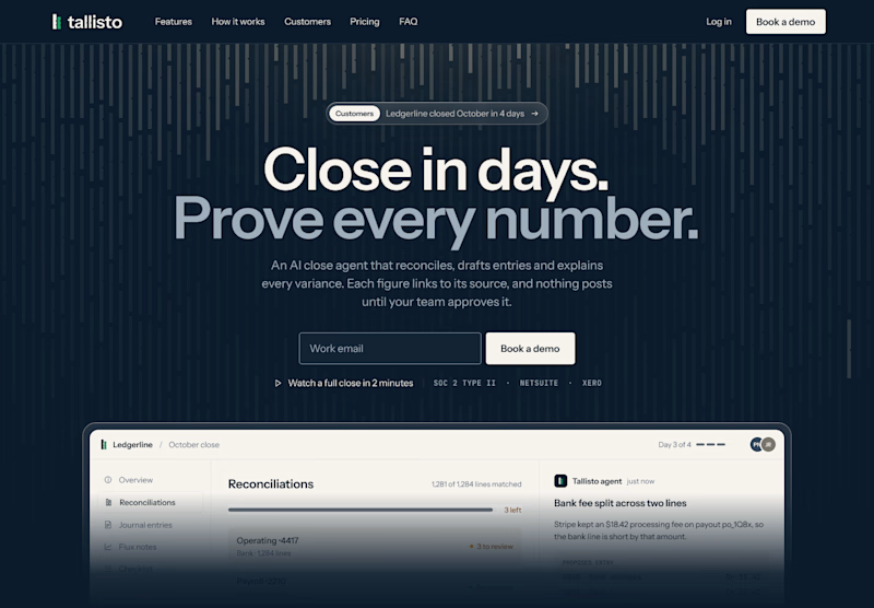
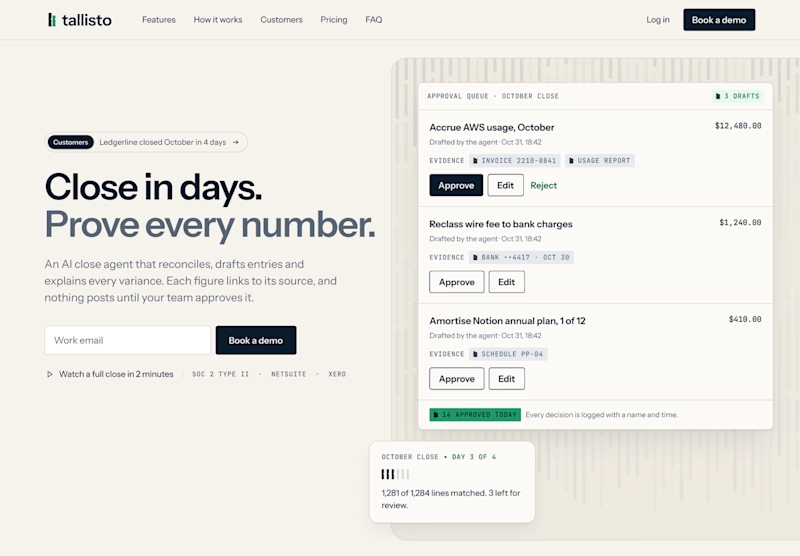
I’m designing the website for Tallisto, a concept AI accounting tool that helps finance teams close the month in days. Both versions use the same copy, so only the layout changes.
A is centred and dark. The headline does the talking, and the product sits right underneath it.
B is a light split layout. You read on the left and see the approval queue on the right, where every entry waits for a person to approve it.
Vote for the one you’d click, and tell me why in the comments. I’m building the winner in Webflow next.
3 voted
60%
2 voted
40%
5 votes
Closed

Split and light for me. The approval queue next to "Prove every number" shows the proof right away, which is what a finance team wants to see. The dark one looks moodier but the product sits low. Will you test the CTA copy too?


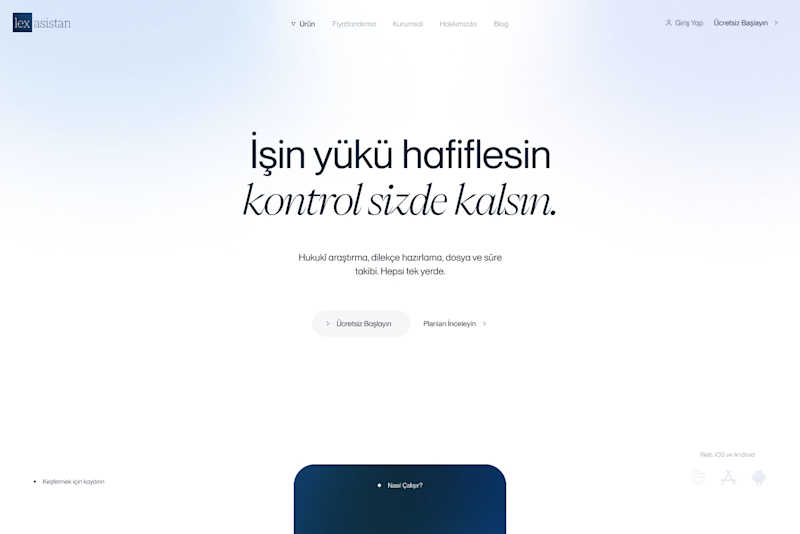
Exploring hero backgrounds for an AI assistant landing page. Which one feels more trustworthy?
9 voted
100%
0 voted
0%
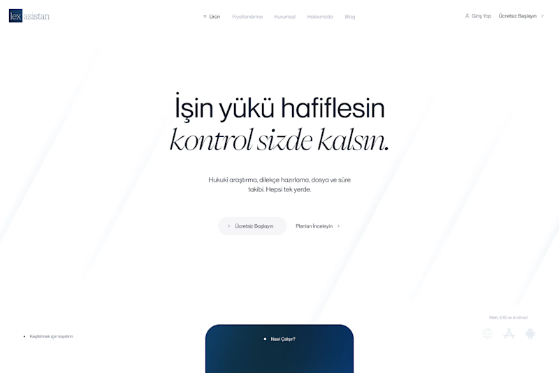
9 votes
Closed

Aura feels more trustworthy and calm.

FLIGHT OR TRAIN? — YOU DECIDE!
Two travel experiences. Two different vibes. One question: Which hero design would you choose?
A — Flight Experience ✈️
A modern, premium travel feel with a stunning aerial view and a clean booking interface.
B — Train Journey 🚆
A scenic, immersive experience featuring beautiful mountain views and a premium train-booking interface.
Both designs focus on making travel booking feel effortless, engaging, and memorable.
👇 YOUR TURN TO VOTE!
Which design wins your attention?
Drop your choice in the comments!

8 voted
80%
2 voted
20%
10 votes
Closed

Both look great, and it’s really hard to choose one over the other.