The network for creativity
Join 1.25M professional creatives like you
Connect with clients, get discovered, and run your business 100% commission-free
Creatives on Contra have earned over $150M and we are just getting started
Back to feedPost

Website Homepage Redesign, "We Got This! Health Coaching"
Redesigned the homepage for a women's health and hormone coaching brand to better reflect their expertise and improve conversions. The original site felt cluttered and didn't clearly communicate the coach's offer or build trust fast enough.
Before:
The original homepage packed a lot into the first screen, a busy lifestyle photo, multiple taglines, and several buttons competing for attention. The message got lost before visitors could figure out what the coach actually offered or why they should book a call.
After:
The redesign leads with one clear, benefit-driven headline and a single strong call-to-action. The layout is cleaner, calmer, and puts the focus on Jodi's expertise and the transformation she offers, not on visual noise.
What I did:
1. Rebuilt the hero section with a clear, benefit-driven headline and one focused CTA
2. Simplified navigation and visual hierarchy for easier scanning
3. Added social proof ("As Seen In" press bar) higher up the page to build instant credibility
4. Reorganized content into clean, digestible sections (problem/solution, pain points, offer)
5. Refined the color palette and typography for a more premium, trustworthy feel
6. Fully responsive design, optimized for both desktop and mobile
Result: A cleaner, more professional homepage that clearly communicates the coach's value and guides visitors toward booking a consultation.




The network for creativity
Join 1.25M professional creatives like you
Connect with clients, get discovered, and run your business 100% commission-free
Creatives on Contra have earned over $150M and we are just getting started




Related posts


next update on the london architect site.
the homepage hero. you scroll, and instead of the page moving down, you walk up to the house, through the front door and into the living room.


Amazing!!

I missed an important detail in th first design direction, and the client rejected it.
After revisiting the feedback, I came up with another directiona nd it got approved
Both designs serve the same product, which one do you think got accepted for a web application?
Direction 1
Direction 2

9 voted
69%
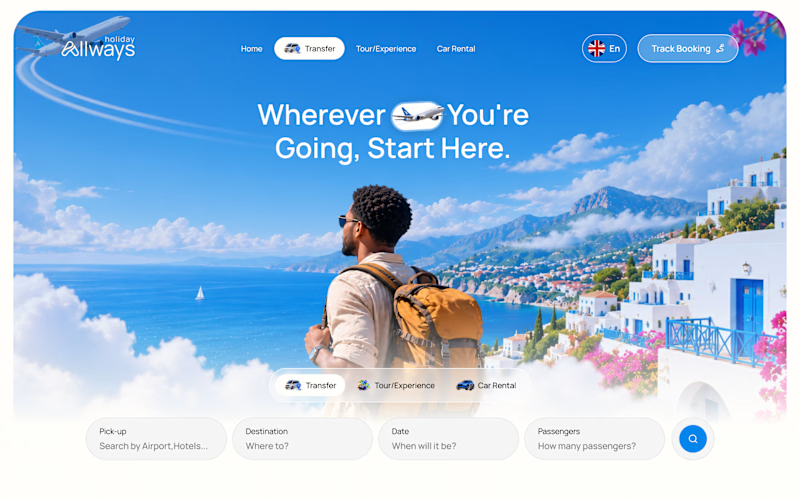
4 voted
31%
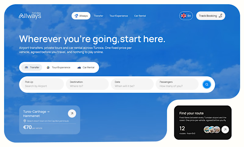
13 votes
Closed

Dir 2 for sure!

One pixel grid. A whole brand.
For Appy, a London product studio for impact-driven startups, the wordmark, icons, 3D smile and Appy Pixel, its custom typeface, all come from the same grid.
Appy Pixel won Typography at the Online Design Awards.
Type first or symbol first: where do you start a rebrand?


thats so nice, i loveee