The network for creativity
Join 1.25M professional creatives like you
Connect with clients, get discovered, and run your business 100% commission-free
Creatives on Contra have earned over $150M and we are just getting started
Back to feedPost

I started with a lotus leaf, not a typeface.
This was an experiment in pushing my creativity beyond the usual boundaries of typography.
Instead of choosing a font and making it work, I wanted to explore how nature itself could influence letterforms, shapes, and the way typography feels.
The challenge was to take something organic, imperfect, and naturally beautiful, and translate it into a custom typographic form without losing the essence of its inspiration.
Because creativity isn't always about finding new tools or learning new techniques. Sometimes, it's about looking at something familiar and imagining what else it could become.
And this was my attempt at doing exactly that. 🌿

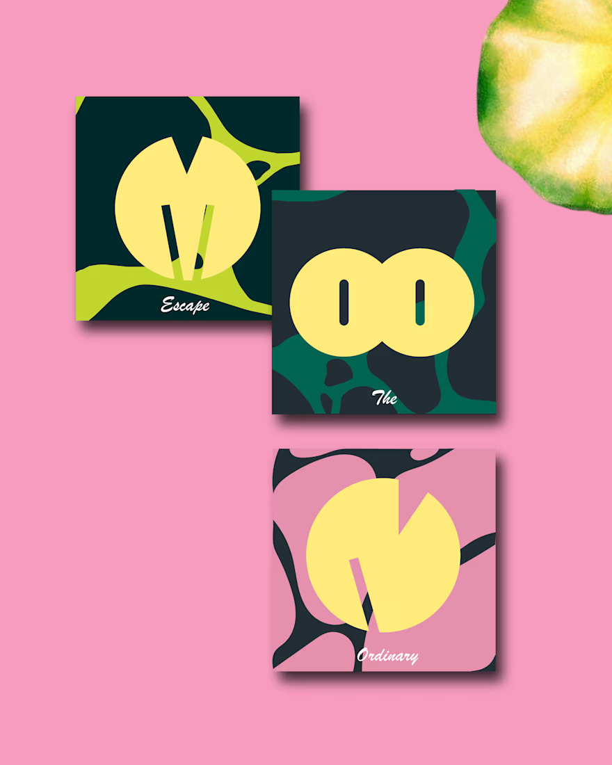
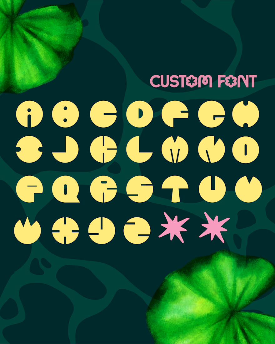
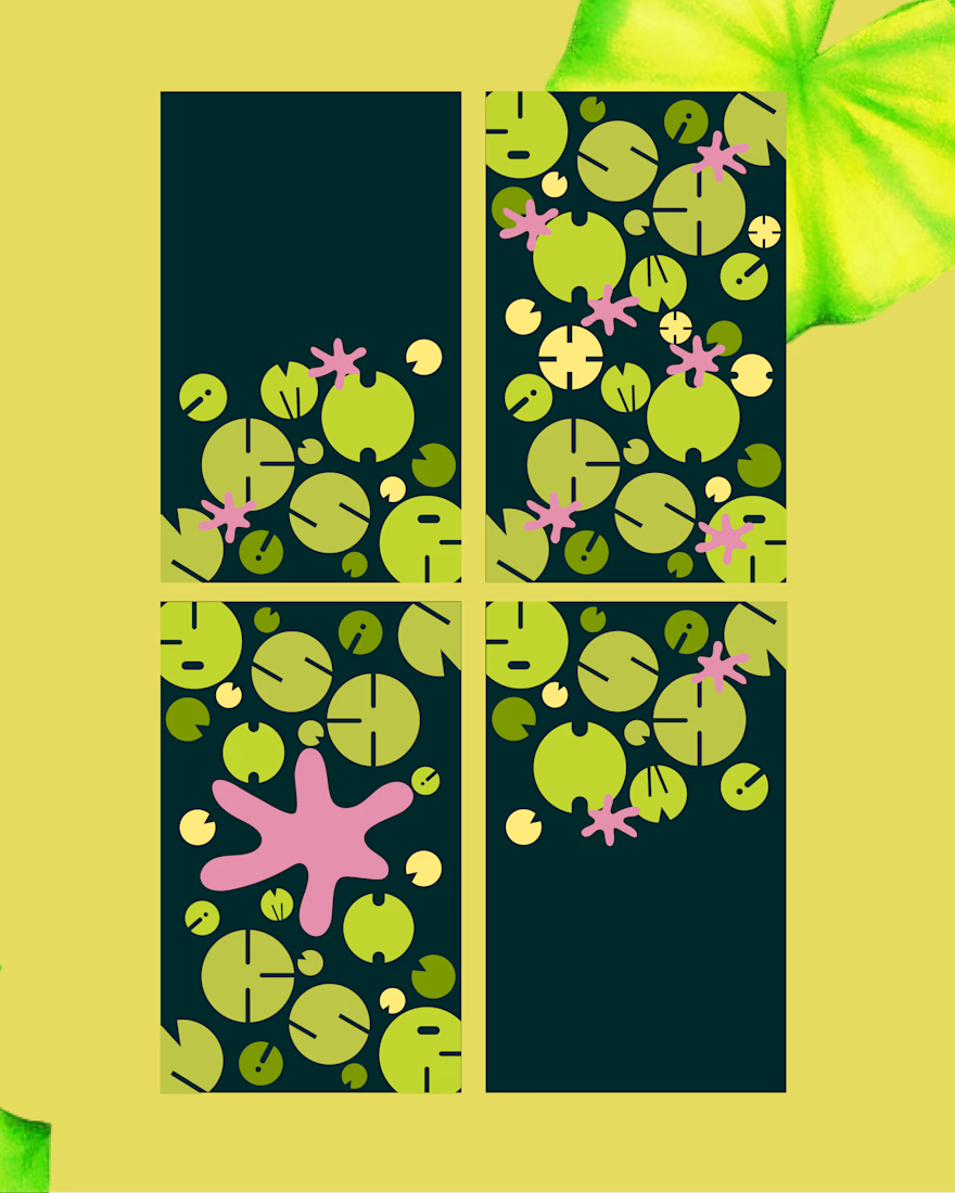

The notch in the lily pad turning into a letter cut is a clever bridge between the organic source and a usable alphabet. Did you keep the leaf's slight irregularities across the glyph set, or normalise them so the letters sit together at text sizes?

The network for creativity
Join 1.25M professional creatives like you
Connect with clients, get discovered, and run your business 100% commission-free
Creatives on Contra have earned over $150M and we are just getting started








Related posts

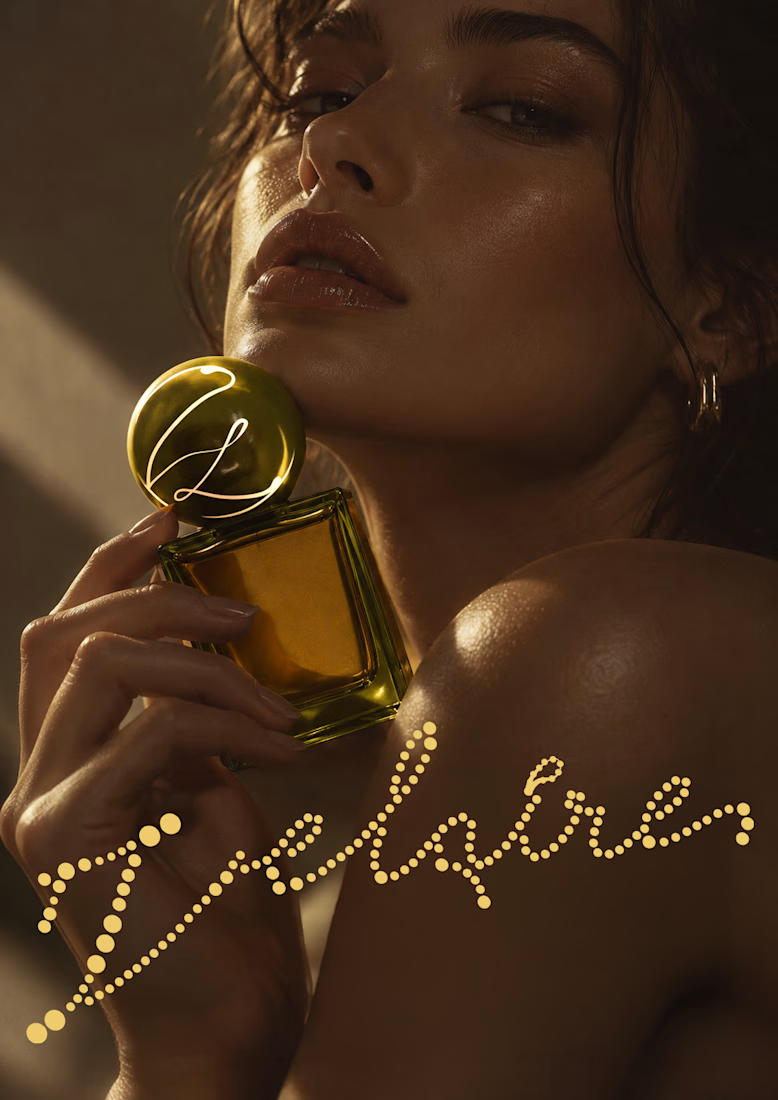
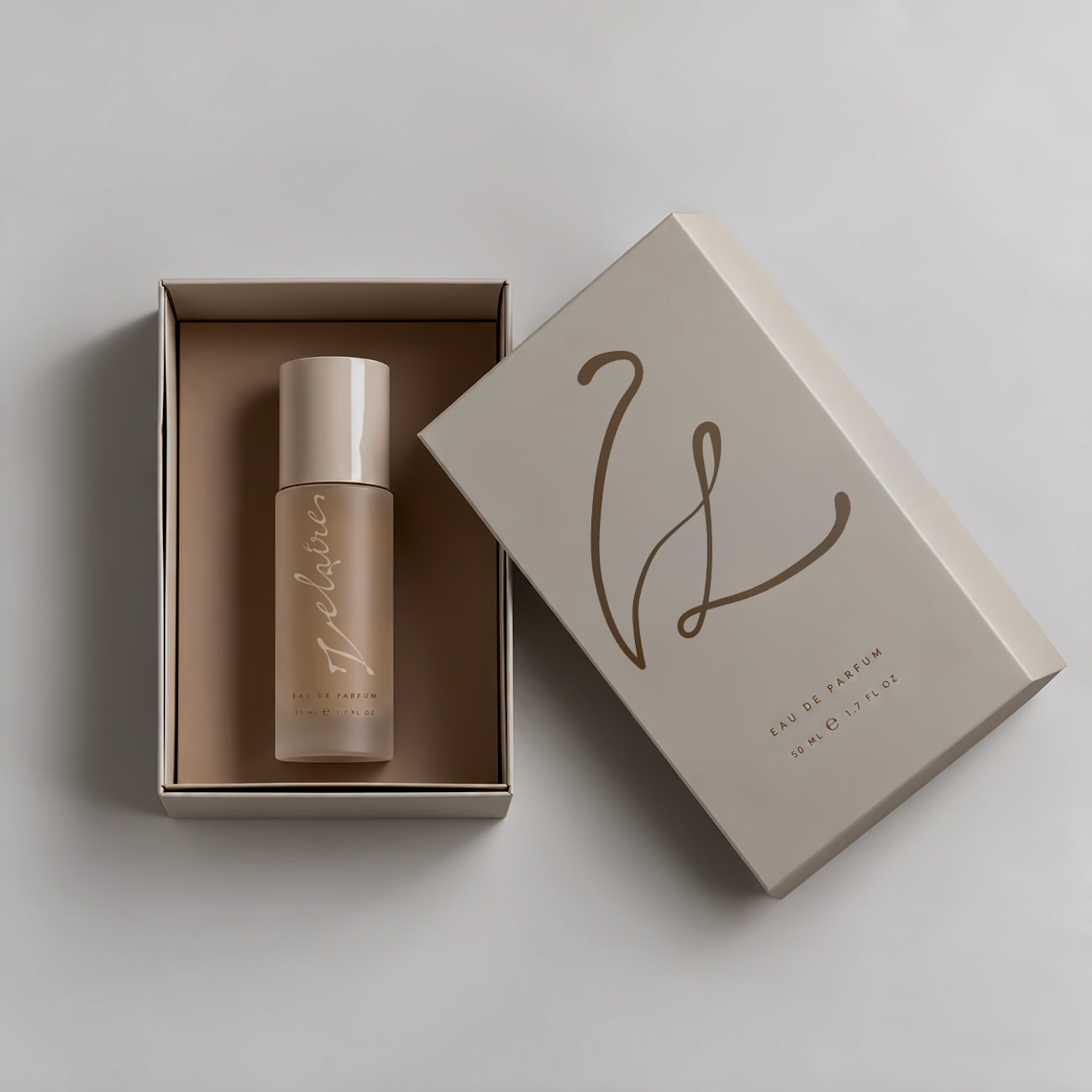
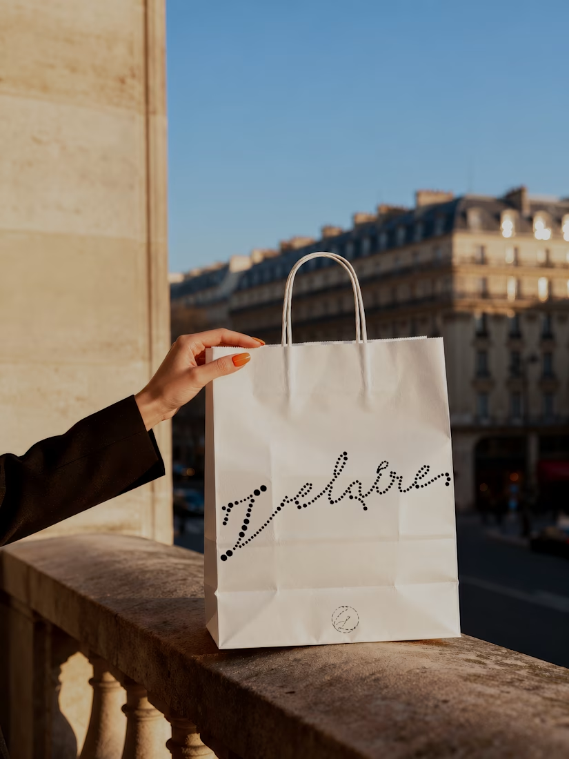
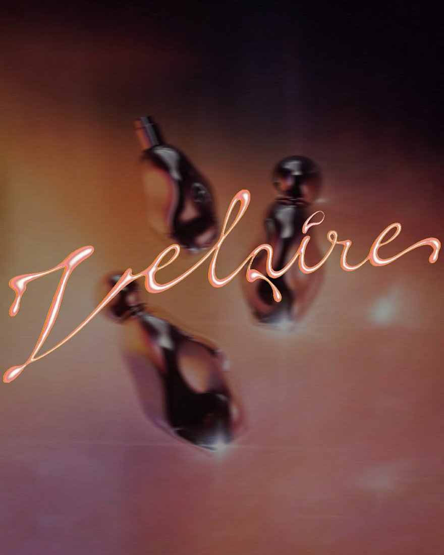
VELAIRE — Beauty & Fragrance Visual Identity
A self-initiated identity exploring custom lettering, sensual art direction and a refined visual system across packaging, editorial and digital applications.
Currently open to freelance and remote collaborations in branding, music, fashion and culture.
Visual Identity · Art Direction · Logo Design · Campaign Design
#VisualIdentity #ArtDirection #BrandDesign #LogoDesign #GraphicDesign



Great brand identity Yaren that's really luxury 🔥🔥


I like the Clarity and neatness in your work


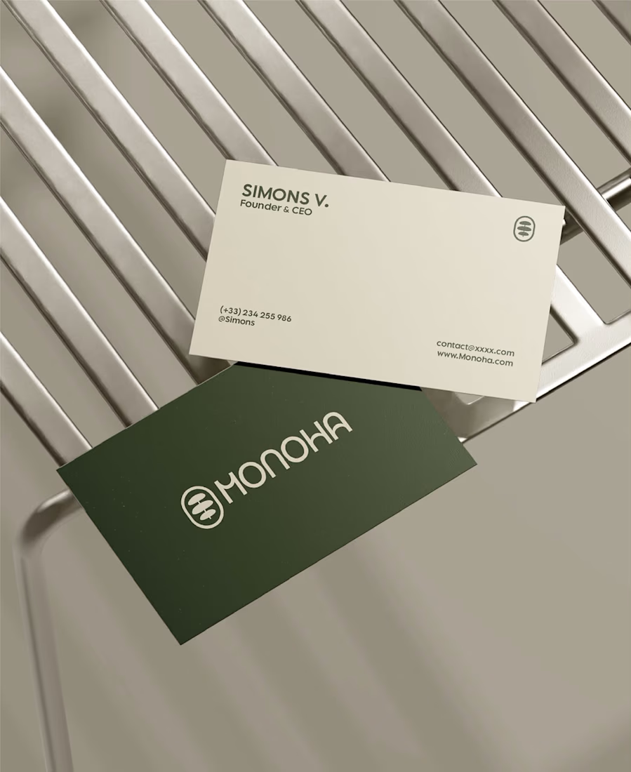
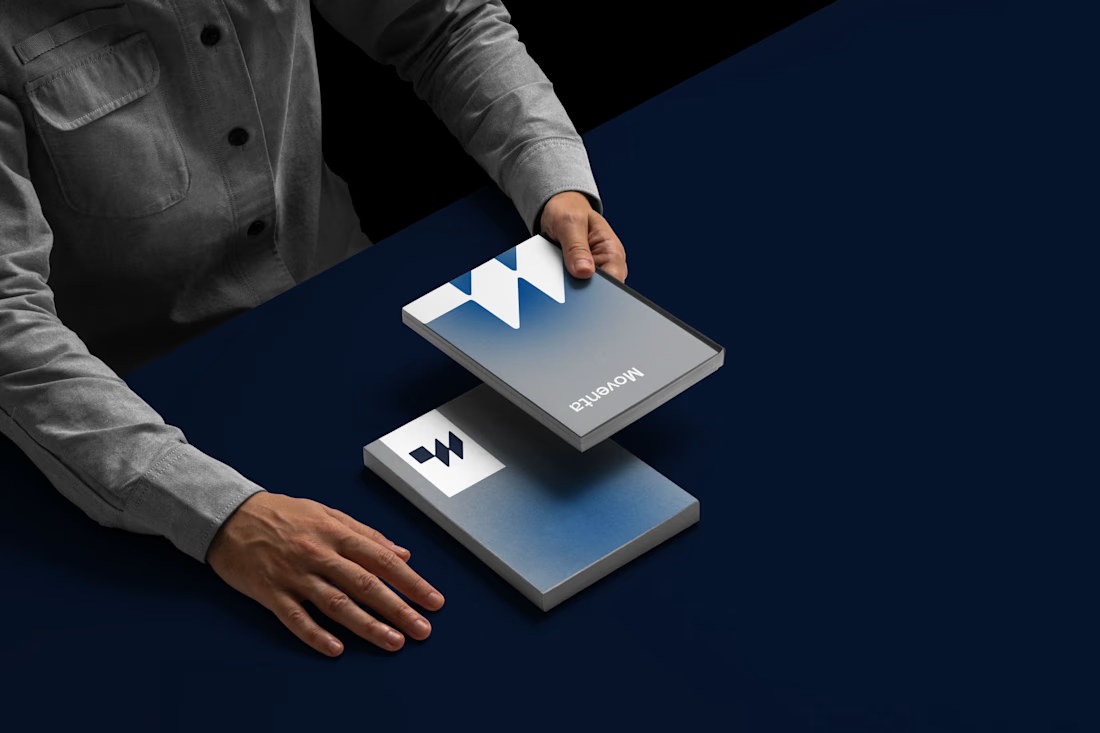
Great branding kit Alex 🎉🎉