The network for creativity
Join 1.25M professional creatives like you
Connect with clients, get discovered, and run your business 100% commission-free
Creatives on Contra have earned over $150M and we are just getting started
Back to feedPost

The subway ad placement sells the concept more than a clean render ever could, the worn tile and empty green seats make NORD feel like it already exists.

The network for creativity
Join 1.25M professional creatives like you
Connect with clients, get discovered, and run your business 100% commission-free
Creatives on Contra have earned over $150M and we are just getting started

Challenges
View all


Related posts


Day 12/30 of my hero section challenge.
Another day of prioritising the visuals and imagining a company that doesn't exist. I promise the next one is a tech brief with barely any imagery at all, I've leaned hard on beautiful photography for twelve days straight.
Concept: a mycelium materials company producing leather, packaging and foam grown from fungal networks. The design deliberately inverts the category's defaults; biotech branding tends toward dark, clinical and electric blue, so this one goes warm and botanical, with a subtle looping video of spores drifting and mushrooms emerging. The copy pulls hard the other way: plain, technical, B2B-direct, anchored by two concrete numbers instead of sustainability adjectives.
Twelve briefs across travel, food retail, personal branding, events, landscape architecture, pet services, hospitality, coffee, lighting, wellness, restaurants and now biomaterials.
12 down, 18 to go.
Built on the Viper template by Westhill Studio, adapted and customised by me.
Imagery and video generated with AI.


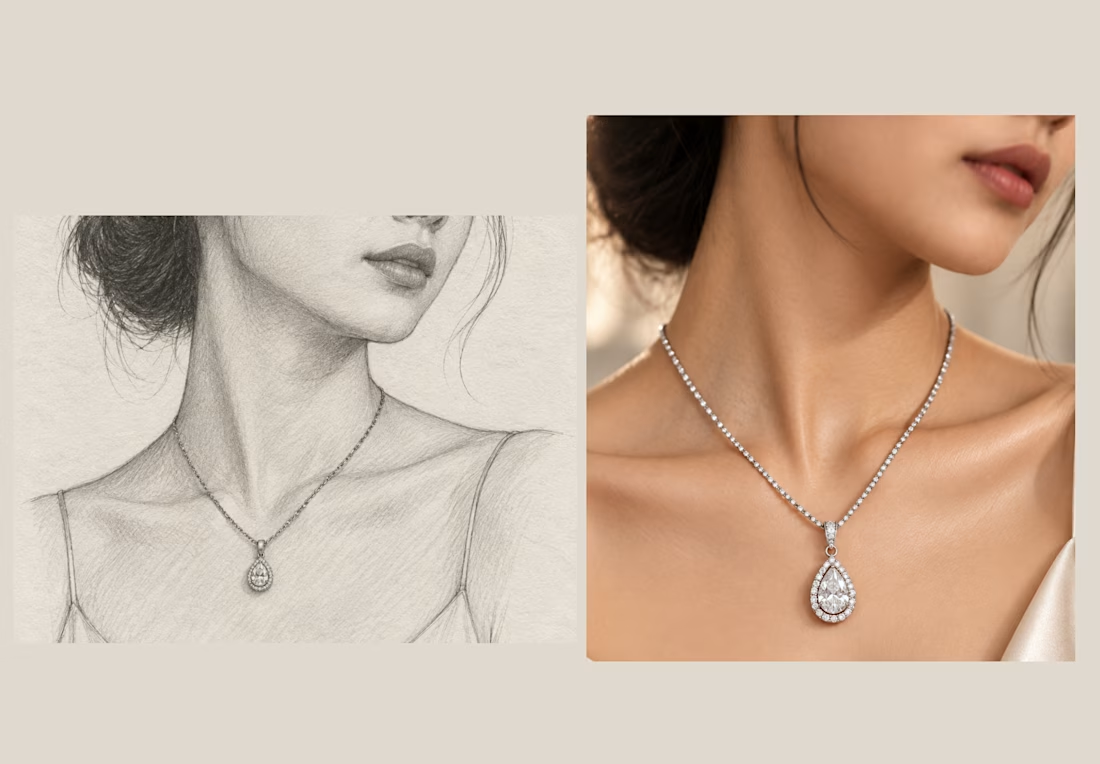
✨ From Sketch to Product Story
A product catalog doesn’t have to start with a product photo.
For this necklace, I started with a simple pencil sketch ✏️ to explore the composition, model positioning, and how the jewelry would become the visual focal point.
Then, I transformed the concept into a realistic luxury editorial image 💎
🎯 The strategy:
• Start with the concept
• Establish the composition
• Make the jewelry the hero
• Build a premium visual environment
• Create a style that can scale across the entire catalog
The goal wasn’t just to create an image. It was to create a consistent visual direction for the product collection. ✨
Sketch → Concept → Realistic Product Visual → Catalog
#JewelryDesign #ProductPhotography #CreativeStrategy #ArtDirection #AIVisuals #ProductCatalog #CreativeProcess