The network for creativity
Join 1.25M professional creatives like you
Connect with clients, get discovered, and run your business 100% commission-free
Creatives on Contra have earned over $150M and we are just getting started
Back to feedPost
Taste Test

✨ Two renders. One product. Which Arvana visual do you prefer?
Exploring realistic 3D product rendering for Arvana, blending minimal design with warm, natural interiors. 🏡🤍
🏠 Option 1: Lifestyle & Ambient
☀️ Option 2: Clean & Product-Focused
Which one stands out to you? 👀 Cast your vote! 🗳️👇
3 voted
27%
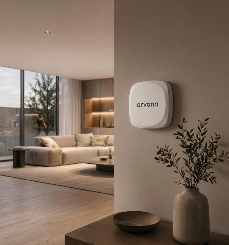
8 voted
73%
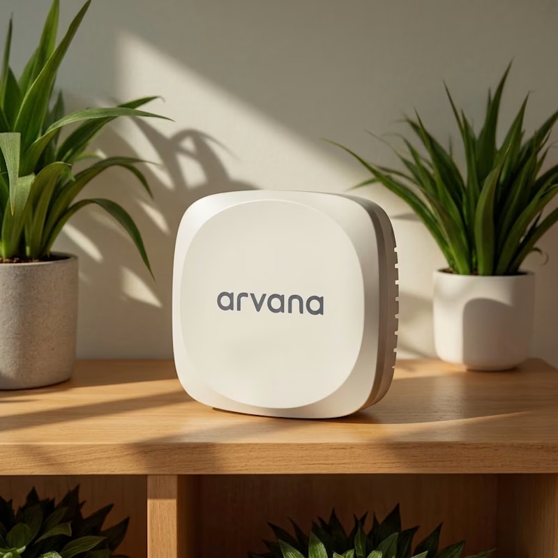
11 votes
Closed

☀️ Option 2 looks good.

Clean and focused is great Maham it was great for tech brand advertising

Option 1: Lifestyle & Ambient

Option 2


I’d pick Option 1. The warm interiors make the product feel more natural and help people picture it in their own home.

The Clean & Focused direction reads more product-led — less noise around the bottle and a tighter visual hierarchy that would hold up on a dark-mode ecom page. If I were picking for an ecom PDP, I'd go with Clean & Focused and bump the bottle's drop shadow just a touch so it lifts off the glass without adding clutter.

Gorgeous 😍

Clean and focused

Both renders look premium, Maham, but the Clean and Focused direction really lets the product shine. The warm interiors in option one are gorgeous too, though. Lovely 3D work either way.

Option 1
The network for creativity
Join 1.25M professional creatives like you
Connect with clients, get discovered, and run your business 100% commission-free
Creatives on Contra have earned over $150M and we are just getting started



Related posts


Video-led hero for me. The big script Presence over the field sells a feeling in one glance, which is what wellness needs. The expanding gallery would work well as the second section.


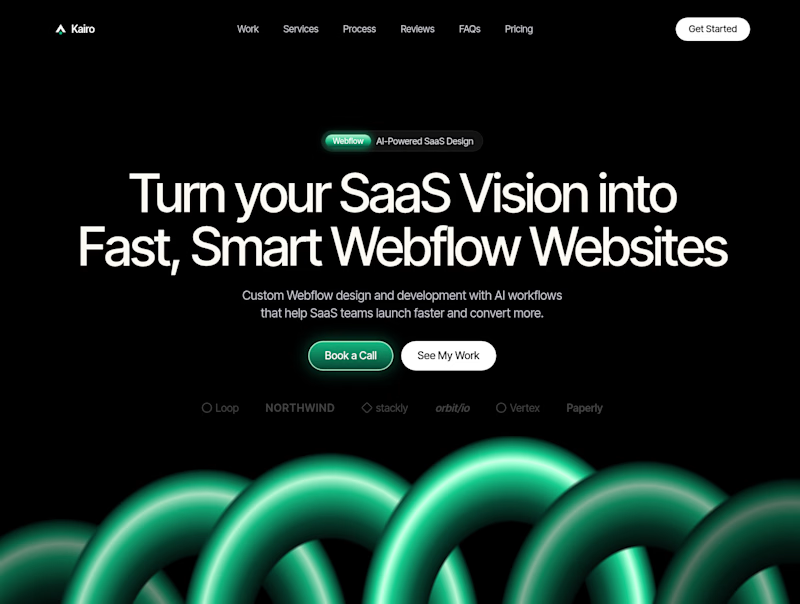
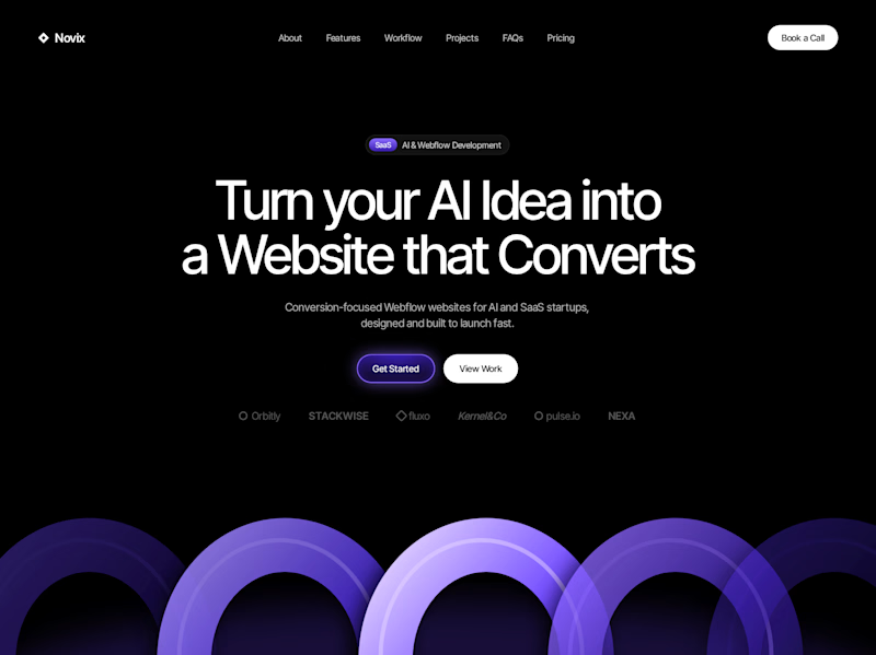

Both look great, but Violet & Black gets my vote! The purple accents give it a more modern, premium feel while keeping the design clean and focused on conversions. Amazing how a color change can create such a different brand personality. Have you tested which version performs better with visitors?

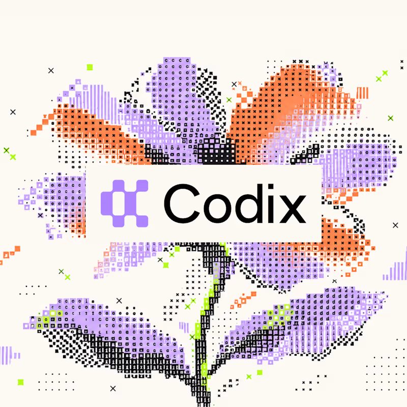
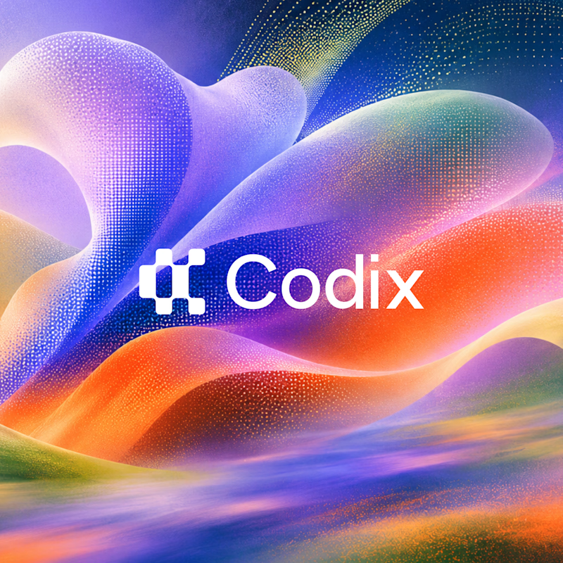
Codix - Which Visual Direction Works Better? 👀
Exploring two different visual styles for Codix, an experimental tech brand identity.
Option 1
Bold, geometric, and pixel-inspired. A playful mix of digital patterns, modular shapes, and vibrant colors.
Option 2
Abstract, expressive, and futuristic. A dynamic blend of flowing forms, gradients, and digital textures.
Same Brand. Two different creative directions.
Which one would you choose - 01 or 02?
5 voted
24%
16 voted
76%
21 votes
Closed
Option 2 was stunning🔥🔥