The network for creativity
Join 1.25M professional creatives like you
Connect with clients, get discovered, and run your business 100% commission-free
Creatives on Contra have earned over $150M and we are just getting started
Back to feedPost

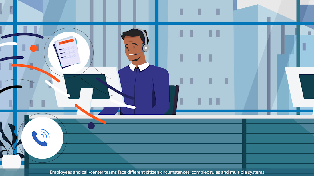
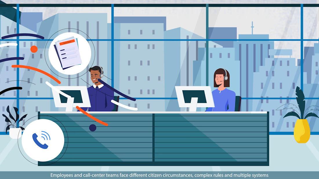
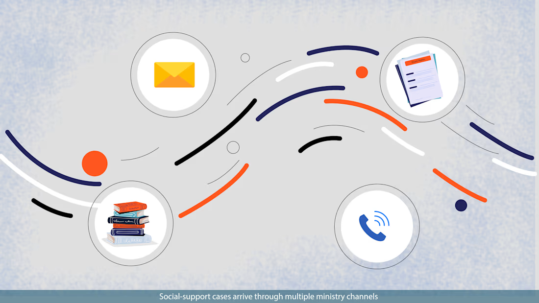
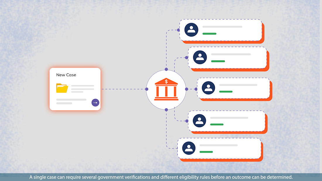
Sharing a few style frames I created recently.
The interesting part for me wasn’t just making individual frames look polished, it was building a visual language that could carry the story consistently from one scene to the next.
The direction combines simple illustration, diagrams, typography, and more conceptual visuals, while keeping everything modular enough to animate smoothly later.
When you’re watching a motion piece, what usually makes it feel memorable to you?
#Illustration #Styleframes #MotionDesign #VisualDesign #ArtDirection #InformationDesign #AI


The network for creativity
Join 1.25M professional creatives like you
Connect with clients, get discovered, and run your business 100% commission-free
Creatives on Contra have earned over $150M and we are just getting started





Related posts

Still waiting to hear back from @Contra HQ
So I did what any designer would do: I made the card myself 😂
Brushed metal. Laser-engraved logo. Holographic Mastercard rings. Full 360° spin. I'm going to keep polishing this until the real one shows up in my mailbox. Your move, Contra 👀
(Concept / fan design, not an official Contra product..Yet 🙌 )


“Okay, this looks WAY too good 🔥 Contra needs to make this real 👀”

Saas Management Landing Page Design
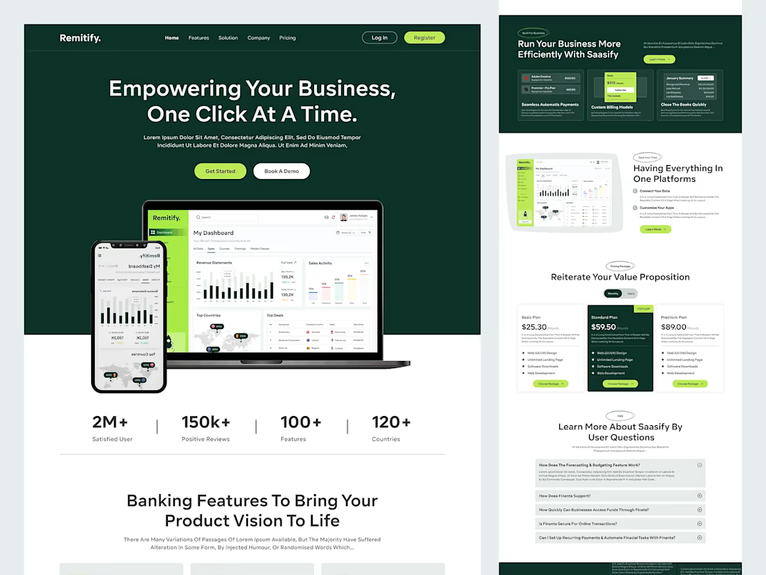
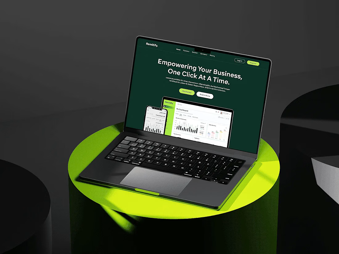

The deep green with lime accents reads "finance you can trust" without feeling like a bank, and the stats row right under the hero adds instant credibility. When pages like this get built, the dashboard in the hero is the part I'd make live: a lightweight animated version with...

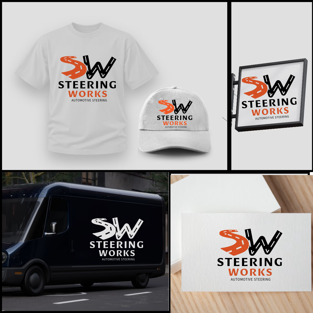
SW logo where S and W are winding roads, inspired by windy road sign idea. The orange S adds energy, black W adds strength. As shown, the design is highly adaptable and works perfectly on t-shirts, caps, van graphics, shop signage, and business cards in both color and single-color white. Strong, memorable, and built for automotive enthusiasts.


That's very attractive great job bro 🎉🎉🔥🔥