The network for creativity
Join 1.25M professional creatives like you
Connect with clients, get discovered, and run your business 100% commission-free
Creatives on Contra have earned over $150M and we are just getting started
Back to feedPost
Taste Test


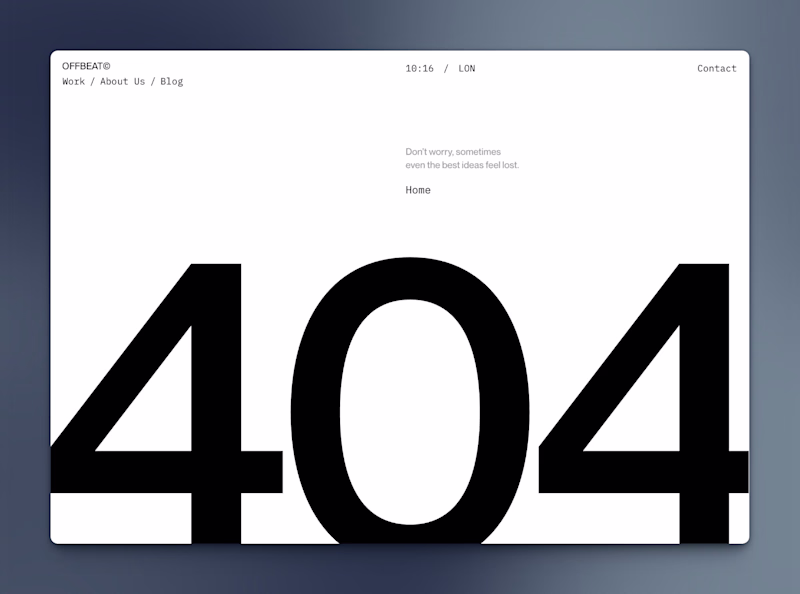
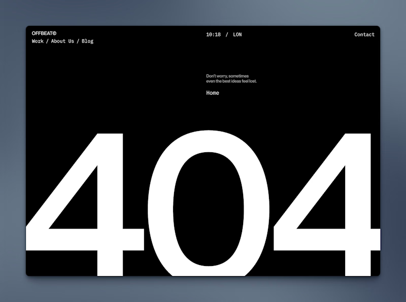


I will prefer A though

A Bro I found you here as well.😊

404 in version A feels more 404 than B I don't know why

Just keep both, add two light and dark themes

Dark mode for sure!

Depends on the template's mode, whether it's light or dark, I'd say, they both do the job in a good way!


Just to clarify, are you looking at design differences or which color mode is better for the 404 page?
The design feels identical to me aside from the color.
I’d lean toward dark mode since it reads better with the smaller text.

i love A! 👍

Option B works better

nice work

Super!

White is always beautiful, but thinking about people's retina....

Leaning towards A — the light background feels cleaner and more aligned with a minimal aesthetic. Great direction

Black is hitting me in this!!

Do you really have to pick? I mean both work as light and dark modes respectively.

Both Looks Great. i personally leaning towards the light mode more :)
The network for creativity
Join 1.25M professional creatives like you
Connect with clients, get discovered, and run your business 100% commission-free
Creatives on Contra have earned over $150M and we are just getting started
Related posts


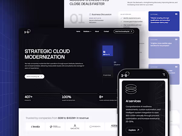
New Case Study: 3-11 Consulting
Redesigned and built 3-11 Cloud Consulting’s website in #Framer, refining service positioning and creating a cohesive UI system that communicates credibility and scale.
3-11 helps enterprise teams modernize operations across NetSuite, Salesforce, and AI.
See it live → 3-11cloud.com


Nice work Jeremie 🔥

For this project, me and my client designed and developed a custom toggle component to showcase the product features/journey on the hero section
The component has a timer of 7 seconds to showcase each animation and then jumps to the next one
Done with Framer workshop + Claude code


Great.

Clean af


Trending
maxearnings
The next frontier of payments is live on Contra. How are you maximizing revenue?
freelancerlife
Freelancer life is wins, pivots, and everything in between. What’s yours right now?
aidesignflow
AI tools are redefining how designer work. What does your workflow look like?
micrographics
Micrographics started as utility - barcodes, packaging, instruction labels. How would you use them?
aivideo
AI video tools are moving at warp speed. What tools are you using?