The network for creativity
Join 1.25M professional creatives like you
Connect with clients, get discovered, and run your business 100% commission-free
Creatives on Contra have earned over $150M and we are just getting started
Back to feedPost

site criado para pizzaria com pagina inicial ,botoes de navegação,whatssa e ate localizaçao via google maps.
The network for creativity
Join 1.25M professional creatives like you
Connect with clients, get discovered, and run your business 100% commission-free
Creatives on Contra have earned over $150M and we are just getting started

Challenges
View all


Related posts

What if Google Maps had been designed in the 1920s? 👀
For the #revival challenge, I reimagined Google Maps through the visual language of Soviet Constructivism.
Routes become bold diagonals, turns become oversized arrows, and ETA and distance become strong typographic statements. Navigation stops feeling like a quiet interface and starts feeling like a piece of graphic propaganda telling you exactly where to go.
Such a fun exercise in taking something extremely familiar and asking how differently it could have been designed in another time.
Your turn!
What modern product would you send back in time, and to which era? 👀


The Constructivist direction makes the map feel like an active piece of visual communication rather than a passive interface. The oversized arrows and tight typographic rhythm give the navigation a wonderfully confident voice.

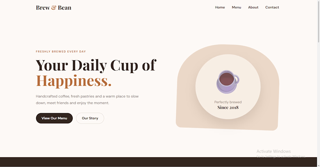
A modern coffee shop website with a warm, elegant design, responsive layout, clear navigation, and engaging sections for showcasing the brand, menu, and story.



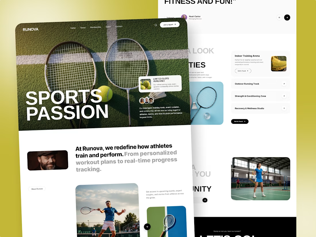
Recent Sports Landing Page Design In Figma
Designed a modern sports club and fitness platform website for Runova. The goal was to build a bold, dynamic visual interface that seamlessly showcases facility offerings, training zones, and athlete membership programs. Every section is structured to deliver an energetic user experience that turns visitors into active members.
𝗛𝗮𝘃𝗲 𝗮 𝗨𝗜/𝗨𝗫 𝗱𝗲𝘀𝗶𝗴𝗻 𝗽𝗿𝗼𝗷𝗲𝗰𝘁 𝗶𝗻 𝗺𝗶𝗻𝗱? 𝗟𝗲𝘁’𝘀 𝗰𝗼𝗹𝗹𝗮𝗯𝗼𝗿𝗮𝘁𝗲 𝗮𝗻𝗱 𝗰𝗿𝗲𝗮𝘁𝗲 𝘀𝗼𝗺𝗲𝘁𝗵𝗶𝗻𝗴 𝗲𝘅𝗰𝗲𝗽𝘁𝗶𝗼𝗻𝗮𝗹 𝘁𝗼𝗴𝗲𝘁𝗵𝗲𝗿! 🚀