The network for creativity
Join 1.25M professional creatives like you
Connect with clients, get discovered, and run your business 100% commission-free
Creatives on Contra have earned over $150M and we are just getting started
Back to feedPost
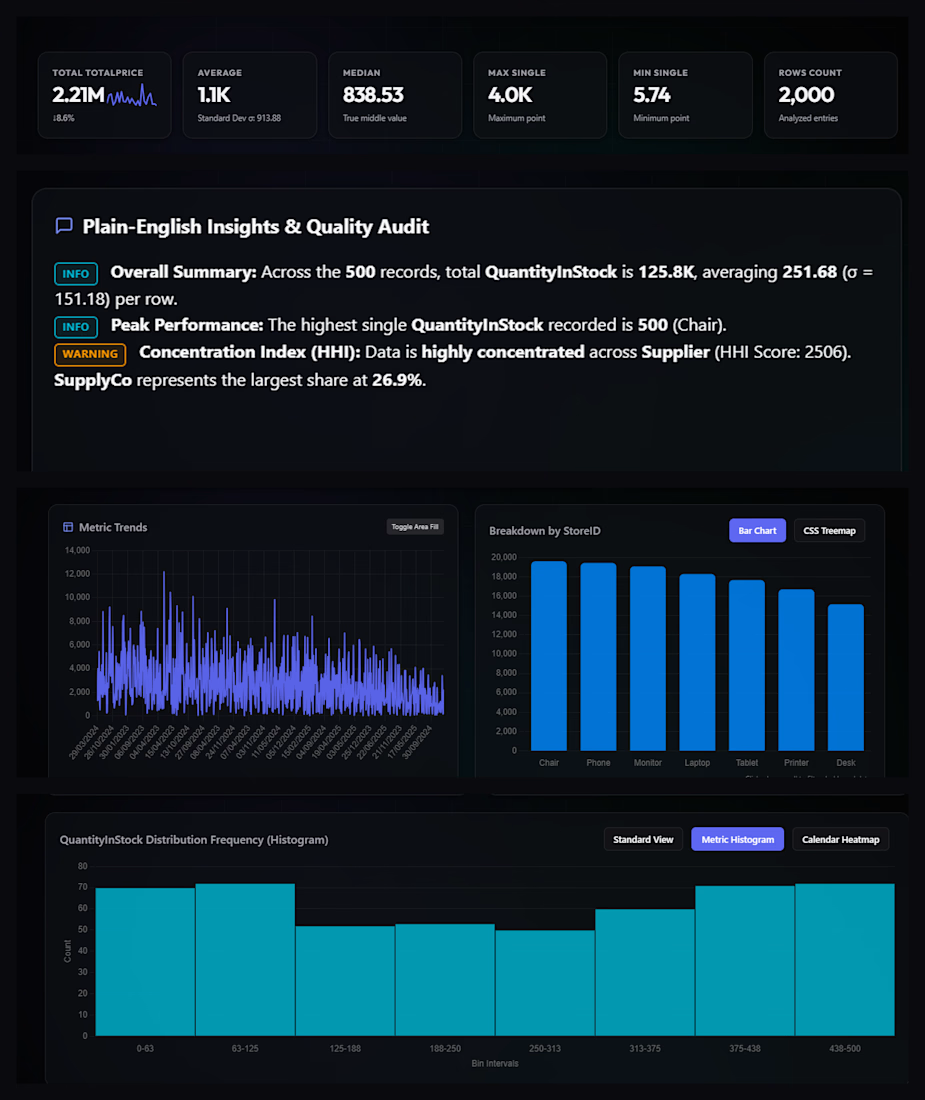
This is an inventory/sales analytics dashboard, likely built for exploring stock and pricing data across a retail-style dataset. A few things stand out:
Scale and scope: The dataset spans 2,000 analyzed rows with a combined total price of 2.21M, averaging around 1.1K per entry (median 838.53), a right-skewed distribution, since the max single value (4.0K) sits well above the mean while the min (5.74) is near zero.
Automated narrative insights: The "Plain-English Insights & Quality Audit" panel does the analytical heavy lifting for the viewer; it flags that supply is concentrated among a small number of suppliers (HHI score of 2506, with SupplyCo alone holding 26.9% of share), which is a useful red flag for supply-chain risk.
Trend and category breakdown: The metric trends line chart shows highly volatile day-to-day activity with no strong long-term drift, while the store/category bar chart ranks inventory items (Chair, Phone, Monitor, Laptop, Tablet, Printer, Desk) by volume a fairly even, gently descending distribution rather than one dominant category.
Distribution shape: The histogram of quantity-in-stock is roughly U-shaped across bins, with high counts at the low and high extremes (0–63 and 375–500) with a dip in the middle suggesting a bimodal stocking pattern (many items are either kept lean or stocked heavily, with fewer landing in between).

The network for creativity
Join 1.25M professional creatives like you
Connect with clients, get discovered, and run your business 100% commission-free
Creatives on Contra have earned over $150M and we are just getting started
Related posts

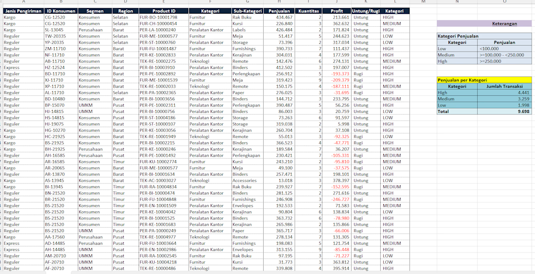
Using logical formulas is essential for automated data categorization and reporting. This project demonstrates how to apply IF, IFS, COUNTIF, and SUM functions in Excel to process sales data effectively:
-IF Function (Binary Logic): Automatically flags whether a transaction is "Untung" (Profit) or "Rugi" (Loss) based on a single condition.
-IFS Function (Multi-tier Logic): Handles multiple conditions to classify sales performance into tiered categories ("Low", "Medium", "High") based on revenue thresholds.
-COUNTIF Function (Data Aggregation): Calculates the exact number of transactions that fall into each specific performance category.
-SUM Function (Totaling Data): Computes the grand total of all transactions to ensure complete data reconciliation in the summary table.


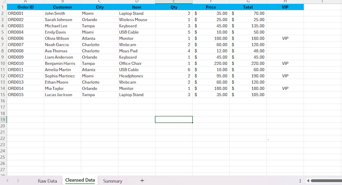

Show us the raw data! 😄

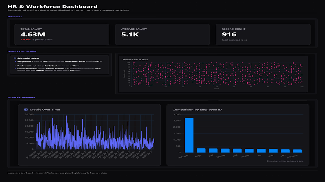
This dashboard takes raw workforce and inventory data and automatically surfaces the metrics that matter no manual pivot tables or chart configuration needed.
What it includes:
KPI summary cards (Total Salary, Average Salary, Record Count) with period-over-period change indicators
A plain-English insights panel that surfaces the standout patterns in the data peak values, leading categories, and distribution shifts instead of leaving the reader to interpret raw numbers
A Reorder Level vs. Stock scatter plot to visualize the relationship between two variables at a glance
Time-series and categorical comparison charts (metric trends over time, comparison by employee ID) that respond to clicks for on-the-fly filtering
Challenges
View all



Trending

Claude
Claude has entered the design space. How are you using Claude Design?

Contra University
Learn from expert creatives how to earn more using next-gen AI tools.
fifaworldcup2026
The World Cup is here and the whole world's watching. How are you designing for the world stage?
creativeaiflow
Creative AI workflows are evolving. What tools do you use, and what are their strengths and weaknesses?
freelancerlife
Freelancer life is wins, pivots, and everything in between. What’s yours right now?