The network for creativity
Join 1.25M professional creatives like you
Connect with clients, get discovered, and run your business 100% commission-free
Creatives on Contra have earned over $150M and we are just getting started
Back to feedPost

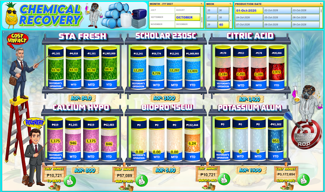
Using logical formulas is essential for automated data categorization and reporting. This project demonstrates how to apply IF, IFS, COUNTIF, and SUM functions in Excel to process sales data effectively:
-IF Function (Binary Logic): Automatically flags whether a transaction is "Untung" (Profit) or "Rugi" (Loss) based on a single condition.
-IFS Function (Multi-tier Logic): Handles multiple conditions to classify sales performance into tiered categories ("Low", "Medium", "High") based on revenue thresholds.
-COUNTIF Function (Data Aggregation): Calculates the exact number of transactions that fall into each specific performance category.
-SUM Function (Totaling Data): Computes the grand total of all transactions to ensure complete data reconciliation in the summary table.

The network for creativity
Join 1.25M professional creatives like you
Connect with clients, get discovered, and run your business 100% commission-free
Creatives on Contra have earned over $150M and we are just getting started





Related posts

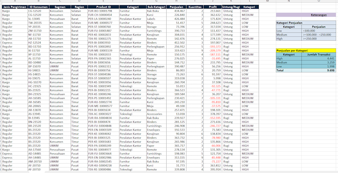
Built an n8n CRM automation system that captures leads, creates and updates CRM records, assigns tasks, sends team notifications, automates follow-ups and generates reports.


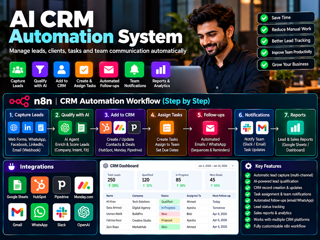
Restaurant Automation System. Automates WhatsApp orders, menu & pricing lookup, estimate generation, PDF invoices, and order processing using n8n, Google Sheets, Gemini AI and WhatsApp Cloud API.


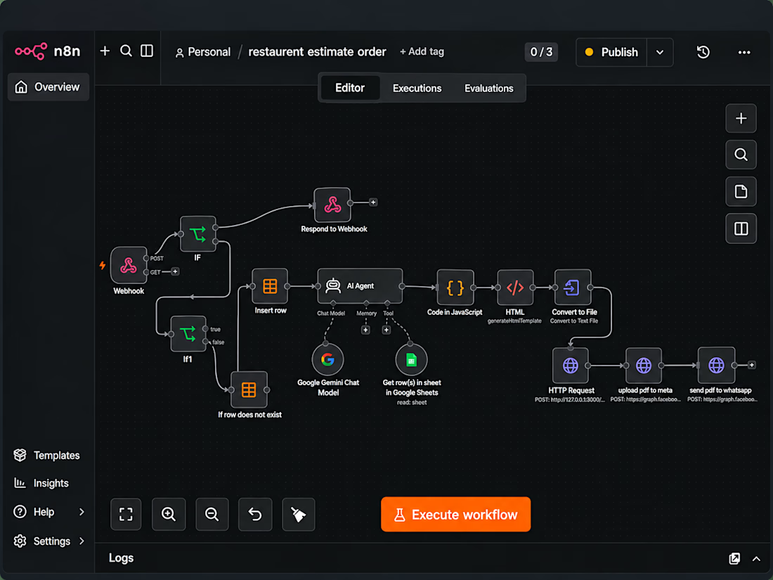

Replicating Complex Industrial Dashboards in Microsoft Excel 🛠️
Check out this highly visual, gamified Chemical Recovery Performance Dashboard! It tracks multi-layered KPIs, rolling timelines, and budget variances across six different industrial chemical lines.
While this specific interface uses a custom graphic skin, a dashboard with this exact level of complexity can be built entirely within Microsoft Excel using advanced data modeling and native features.
If you are looking to build or optimize a tracking system like this, here is how we can replicate its core logic in Excel:
📅 Dynamic Time Slicing: Recreate the top control panel using Excel Slicers connected to a central Calendar Table. This allows users to filter the entire view by Month, Week Number, or a specific Production Date with a single click.
📈 Rolling Timelines (Yesterday, WTD, MTD, YTD): Build out the top metric rows using dynamic SUMIFS or DAX formulas (Power Pivot) that automatically calculate data across moving operational windows based on your slicer selection.
🧪 Gauge & Cylinder Progress Charts: Replicate the fluid container visual by customizing Stacked Column Charts. By using custom shape overlays or image-fill data series, we can make the charts look like filling liquid tanks that change color based on target thresholds.
💰 Financial Variance & AOP Tracking: Link the bottom footer directly to variance calculation tables. This dynamically surfaces the Cost Impact To-Date and flags performance against the Annual Operating Plan (AOP) using conditional KPI indicators.
Whether your data is in manufacturing, logistics, or finance, you don't need expensive proprietary software to get highly engaging, interactive visuals.
If your team needs a clean, automated dashboard to monitor complex KPIs, let's connect! I can design tailored spreadsheet systems that turn raw operational data into actionable executive insights.