The network for creativity
Join 1.25M professional creatives like you
Connect with clients, get discovered, and run your business 100% commission-free
Creatives on Contra have earned over $150M and we are just getting started
Back to feedPost

A modern fashion e-commerce redesign focused on better UX, stronger visual hierarchy, and a smoother shopping experience.
I redesigned the Trendify fashion shopping experience to create a cleaner, more premium, and conversion-focused interface.
The redesign focused on simplifying navigation, improving product discovery, creating a stronger hero section, organizing categories more clearly, and making the overall shopping journey feel more intuitive on mobile.
What I worked on
E-commerce UI/UX redesign
Mobile-first interface design
Homepage redesign
Product card and product showcase design
Category navigation
Search experience
Promotional banner design
Visual hierarchy and spacing
Conversion-focused CTA placement
Bottom navigation for mobile shopping
Design Goal
The goal was to transform a basic fashion shopping interface into a visually engaging experience that helps shoppers discover products faster and move naturally from browsing to purchase.


Beautiful
The network for creativity
Join 1.25M professional creatives like you
Connect with clients, get discovered, and run your business 100% commission-free
Creatives on Contra have earned over $150M and we are just getting started
Related posts

Need a second pair of eyes 👀
I'm designing the online store for FizzPop, a craft soda brand: all-natural sodas, sparkling waters and botanical tonics.
Flower Fizz(A): eggshell, tiger orange and deep ultramarine, with flower shapes and stacked colour swatches for the flavours
Corner Shop(B): lime, soft blues and navy, editorial layout with a giant wordmark and menu-style flavour tiles
38 voted
44%
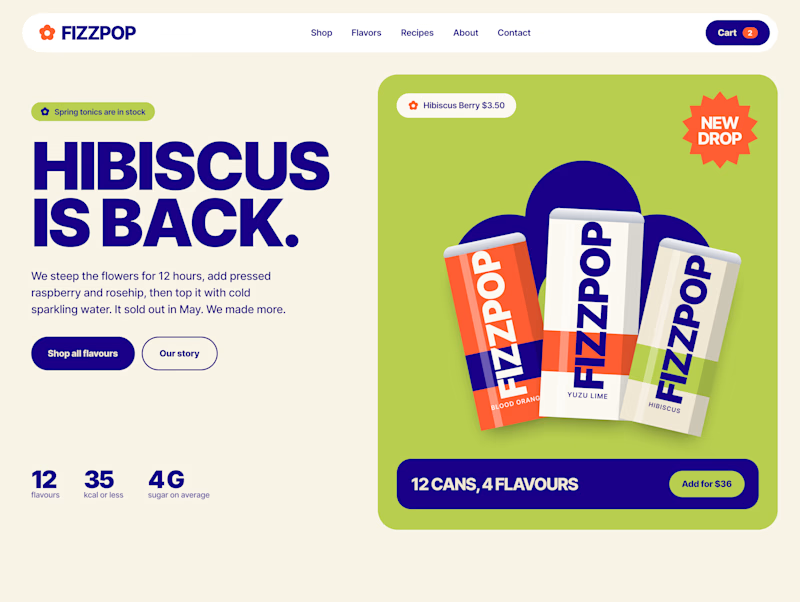
48 voted
56%
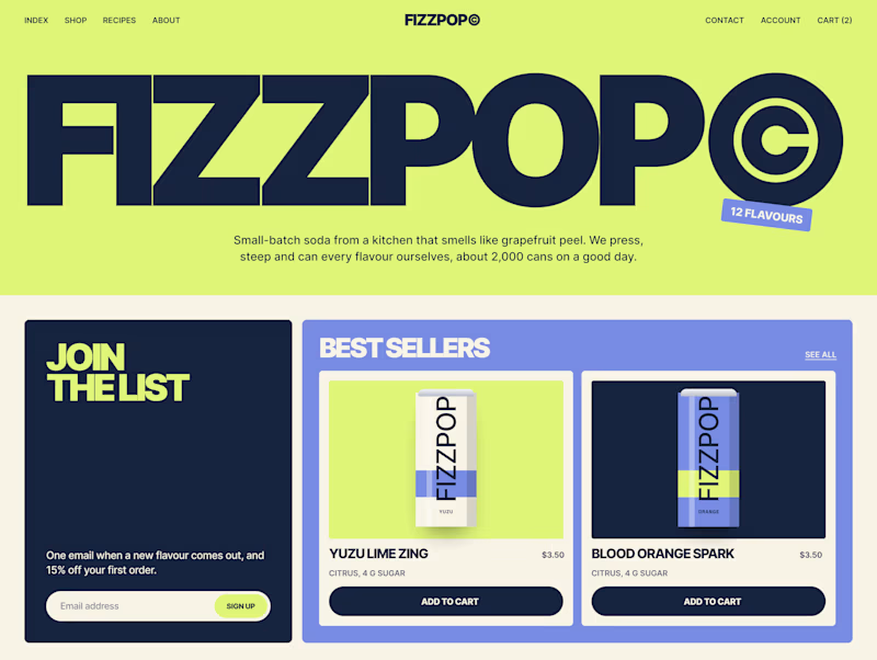
86 votes
Closed


I missed an important detail in th first design direction, and the client rejected it.
After revisiting the feedback, I came up with another directiona nd it got approved
Both designs serve the same product, which one do you think got accepted for a web application?
Direction 1
Direction 2
9 voted
69%
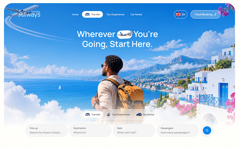
4 voted
31%
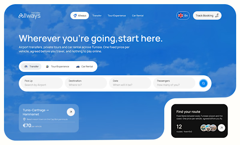
13 votes
Closed

Dir 2 for sure!

I've spent years obsessing over the stuff nobody notices on a website. Until it's missing.
AI can now build a whole site in an afternoon. I think that's great.
But it still can't decide what feels right.
I don't think AI is the problem. It just stops at "it works". The last part, the spacing, the type, the way things move when you scroll, still needs someone who cares about it.
That's the part I've always loved doing. So I made a small thing around it: you bring the site AI built, I finish it in Webflow.
It's called Verdikt https://verdikt.studio


Agreed. AI gets you a working layout fast, but spacing and type rhythm are where it still feels off. I'd add forms and mobile checks to that list too. What's the most common fix people bring you?
