The network for creativity
Join 1.25M professional creatives like you
Connect with clients, get discovered, and run your business 100% commission-free
Creatives on Contra have earned over $150M and we are just getting started
Back to feedPost

How do you approach balancing clean typography with product details so the label stands out in a crowded market?


The network for creativity
Join 1.25M professional creatives like you
Connect with clients, get discovered, and run your business 100% commission-free
Creatives on Contra have earned over $150M and we are just getting started


Related posts

A white-label client needed one page that gives students all three
products at once, with the value clear at a glance. I put that job
on the hero: the headline sets the direction, and three numbered
links lead straight into each product.
Which background would you pick, the copper dark or the gold and olive blend?


5 votes
Ends in 12h

Copper dark — its richer depth suits the offer.

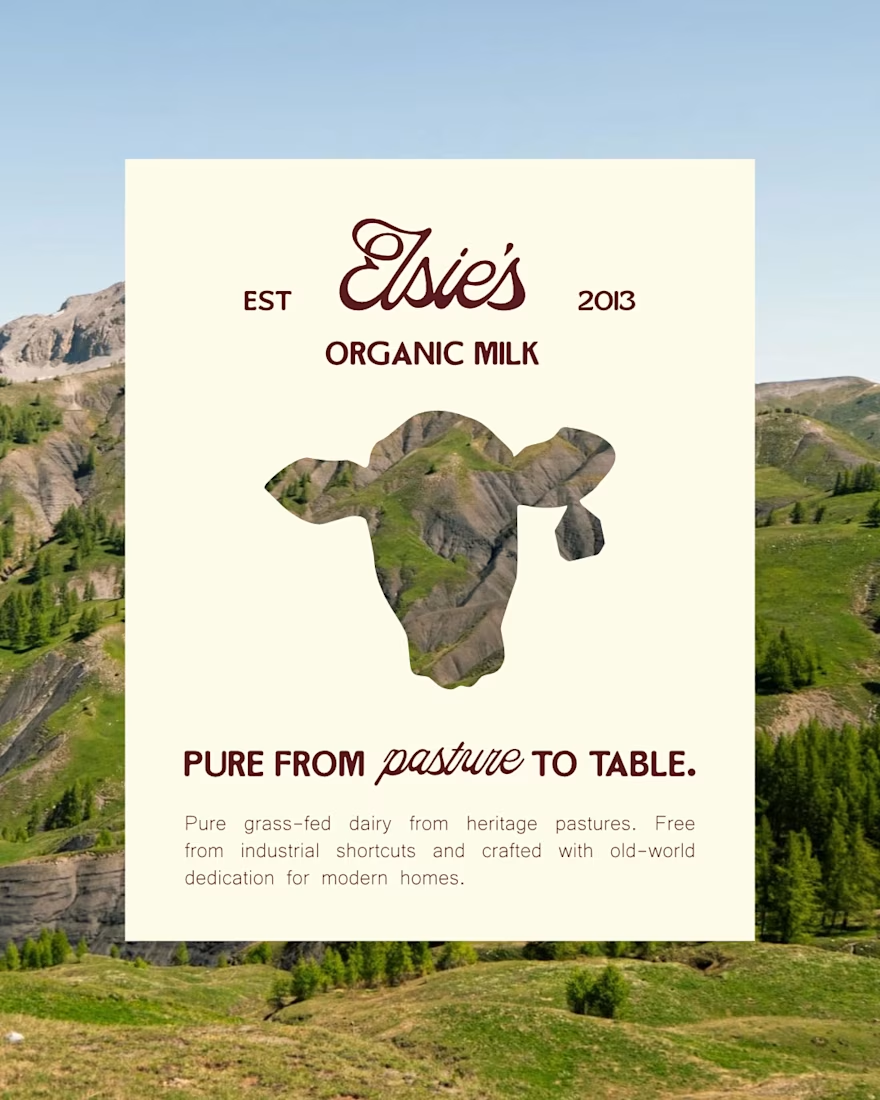
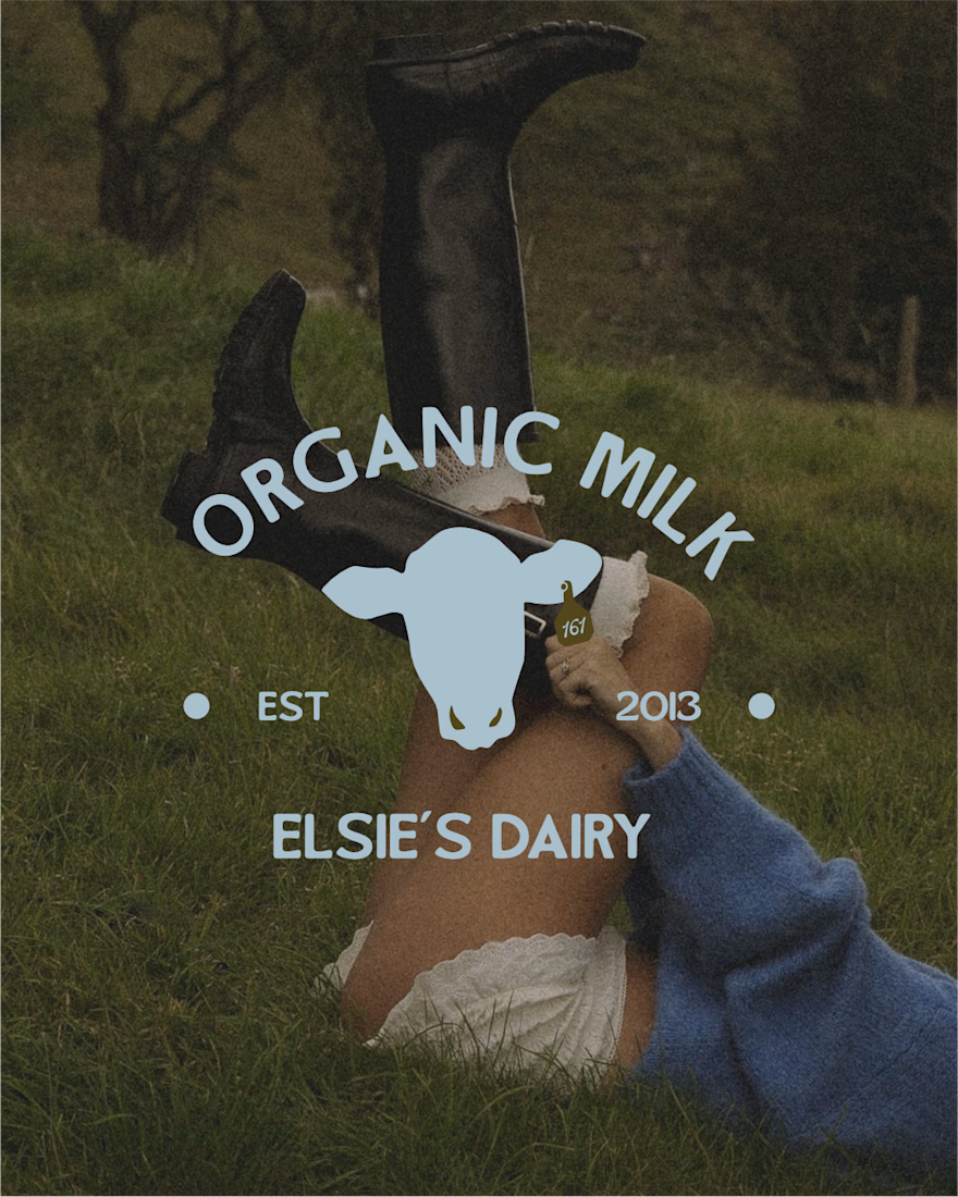
Industrial shortcuts ruined milk. I brought honest dairy back.
Walk down any dairy aisle today. What do you see?
Clinical white cartons
• Generic cow illustration with no story
• Corporate logos shouting percentage points
Every single brand plays by the exact same visual playbook. And because they try to fit in, they completely blend into the background.
When designing the brand identity and packaging for Elsie's (an organic, grass-fed milk brand), my goal was simple:
Break that pattern. Completely.
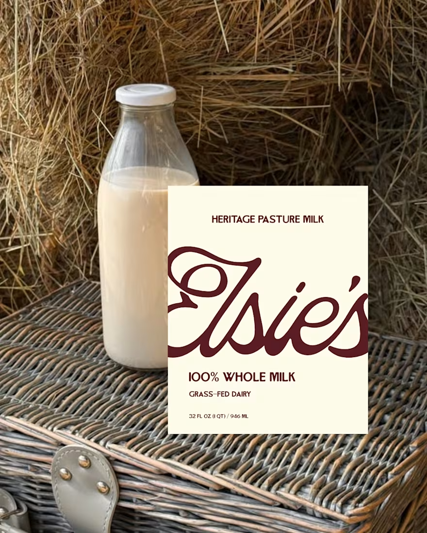
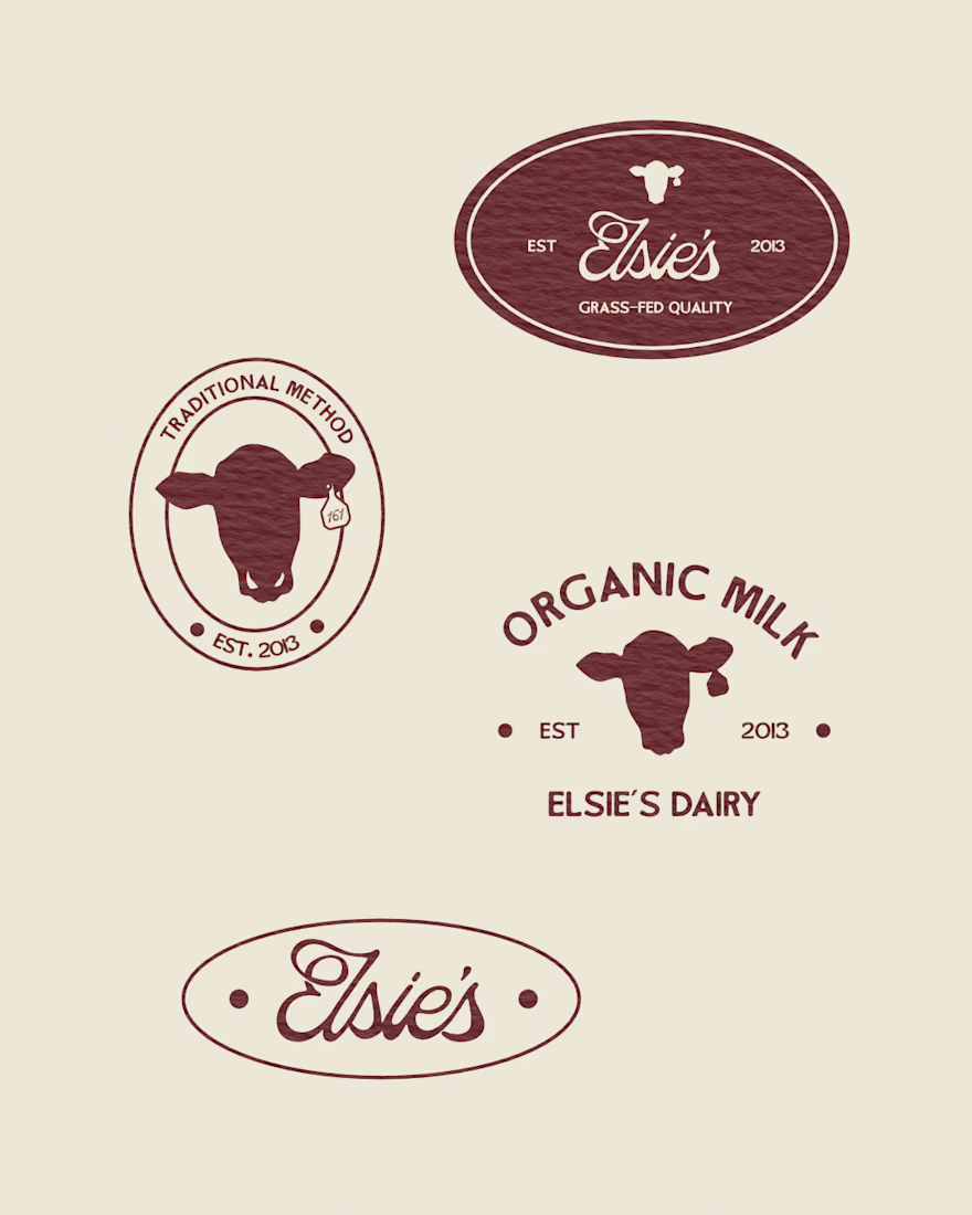
To make Elsie's unmissable in a crowded fridge, I built a visual identity rooted in heritage, warmth, and total transparency:
1 Color Palette: Swapped sterile blues and clinical whites for rich, warm tones that evoke real pastures and old-world farm kitchens.
2 Typography: Built the brand around custom serif lettering that feels human, grounded, and instantly premium.
3 Visual Hierarchy: Placed "100% Grass-Fed" front and center so shoppers recognize the quality before reading a single line of fine print.
This created packaging that earns immediate trust on the shelf and looks great on a kitchen counter.
Swipe through to check out the packaging details and visual system!


One of the hardest things in branding is knowing what not to change.
Nubank recently worked with Koto to evolve its visual identity as the company expands internationally.
They kept the recognizable logo but rebuilt the wider system around typography, colour, illustration, photography, and motion.
The interesting part for me is how much of this work happens inside the actual product.
Animations built in Rive, a more consistent interface language, and an identity that needs to work across different markets without losing its personality.
I think that's where branding is heading, especially for digital-first companies.
A good identity shouldn't just look great in a presentation. It needs to work just as well inside the product people use every day.

Top-notch branding/rebranding