The network for creativity
Join 1.25M professional creatives like you
Connect with clients, get discovered, and run your business 100% commission-free
Creatives on Contra have earned over $150M and we are just getting started
Back to feedPost

Day 1: Layout Lab
I started noticing how often I was falling back on the same layout ideas, so this series is my way of pushing past that and exploring new directions more intentionally.
Every layout in this series has to meet a simple standard:
- support a real business outcome
- stay WCAG compliant (AA)
- doesn’t drag down performance
->Today’s concept: Parallax Scrolling Cards with Highlight Text
Good fit for: showcasing benefits, featured projects, social proof, or any content that needs more visual emphasis

The network for creativity
Join 1.25M professional creatives like you
Connect with clients, get discovered, and run your business 100% commission-free
Creatives on Contra have earned over $150M and we are just getting started





Related posts

Booking a fitting shouldn’t take more messages than the alteration itself.
Meet Tivora Atelier, a fictional clothing alterations studio in Bucharest. The problem: a solo owner spends too much time asking every customer the same questions and coordinating appointments by hand.
I designed and built a booking experience in @Lovable that takes a customer from “Can I book?” to a confirmed fitting. They share garment details, choose an available time and receive a confirmation email. They can add the fitting to their calendar or use a private link to manage it later.
On the other side, the owner has one view for appointments, garment notes and availability.
This is an exploratory demo, not a real booking service. The video walks through the customer and owner experiences in under a minute.
Explore the public project: https://tivoraatelier.lovable.app/
#lovablechallenge


Great job, Anca


Consistency means every touchpoint feels like it belongs to the same brand. Uniformity means every touchpoint looks identical. The first builds trust. The second kills flexibility.

Your shot is exceptional. I'm overwhelmed with the quality of work!

Two variants, Same concept
I'd go with A here, looks clean and easy to scan
Which one would you choose?
6 voted
55%
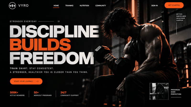
5 voted
45%
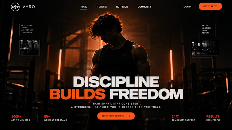
11 votes
Closed

I liked Both.