The network for creativity
Join 1.25M professional creatives like you
Connect with clients, get discovered, and run your business 100% commission-free
Creatives on Contra have earned over $150M and we are just getting started
Back to feedPost

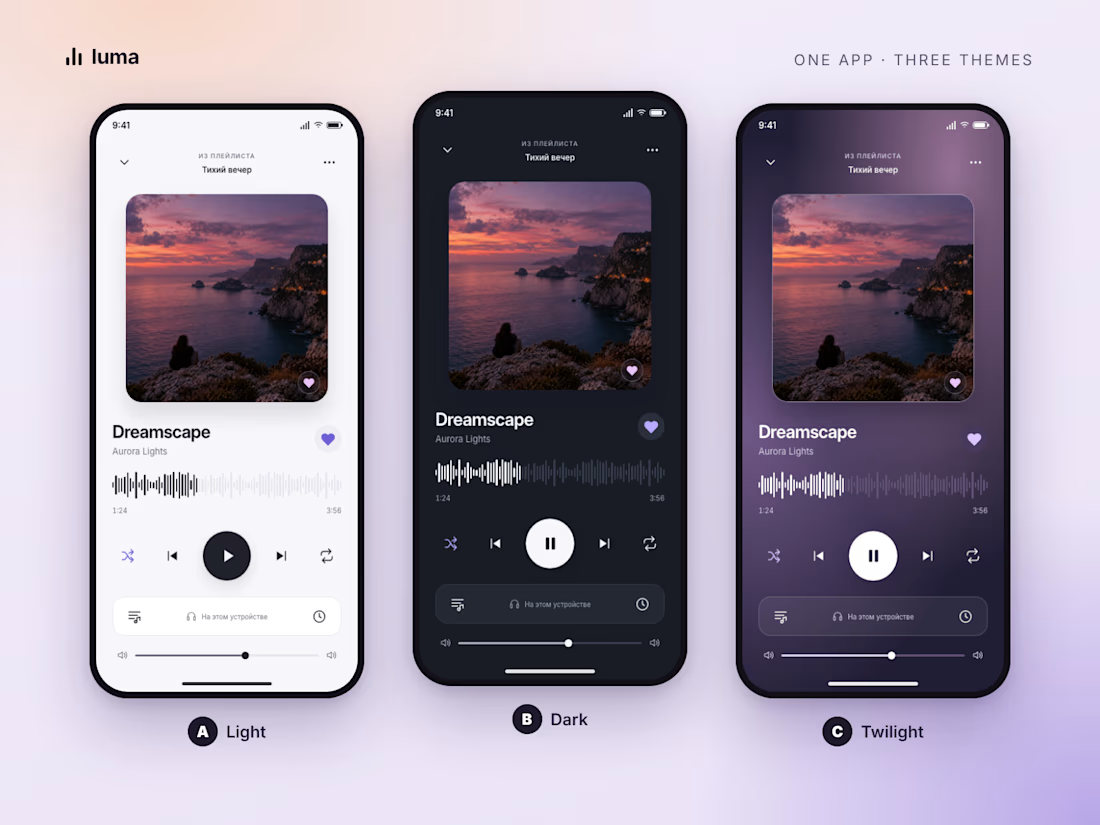
One music app, three moods.
Luma has three themes: Light for the day, Dark for the night, and Twilight — where the cover colors flow into the whole screen.
Light and Dark are easy. Twilight is the tricky one: the background comes from each cover, so a bright cover can make white text unreadable.
My plan: take the main color from the artwork and darken it until the text stays readable. Every track gets its own look.
Which one would you open at 11 pm?
The network for creativity
Join 1.25M professional creatives like you
Connect with clients, get discovered, and run your business 100% commission-free
Creatives on Contra have earned over $150M and we are just getting started



Related posts

Photographer Portfolio Website
"Capturing light, emotion, and the moments you never want to forget." That line set the tone, and the layout follows it.
The hero is one motion-blurred portrait washed in red. The photographer's name runs across the bottom in a condensed white face, so large the screen cuts it off. The photo keeps its soft focus, and the name still reads first.
Thin grid lines split the page into narrow columns, and the small copy sits justified inside them. The loose photo gets a strict structure to lean on.
A single round red button with an arrow sits right on the letters and marks where to go next.
Designed by the Hue & Machine team.
#WebDesign #Photography #PortfolioWebsite #EditorialDesign #Typography #UIDesign #ProductDesign #CreativeDirection #ResponsiveDesign #FigmaDesign


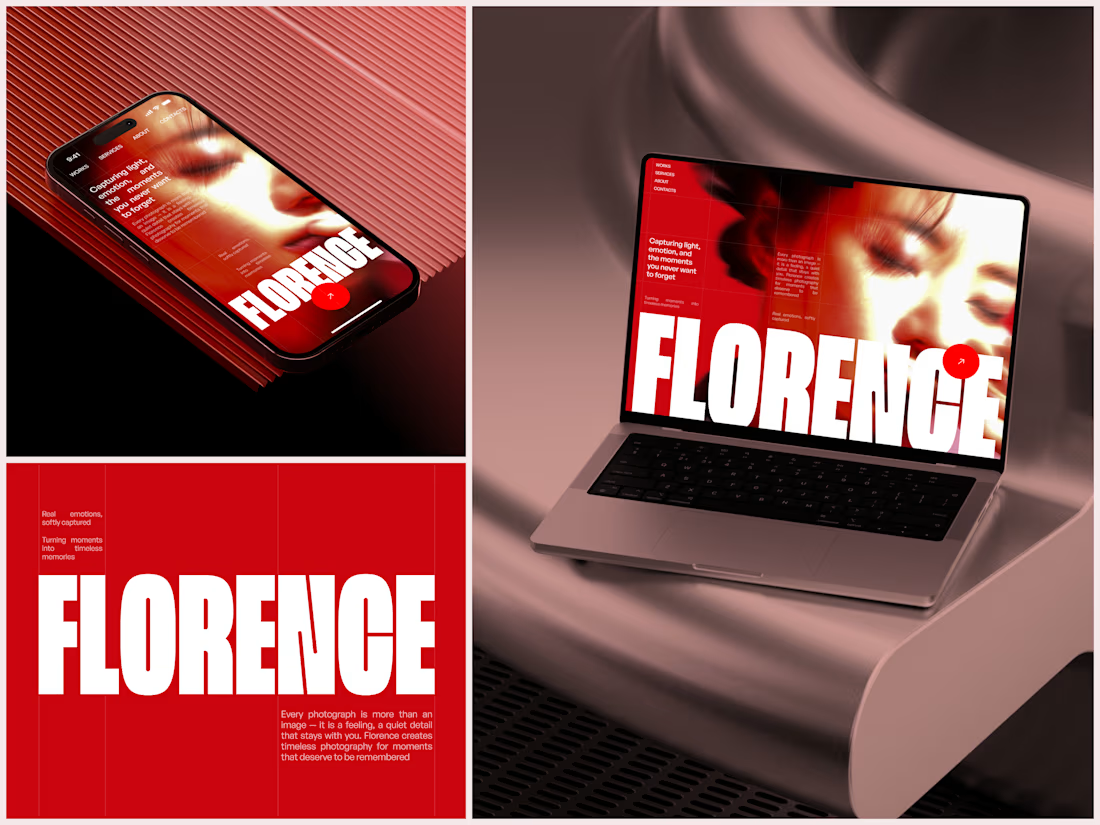

The heavy condensed white FLORENCE over the red portrait is bold, and keeping the same red across phone, laptop and type tile makes the case study read as one system. Did the red come from the photographer's own work, or was it your call?

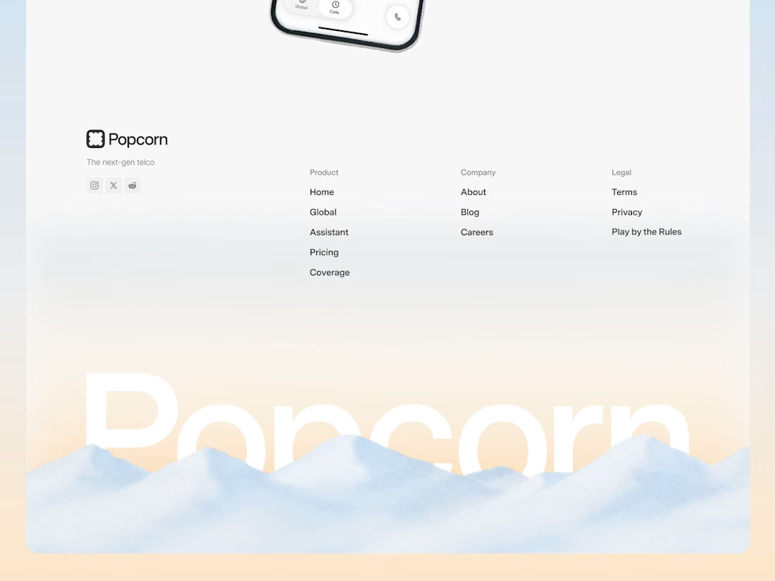


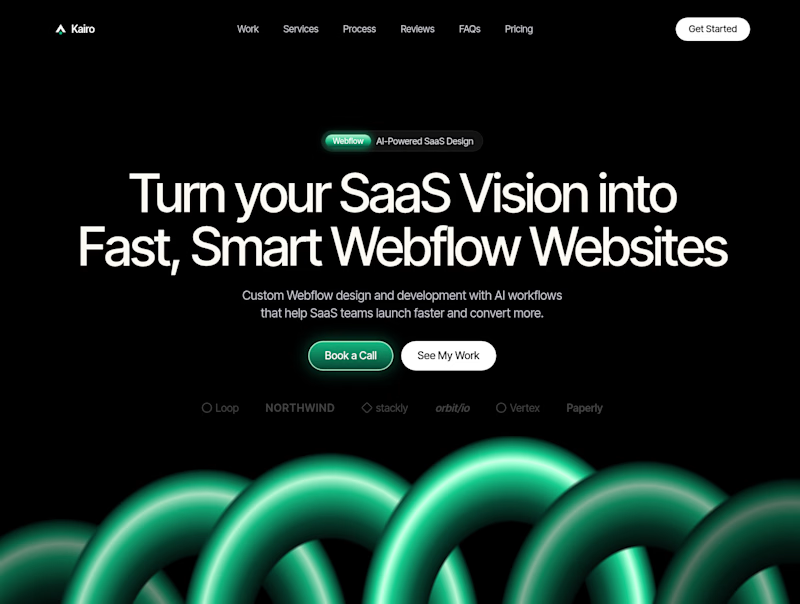
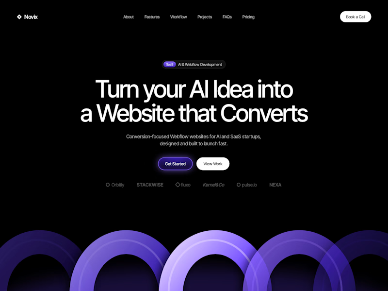

Both look great, but Violet & Black gets my vote! The purple accents give it a more modern, premium feel while keeping the design clean and focused on conversions. Amazing how a color change can create such a different brand personality. Have you tested which version performs better with visitors?