The network for creativity
Join 1.25M professional creatives like you
Connect with clients, get discovered, and run your business 100% commission-free
Creatives on Contra have earned over $150M and we are just getting started
Back to feedPost

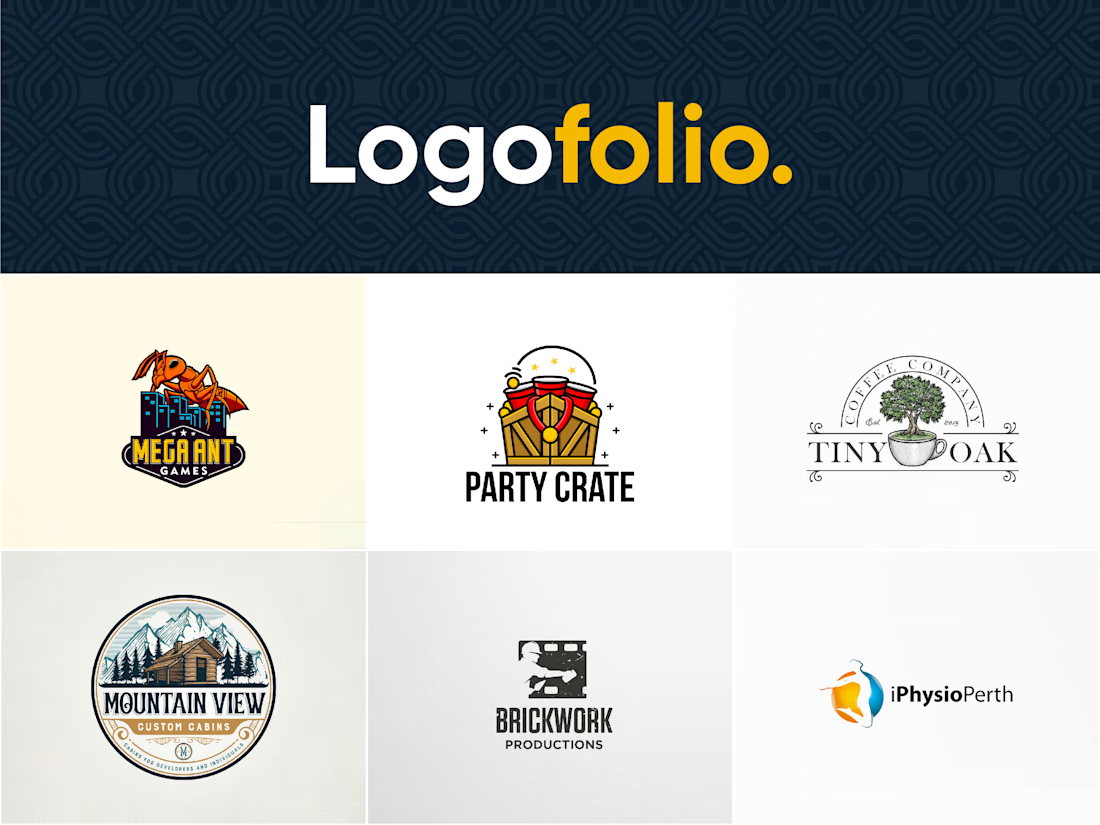
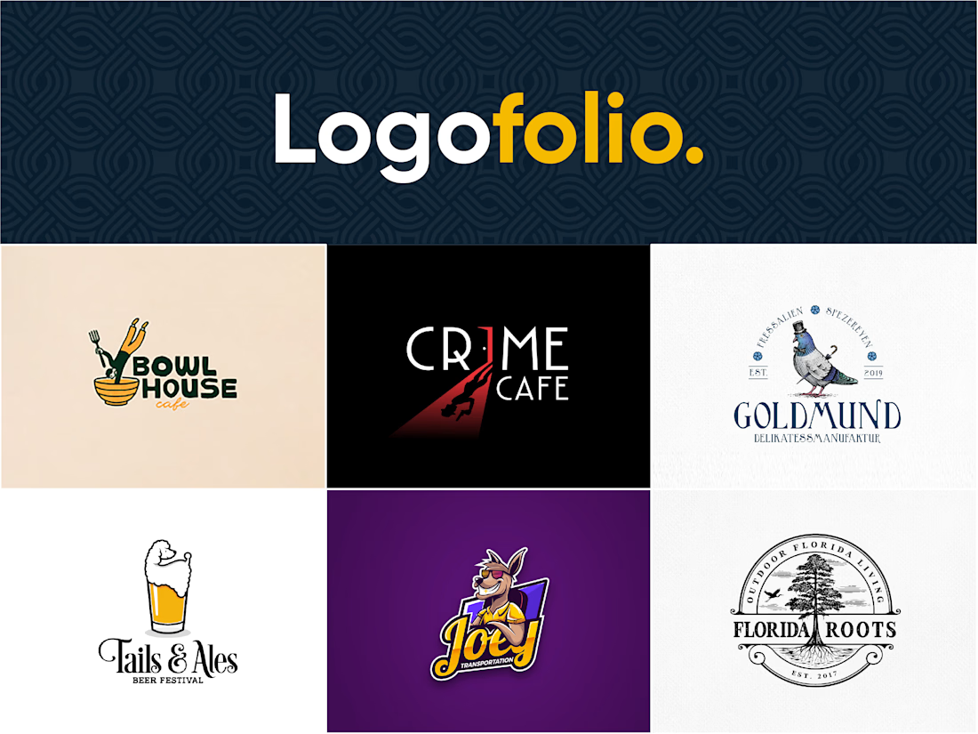
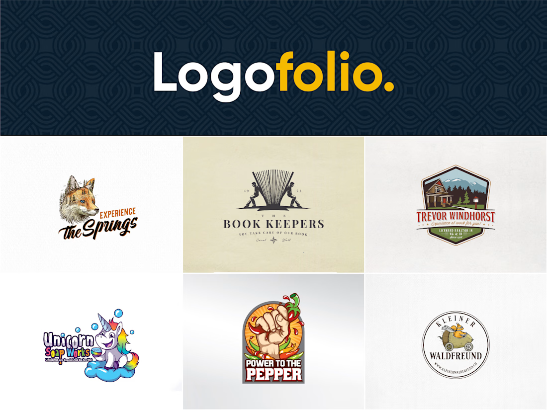
😊 I have designed some top notch Mascot style logos in the past so I'd like to hear from Contra design community, which one from these do you think is the best to share with any client?
Let me know. 😊


The network for creativity
Join 1.25M professional creatives like you
Connect with clients, get discovered, and run your business 100% commission-free
Creatives on Contra have earned over $150M and we are just getting started







Related posts

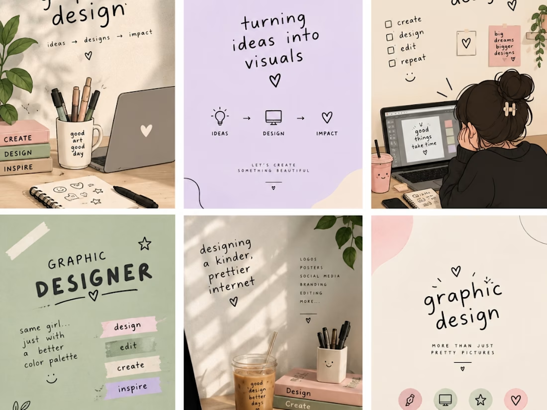
I am a creative graphic designer passionate about turning ideas into eye-catching designs. I create unique and professional designs, including logos, social media posts, business cards, posters, banners, and branding materials. My goal is to bring your vision to life through creativity, quality, and attention to detail. I believe every design tells a story, and I am here to make your brand stand out with beautiful and meaningful visuals. ✨🎨
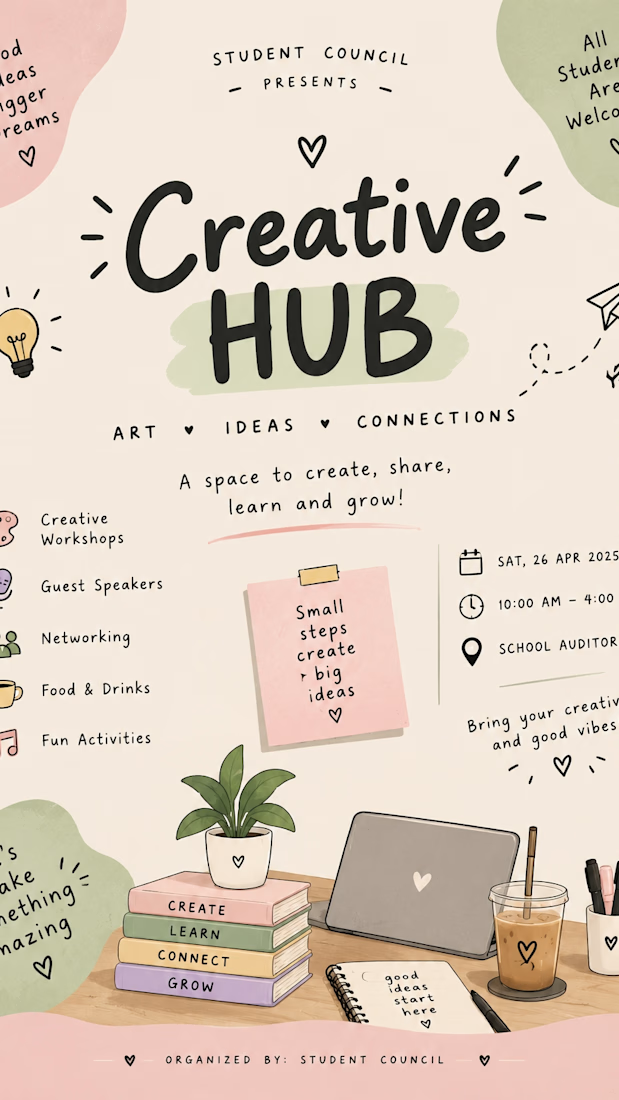

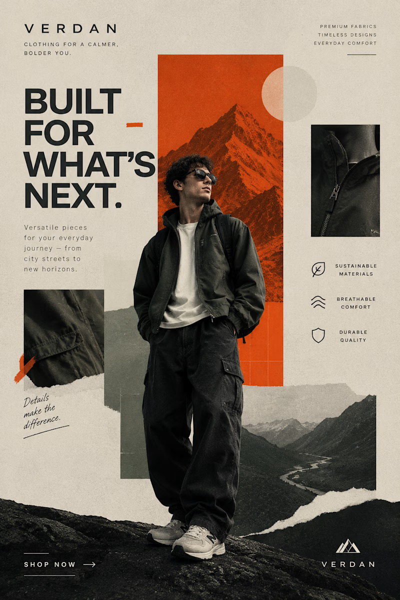
Two Brands. Two Completely Different Creative Directions. 🎨
A brand’s visual identity can change everything about how its products are perceived.
✨ Option A: Cinematic Minimalism — elegant, refined, and luxurious.
🔥 Option B: Modern Editorial Collage — bold, expressive, and adventurous.
Both styles tell a different story, but which one captures your attention?
Vote A or B in the poll and tell me what makes your choice stand out!
Need eye-catching advertisement designs for your brand, product, or social media campaign? I create custom ad creatives tailored to your brand’s identity, audience, and goals.
Have a project in mind? Explore my services on Contra and let's bring your ideas to life.
1 voted
14%

6 voted
86%
7 votes
Closed


This is so true! Even in 3D product animation, I always start with rough sketches on paper before jumping into Blender.
It saves hours of rework and the ideas flow more human. AI can't replace that feeling.
Great process Filip!

Is sketching part of your creative workflow or we've forgotten what it feels to be human?
Depending on the projec's scope, I normally like to explore my ideas on paper before I come up with the best solution.
And no, they're not perfect.
They are rough and messy, my goal is so...

Same thing happens in sales copy. A rough outline on paper catches the weak argument before I waste time polishing it.