The network for creativity
Join 1.25M professional creatives like you
Connect with clients, get discovered, and run your business 100% commission-free
Creatives on Contra have earned over $150M and we are just getting started
Back to feedPost

I’m excited to kick off a 3-part case study series for The Purest Solutions, starting with the core social media ad design. For this first visual, I focused on high-impact branding and visual psychology.

The network for creativity
Join 1.25M professional creatives like you
Connect with clients, get discovered, and run your business 100% commission-free
Creatives on Contra have earned over $150M and we are just getting started



Related posts


Great!!

Login page idea design
A playful visual concept where the character literally “arms” himself depending on the strength of the password.
As the user creates a stronger password, the character progressively equips himself with more powerful protection and armor. The stronger the password, the better prepared and more protected he becomes.
The idea turns password security into a simple and engaging visual metaphor , instead of showing abstract security levels, the user can immediately see how their password makes the character stronger and safer.


Very cool, Anna!

Two dark-mode hero designs, one bold look. 🌌
Color palette: Midnight navy, electric blue, cobalt, cyan/aqua glow and clean white.
Which one is your favorite? 👇

1 voted
50%
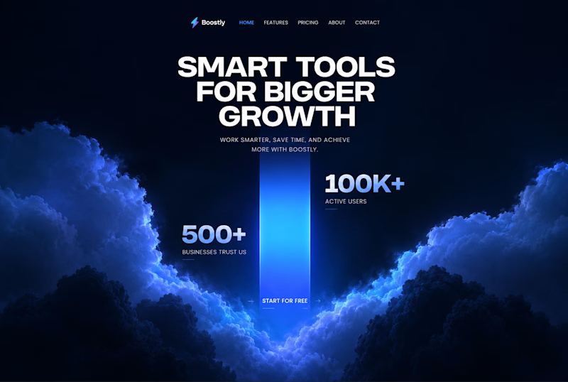
1 voted
50%
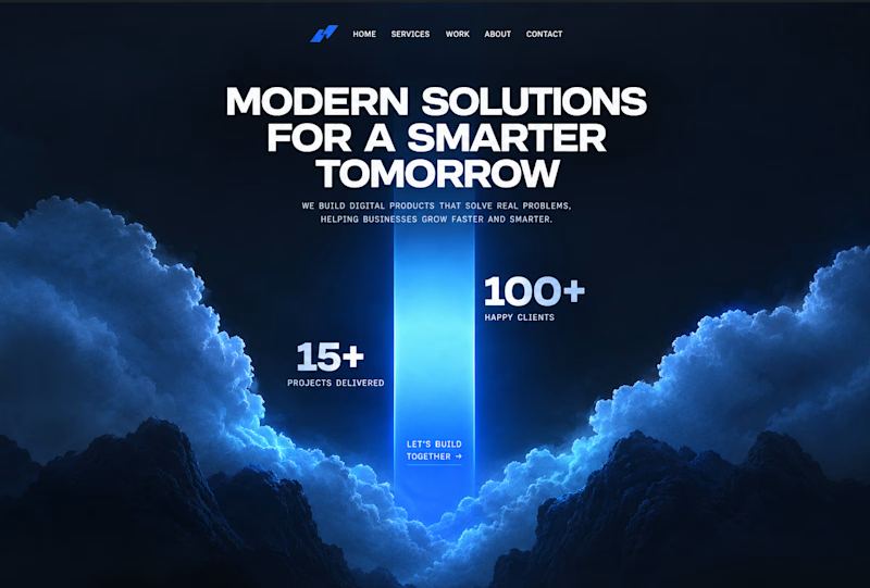
2 votes
Closed

Boostly for me, the cyan glow on navy feels calm but still techy. Did you build these straight in Webflow after Figma, or try Claude Code for the glow effects?