The network for creativity
Join 1.25M professional creatives like you
Connect with clients, get discovered, and run your business 100% commission-free
Creatives on Contra have earned over $150M and we are just getting started
Back to feedPost

Ai gave me a purple gradient, a 👋, and a "Quick Actions" grid. Looks fine. Looks like every other app, too. Even the stats were made up ("18 kg CO₂ saved 🌱", sure, buddy).
My version looks plainer on purpose, because I kept catching things AI never would:
→ My nav and my home screen had the same 4 options. Looked complete, but made people choose twice.
→ A pre-filled "current location" sounds helpful until you remember nobody gave the app permission yet.
→ The "bus is late" screen. That's the moment someone is standing outside and stressed, so it matters more than the pretty one.
AI helped me a lot on this project. But it doesn't ride the bus, and it doesn't notice when a screen says "Welcome back to to Route Clear." That part is the job.
Swipe to see both versions 👉 Which one would you trust with your commute?
#UXDesign #ProductDesign #HumanCenteredDesign

The network for creativity
Join 1.25M professional creatives like you
Connect with clients, get discovered, and run your business 100% commission-free
Creatives on Contra have earned over $150M and we are just getting started
Related posts


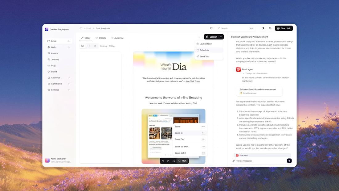


Awesome dude


A fresh digital identity, a premium workspace designed for creative professionals.
From an elegant, editorial-style website to a functional mobile app for bookings and studio management, the goal was to make every interaction feel as refined as the space itself.
Clean layouts, timeless typography and a deep green palette bring the whole experience together.


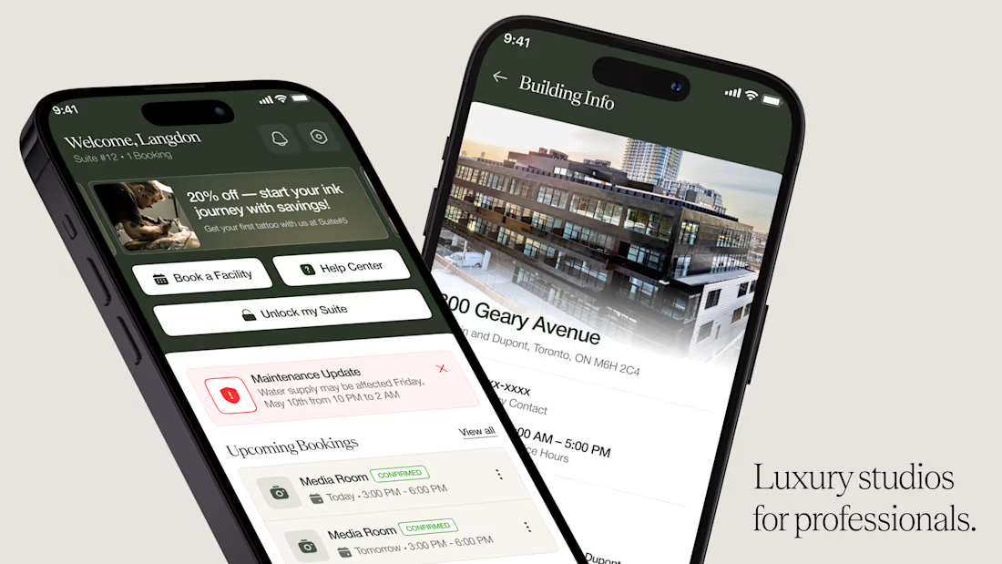
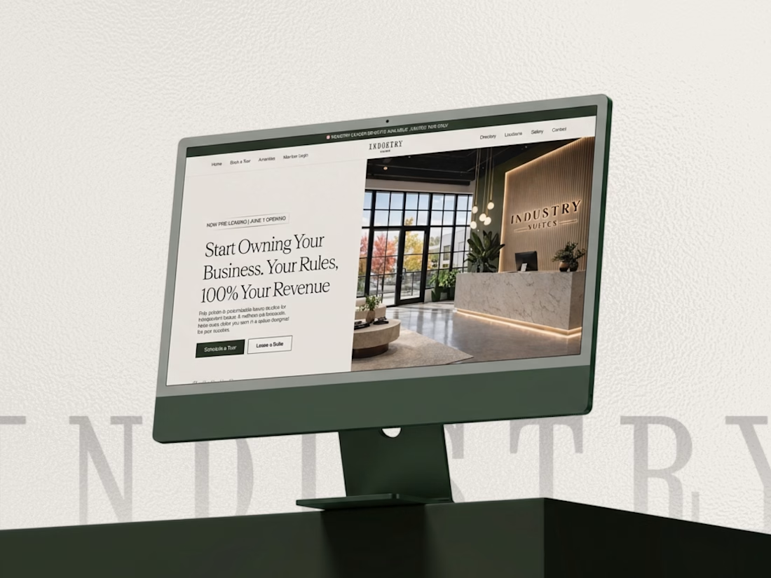

This looks super premium Kabir! Love how you carried the same refined, editorial feel from the website to the mobile app. The clean layouts and booking flow feel exactly like a high-end creative studio should - elegant but functional. The desktop + mobile mockups show the consistency really well. Great execution!

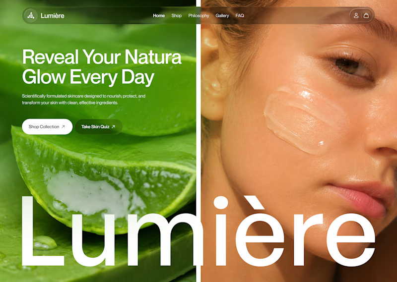
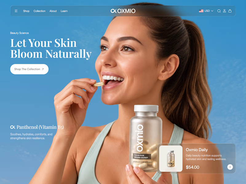
Your design has 3 seconds to earn attention. Which skincare brand wins?
A leads with confidence, energy, and aspiration. B builds trust through nature, freshness, and simplicity.
Great design doesn’t just look good. It makes people feel the brand before they read a word.
A or B? Which would make you stop scrolling?


30 voted
52%
28 voted
48%
58 votes
Closed


B without questions