The network for creativity
Join 1.25M professional creatives like you
Connect with clients, get discovered, and run your business 100% commission-free
Creatives on Contra have earned over $150M and we are just getting started
Back to feedPost
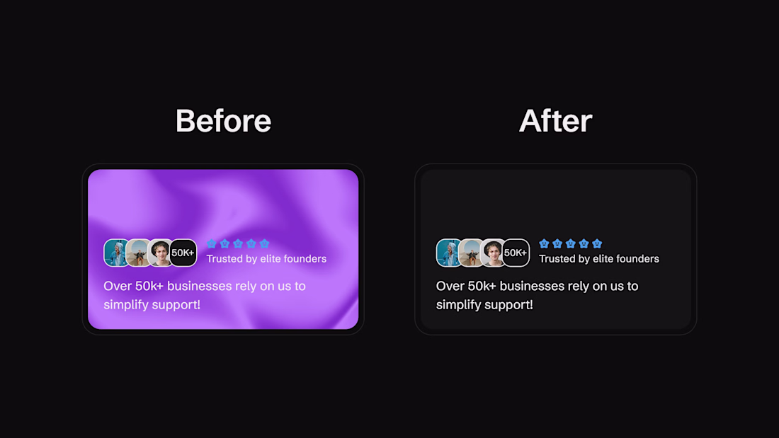
Improved contrast!
One of the things I recently refined on my Custiq template was removing that beautiful purple shader and replacing it with a simple dark gray background.
Design should be clear before it’s beautiful.
The network for creativity
Join 1.25M professional creatives like you
Connect with clients, get discovered, and run your business 100% commission-free
Creatives on Contra have earned over $150M and we are just getting started
Related posts
Footer design built in Framer. Framer shaders are genuinely so much fun to work with.
Nice work!
Amazing!
A Framer portfolio template in progress. CTA section featuring three tickers that collapse into a single pill button on scroll.
Great work
Trending
Claude
Claude has entered the design space. How are you using Claude Design?
Contra University
Learn from expert creatives how to earn more using next-gen AI tools.
creativeaiflow
Creative AI workflows are evolving. What tools do you use, and what are their strengths and weaknesses?
portfolioreview
The best portfolios tell a story, not just show a grid. Share yours for feedback.
freelancerlife
Freelancer life is wins, pivots, and everything in between. What’s yours right now?