The network for creativity
Join 1.25M professional creatives like you
Connect with clients, get discovered, and run your business 100% commission-free
Creatives on Contra have earned over $150M and we are just getting started
Back to feedPost
Taste Test


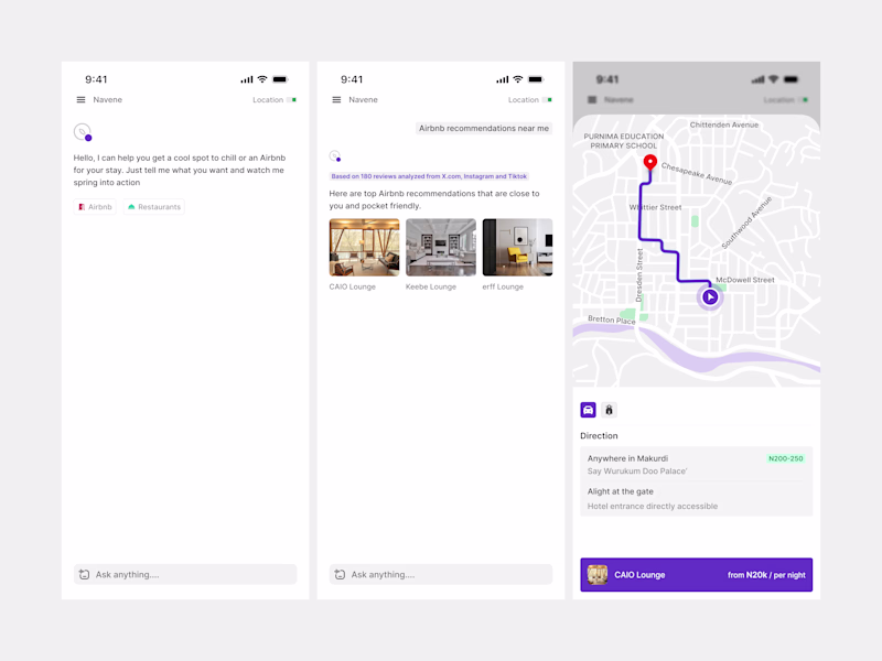
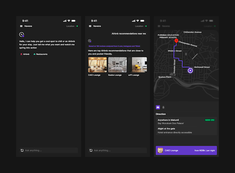

Dark Mode wins for this one! The map interface really pops against the dark background and the neon green route line is dramatically more readable. For a travel/location app, dark mode also reduces eye strain during navigation at night. The contrast hierarchy is just stronger in dark mode here!

Hmm, quite insightful. Thank you🔥

Thank you💯

light mode
Noted💯

Not the biggest dark mode fan but I think it wins the round this time.
The network for creativity
Join 1.25M professional creatives like you
Connect with clients, get discovered, and run your business 100% commission-free
Creatives on Contra have earned over $150M and we are just getting started
Related posts


It seems you copy my brand color 😂

Can you believe I made this in seconds in Figma Make? 👀
Okay… not the final design. But the concept? Yes.
I’m currently building a digital product, and this is how I explore ideas before committing to the actual design.
♥️ 𝐖𝐡𝐚𝐭 𝐅𝐢𝐠𝐦𝐚 𝐌𝐚𝐤𝐞 𝐈𝐬 𝐁𝐞𝐬𝐭 𝐅𝐨𝐫
1️⃣ Early-stage concept testing
2️⃣ Generating multiple directions quickly
♥️ 𝐖𝐡𝐞𝐫𝐞 𝐈𝐭 𝐒𝐚𝐯𝐞𝐬 𝐓𝐢𝐦𝐞
1️⃣ Creating fast variations before committing
2️⃣ Speeding up directions exploration
𝑯𝒆𝒓𝒆’𝒔 𝒎𝒚 𝒕𝒂𝒌𝒆 👇
🟡 Figma Make isn’t replacing design thinking. It’s helping me move faster in the messy early stage.
🟡 Instead of starting from a blank canvas, I can test structure, layout, and direction quickly — then refine everything intentionally inside Figma.
🟡 Exploration first. Design decisions second. ✨
Would you try this workflow?


Trending
maxearnings
The next frontier of payments is live on Contra. How are you maximizing revenue?
freelancerlife
Freelancer life is wins, pivots, and everything in between. What’s yours right now?
aidesignflow
AI tools are redefining how designer work. What does your workflow look like?
micrographics
Micrographics started as utility - barcodes, packaging, instruction labels. How would you use them?
aivideo
AI video tools are moving at warp speed. What tools are you using?