The network for creativity
Join 1.25M professional creatives like you
Connect with clients, get discovered, and run your business 100% commission-free
Creatives on Contra have earned over $150M and we are just getting started
Back to feedPost


Kicking off the week by sharing one of my favorite brand identity projects for Maya, a startup I used to work with.
They had a strong product vision but a fragmented brand, so my goal was to build an identity that felt clear, confident, and ready for growth — from story to visuals.
I focused on:
– Turning the mission and positioning into a simple, memorable narrative
– Designing a scalable visual system (logo, colors, typography)
– Extending the brand into product UI, website, and marketing touchpoints
Seeing a cohesive identity make it easier to pitch, market, and communicate with users and investors was the best part.
The network for creativity
Join 1.25M professional creatives like you
Connect with clients, get discovered, and run your business 100% commission-free
Creatives on Contra have earned over $150M and we are just getting started











Related posts


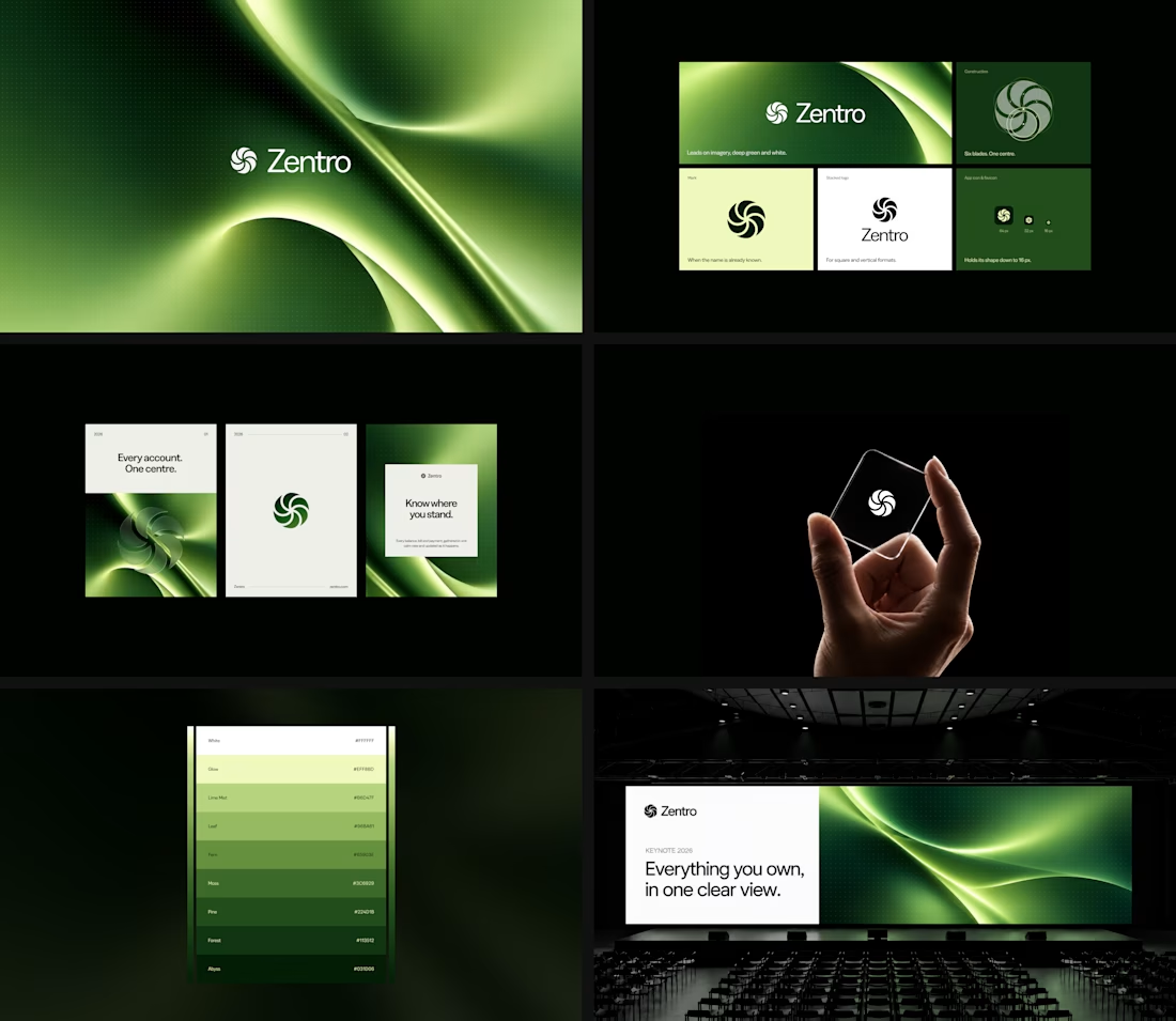

Clean and confident work! The green gradient with the mark feels very modern for fintech - trustworthy but not boring. The app screens look really polished. Curious how you landed on this mark, does it represent growth / movement?

Most early-stage brands play it safe and disappear after a while. For Drylendar, I did the opposite.
3 weeks from brief to full identity: logo, illustration system, app visuals, collectible cards and even merch.
AI makes things cheaper. Personality makes brands memorable.
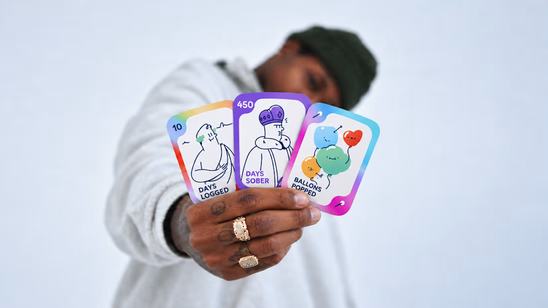
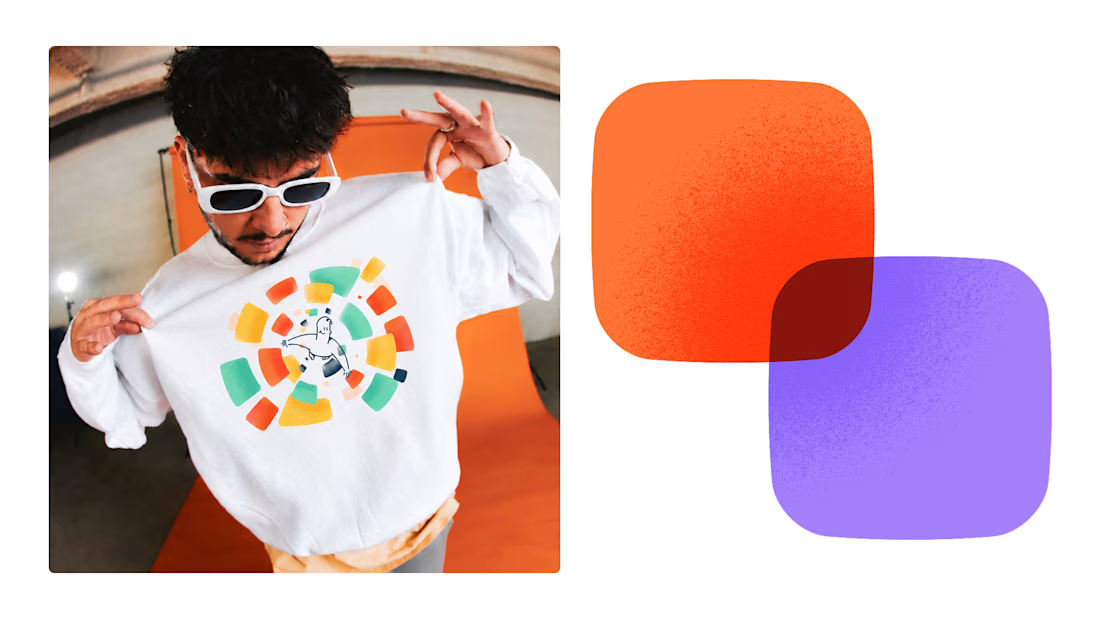
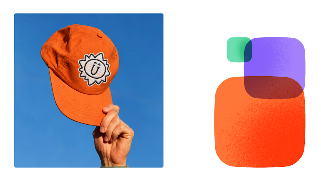
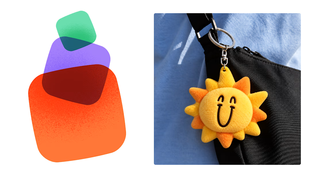

This is exactly what branding should be! 🔥 3 weeks for full identity, merch, cards - you really built personality, not just a logo. Love the Drylendar vibe. AI makes it cheap, but this makes it memorable - so true!

An existing brand identity showcased across a new campaign. This was one of my favourite projects ever!
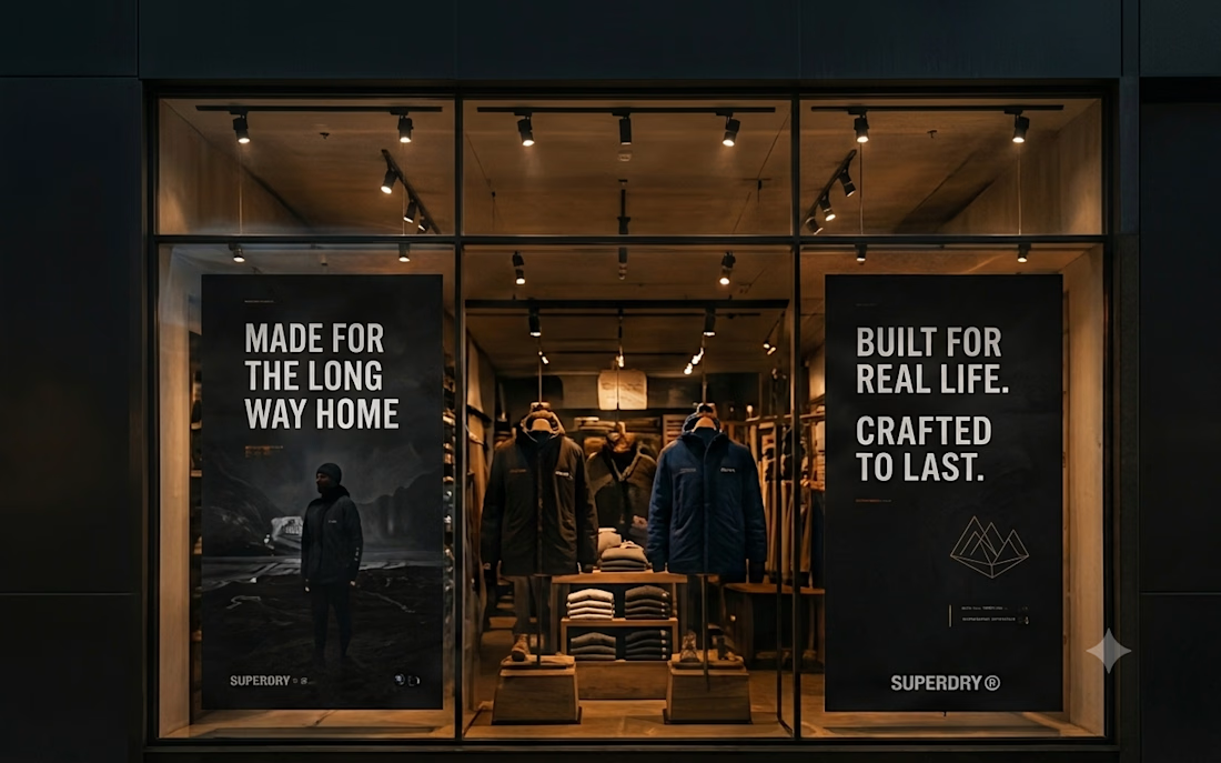
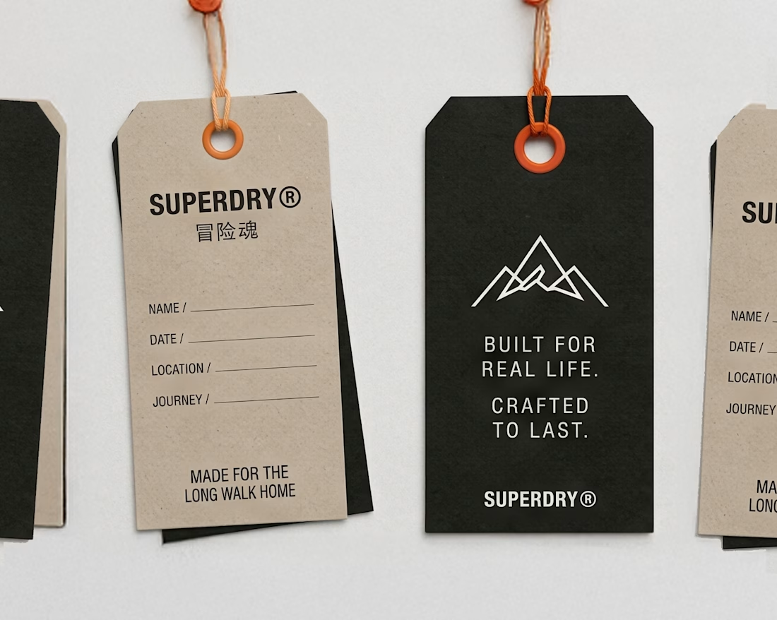
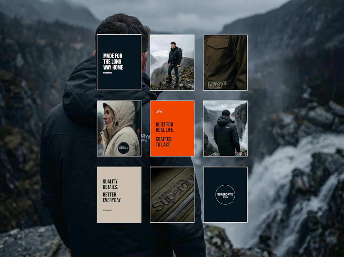
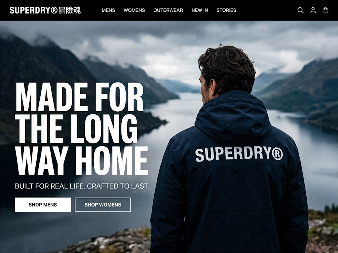

Taking an existing identity and stretching it across a whole new campaign is such a good test of a system. This looks like one of those projects where everything just clicked.