The network for creativity
Join 1.25M professional creatives like you
Connect with clients, get discovered, and run your business 100% commission-free
Creatives on Contra have earned over $150M and we are just getting started
Back to feedPost


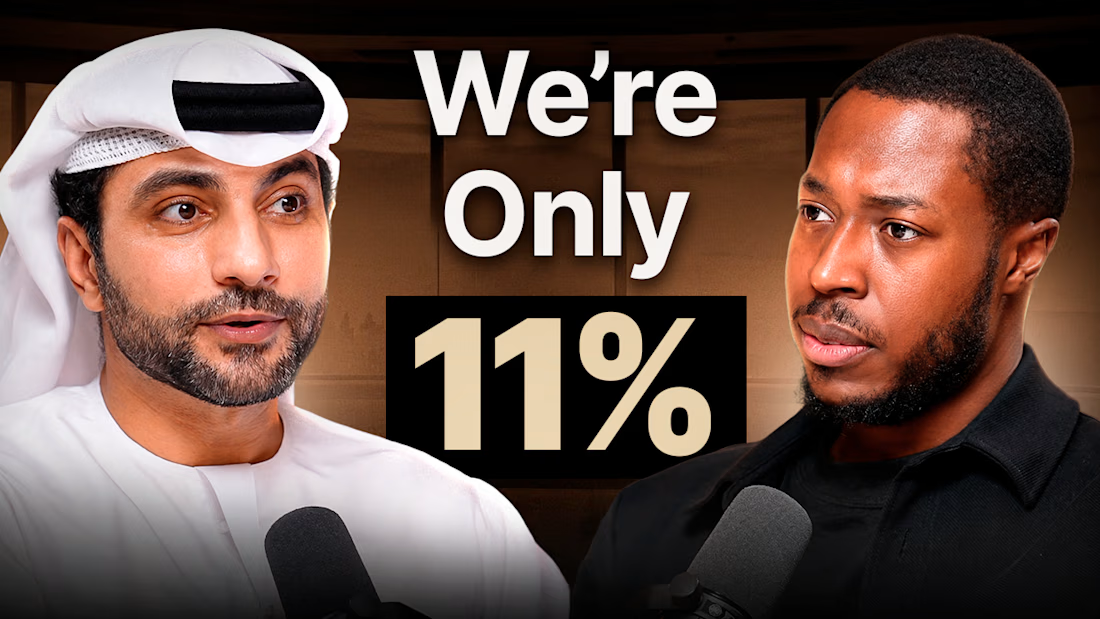
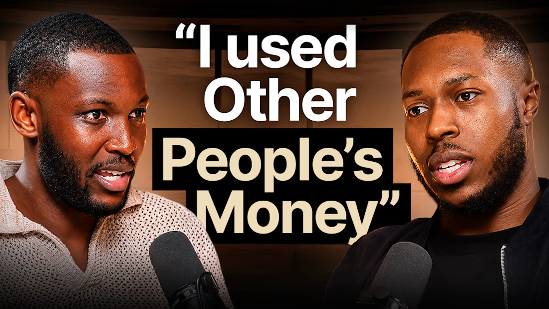
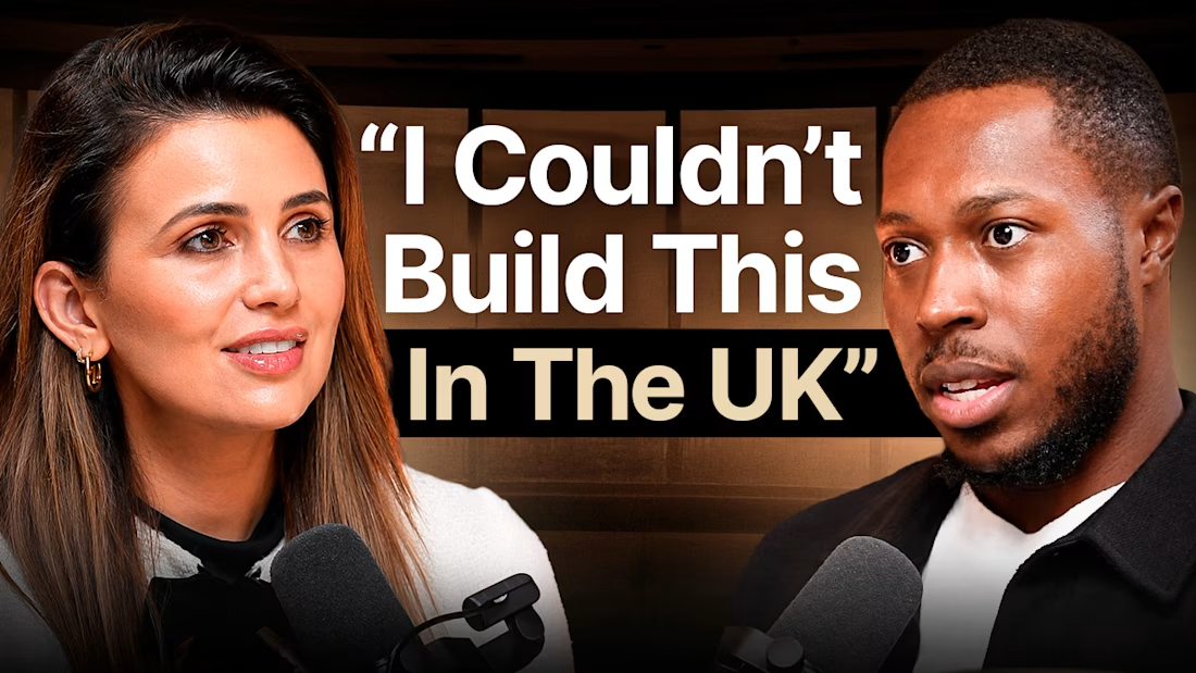
A few thumbnails I designed for The Gulf Standard Time Podcast 🎙️
Focused on strong expressions, clear storytelling, and bold typography to make every episode stand out.
#ThumbnailDesign #PodcastDesign #YouTubeThumbnails


The network for creativity
Join 1.25M professional creatives like you
Connect with clients, get discovered, and run your business 100% commission-free
Creatives on Contra have earned over $150M and we are just getting started





Related posts

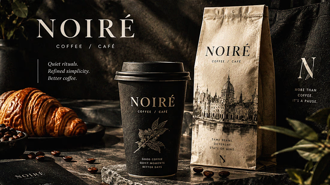
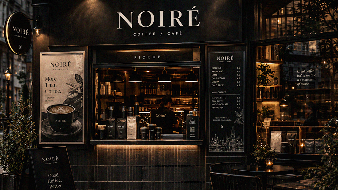
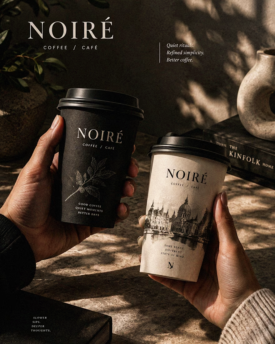
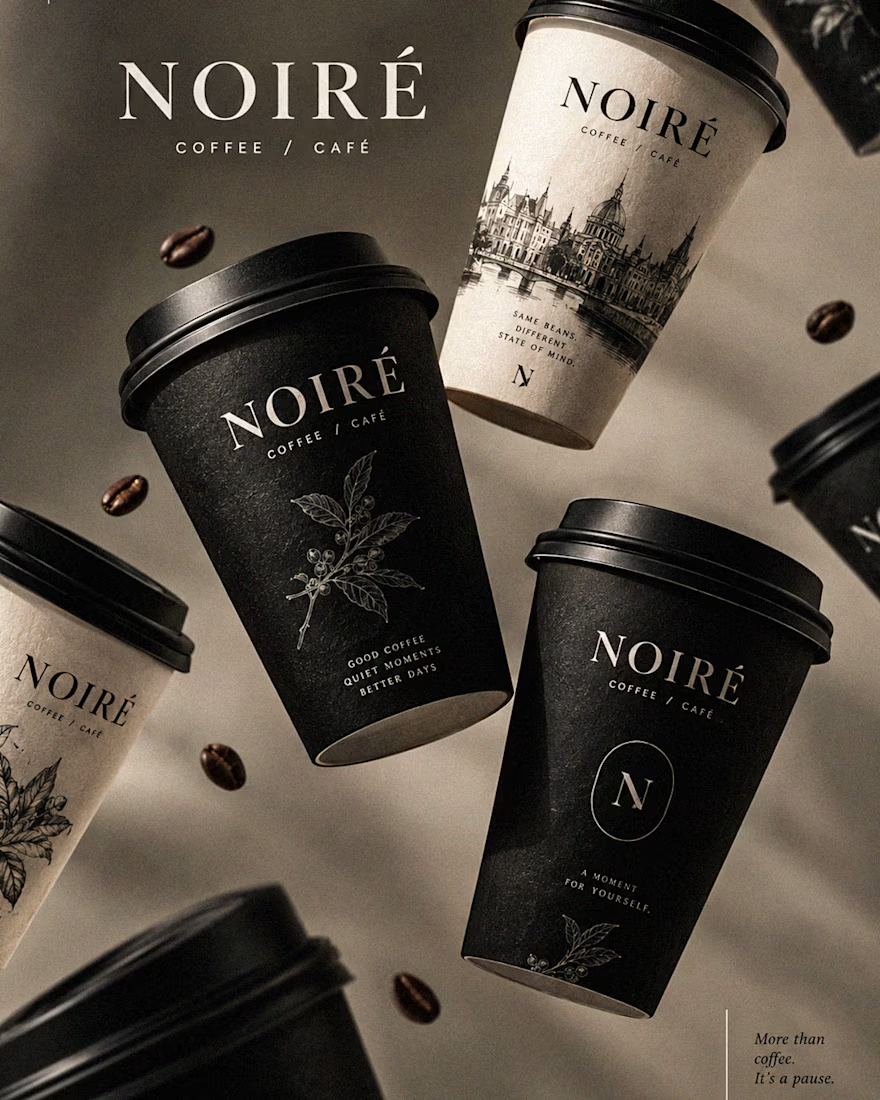
I Just Created NOIRÉ 🔥
A Coffee Brand Built Around the Pause.
NOIRÉ is a premium café brand built around a simple idea:
Great coffee should feel like a moment of pause, not another part of the
routine.
The project explores a complete visual identity, packaging
system, takeaway cups, coffee bags, tote bags, menu design, café applications and lifestyle campaign direction.
Instead of relying on the usual loud coffee aesthetics, I
built NOIRÉ around deep charcoal, warm ivory, soft graphite, refined
typography, subtle botanical illustrations and quiet editorial compositions.
The visual language is intentionally dark, tactile, and understated - giving every touchpoint the feeling of a slow morning, a quiet table, and coffee worth taking your time with.
From the cup in your hand to the café around you, every detail was designed to make the brand feel like a ritual.
Waiting for your thoughts in the comments 🙌🔥
branddesignertastetestBrand DesignGraphic DesignPackaging DesignAdobe IllustratorAdobe InDesignAdobe Photoshop




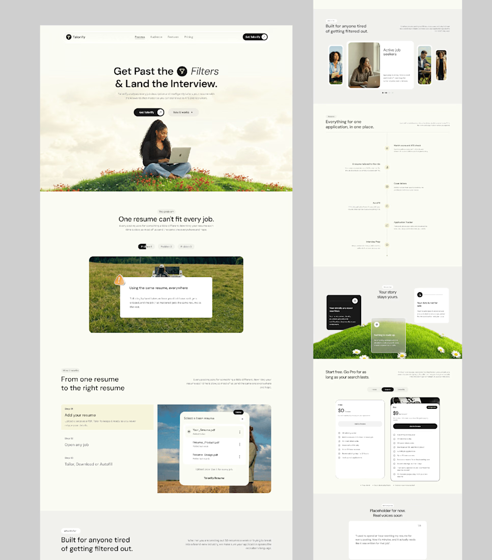
Talorify requested a high-converting landing page. Guess what?
Delivered the full design and development.
A high-converting landing page has one primary job, And this one is basically saying:
“Please get me from the store.” 🔥
Don’t overload your landing page with buttons that confuse your users. Give them one clear direction and make it easy to take action.
Check it out and tell me:
Would you call this design premium?
Hi, I’m Emmanuel Bliss, Product Designer (UI/UX).I bring clarity to what already exists and what is yet to exist.
Checkout the Live HERE


Definitely premium. Did they measure if this new design actually brought in more sign-ups and conversions compared to before?

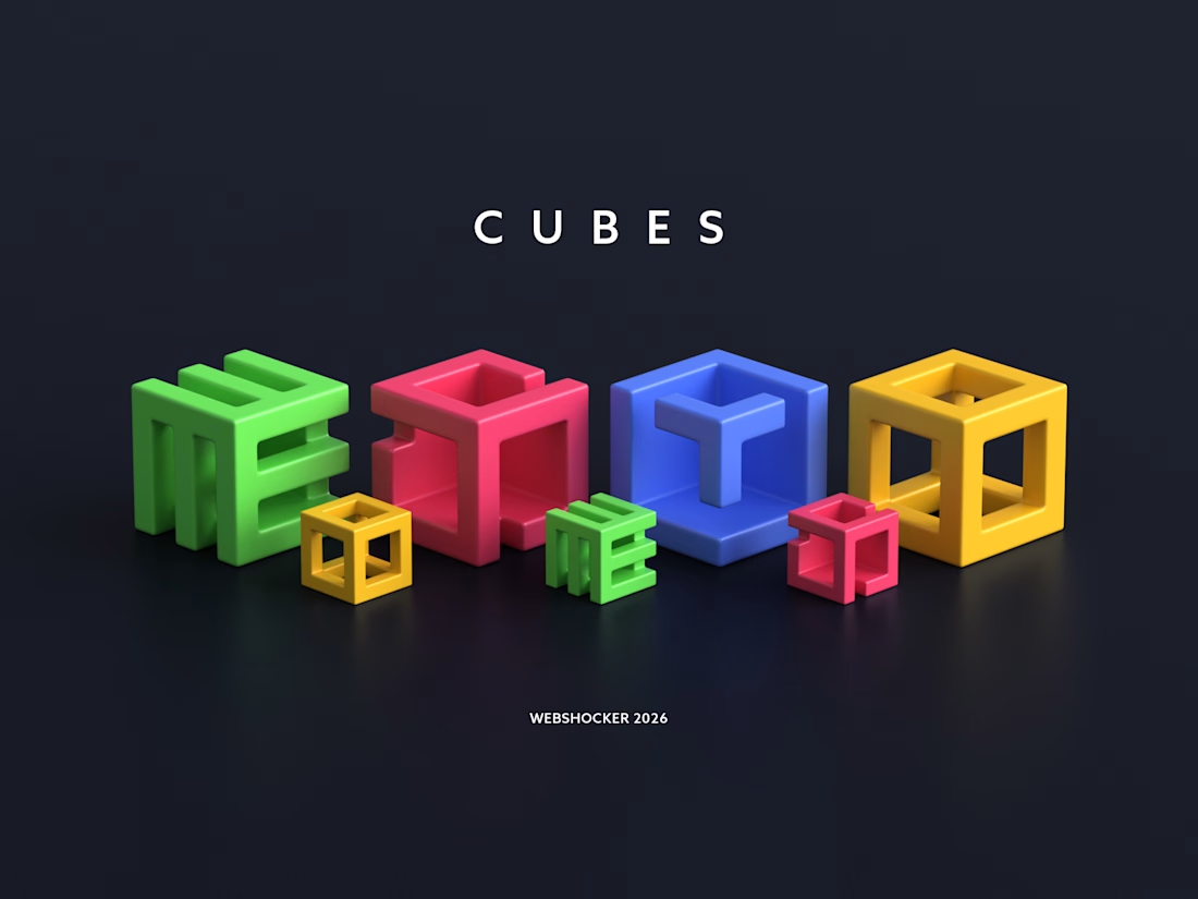
Created this custom 3D icon set for 3D Walkabout.
The icons are built around a cube-based system, with subtle variations to clearly represent different services while keeping a cohesive brand identity.