The network for creativity
Join 1.25M professional creatives like you
Connect with clients, get discovered, and run your business 100% commission-free
Creatives on Contra have earned over $150M and we are just getting started
Back to feedPost

Atelier North
Creative Portfolio · Independent Concept Project
Atelier North is an independent portfolio concept designed for a creative professional who needs their website to communicate both the quality of their work and the character behind it.
The experience treats the portfolio itself as part of the creative identity, combining editorial presentation with a focused and responsive browsing experience.
The Approach
The design was built around three priorities:
Visual Identity
Create a distinctive digital environment that feels considered from the first interaction rather than relying on a conventional portfolio template.
Work Presentation
Give selected projects enough space and hierarchy to communicate their visual quality without overwhelming the visitor.
Focused Navigation
Keep the experience simple and intuitive so visitors can move naturally between the introduction, selected work, and supporting information.
My Role
I handled the visual direction, website design, responsive interface design, interaction design, and front-end development.
What I Built
Responsive portfolio structure
Custom visual direction
Project presentation system
Responsive desktop and mobile layouts
Interactive navigation
Motion and micro-interactions
Front-end implementation
Result
The finished concept positions the portfolio as more than a collection of projects: it becomes part of the creative identity itself, giving the work a structured, distinctive, and immersive digital presentation.
Live project → https://atelier-north-portfolio-concept.netlify.app/


The network for creativity
Join 1.25M professional creatives like you
Connect with clients, get discovered, and run your business 100% commission-free
Creatives on Contra have earned over $150M and we are just getting started



Related posts

What if sending money felt a little more like giving a gift?
For Nova, I explored a banking app that brings payments, cards, and a bit of personality together. You can check your balance, browse recent transactions, send or request money, top up, and pay bills.
My favorite part is the digital postcard feature. Before sending a transfer, you can add a little illustrated card—a heart, a birthday greeting, or a playful character. A simple way to make birthday money or a thank-you feel more personal.
I carried that same 3D character into onboarding, pairing it with bold red gradients and large, clear payment details. There’s room for play, while the recipient and amount stay easy to check.
Would you add a postcard to a transfer? I’d love to know what occasion you’d use it for.






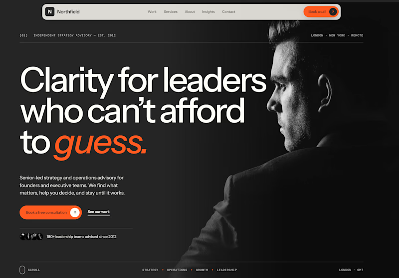
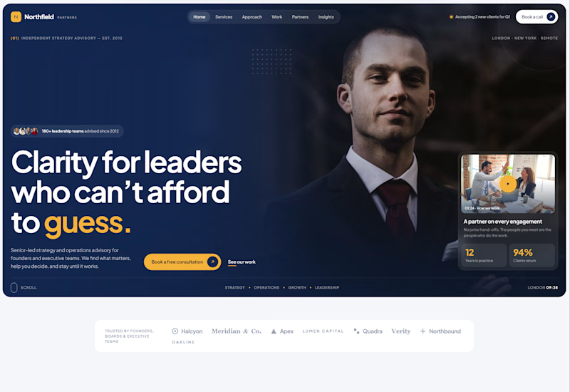
Exploring two different hero directions for a new project.
Same message, two completely different visual approaches.
Which one makes a stronger first impression?
A or B? Curious to hear your thoughts!

36 voted
90%
4 voted
10%
40 votes
Closed

Both are strong. I lean towards the dark version, because the orange accent on the italic "guess." pops and the profile portrait gives it a more editorial, confident feel. The navy one reads a bit more corporate, which could suit a more conservative audience. Nice exploration!

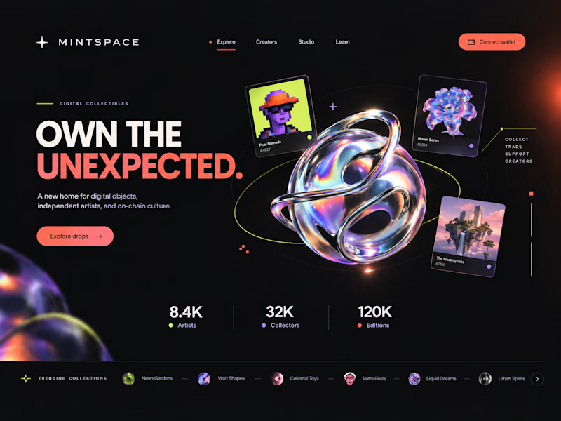
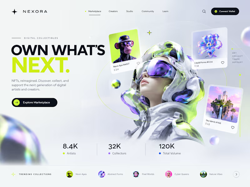
Two directions. One NFT marketplace.
Which visual direction would you choose?
🖤 A — Dark & Futuristic
🤍 B — Bright & Minimal
Both explore the future of Web3, but with completely different visual identities.
Drop your vote in the comments: A or B?
#UIUXDesign #WebDesign #NFT #Web3 #ProductDesign
10 voted
29%
25 voted
71%
35 votes
Closed

Strong design, well done