The network for creativity
Join 1.25M professional creatives like you
Connect with clients, get discovered, and run your business 100% commission-free
Creatives on Contra have earned over $150M and we are just getting started
Back to feedPost

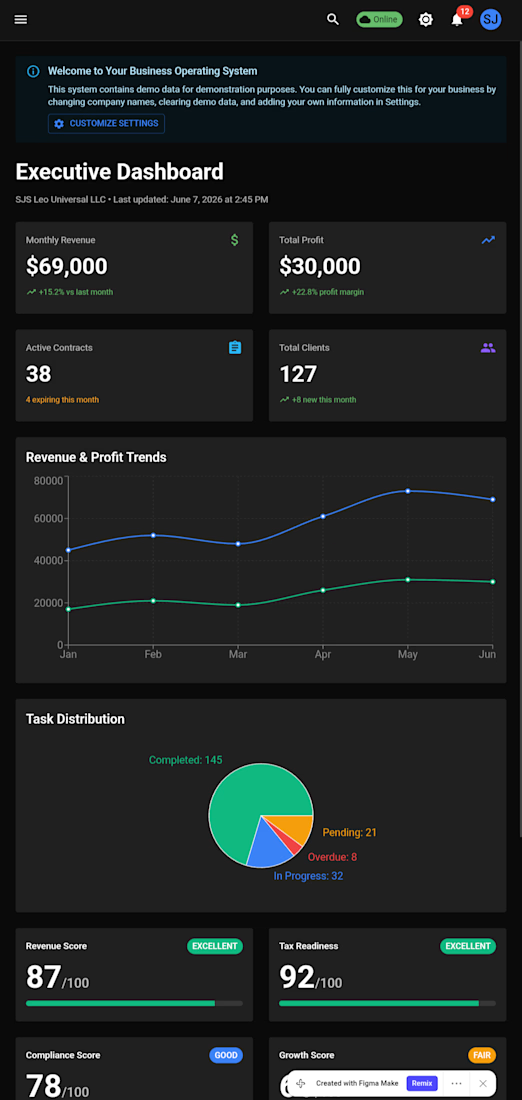
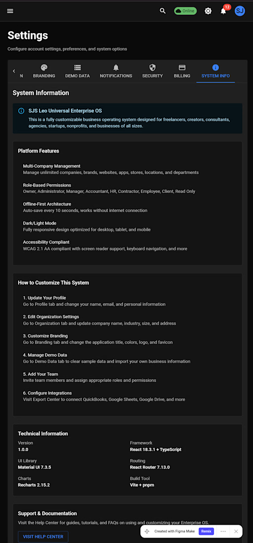
🚀 Officially sharing SJS Leo Universal Enterprise OS.
This project was designed as a centralized operating system concept for businesses, organizations, freelancers, and growing teams who need a better way to manage operations from a single platform.
The goal was simple:
Reduce complexity. Increase visibility. Improve decision-making.
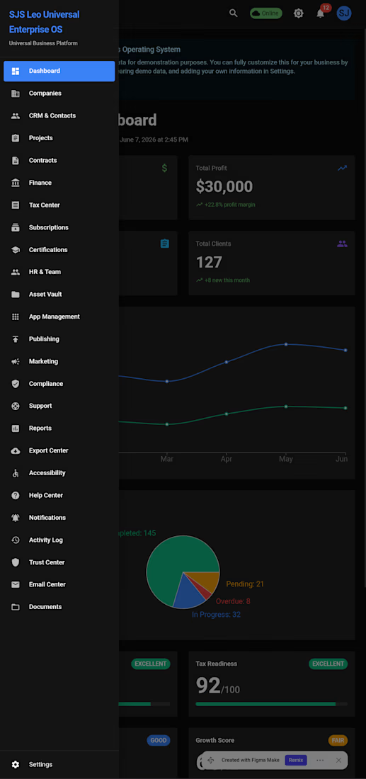
Enterprise OS brings together multiple operational areas into one connected experience, including:
✅ Business Operations Management
✅ Team & Workforce Administration
✅ Contract & Document Tracking
✅ Tax & Compliance Management
✅ Subscription & Service Oversight
✅ Reporting & Analytics Dashboards
✅ Resource Management
✅ Accessibility-First Design Principles
✅ Mobile & Desktop Workflows
What I enjoyed most about this project was thinking beyond individual screens and focusing on how an entire organization functions as a connected ecosystem.
This project was published through Figma Community as part of my ongoing work in enterprise software, accessibility, business systems, and digital product design.
View the project:
SJS Leo Universal Enterprise OS
As I continue building healthcare platforms, accessibility tools, and business software, Enterprise OS remains one of the projects that shaped how I think about scalable systems and user-centered operations.
#EnterpriseOS #BusinessSystems #SaaS #DashboardDesign #Figma #ProductDesign #UXDesign #UIDesign #Accessibility #BusinessOperations #StartupTools #SJSLeoUniversal


The network for creativity
Join 1.25M professional creatives like you
Connect with clients, get discovered, and run your business 100% commission-free
Creatives on Contra have earned over $150M and we are just getting started



Related posts

Building another CRM!!🔥


Love this, most local businesses do not lose clients because of no leads, they lose them because there is no follow up. A clean lead pipeline like this changes everything, once a lead is in the system it never gets forgotten. Really curious to see how you handle follow ups and reminders in this CRM.

Noise Reveal, a premium reveal component for Framer
I built a component that gives Framer sites cinematic reveals for images, video and live layouts. It has a soft, film-like edge with glow and grain, and can play on load, on view, from a variant or scrubbed by scroll.
It’s built for production: the reveal is prepared before it scrolls in, it’s accessible with reduced-motion support, it falls back when WebGL isn’t available, and pages stay plain HTML when nothing is moving.
Launched on the Framer Marketplace. Open to custom Framer and interaction work.


The WebGL fallback and reduced-motion support are the parts most reveal effects skip, so it's great to see them called out. Does the fallback keep some of the grain edge with CSS, or does it drop to a simple fade?


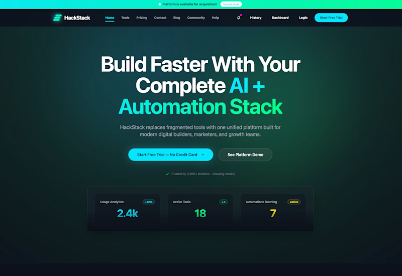
Which homepage would make you more likely to explore the platform?
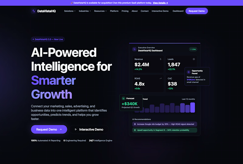
HackStack features bold typography, teal gradients, and a centered layout focused on AI tools and automation. DataVistaHQ uses purple accents, a split layout, and a prominent dashboard preview to introduce its business intelligence platform.
I would like your perspective on the visual design, clarity, and first impression. Which approach communicates its value more effectively and makes you want to take the next step?
Vote for your preferred design and share what influenced your choice: the colors, headline, layout, dashboard preview, or overall presentation.
#WebDesign #AIWebsites #UIUXDesign #SaaSDesign #TransformedDesign


2 voted
17%
10 voted
83%
12 votes
Closed

Visually, I lean toward DataVistaHQ, but the cognitive load is really high. The value proposition and the stats feel like they're competing for attention.
On the other hand, HackStack has a much better visual hierarchy. The value proposition and CTA group immediately give me a...