The network for creativity
Join 1.25M professional creatives like you
Connect with clients, get discovered, and run your business 100% commission-free
Creatives on Contra have earned over $150M and we are just getting started
Back to feedPost
Taste Test

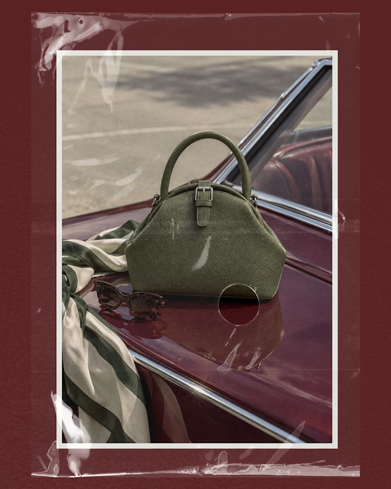
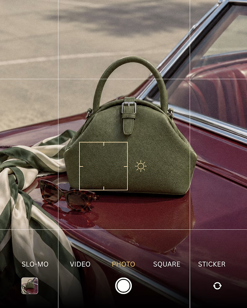
Generated these images for a handbag brand's social media post and then added some texture. Which one do you prefer?
2 votes
Ends in 1d

The texture pass gives the campaign a tactile, editorial feel, and the framing makes the product feel premium. Nice balance between the raw car scene and the polished art direction.

I love option 2 ❤️


Option 1's white border and slight tilt reads more like a Polaroid someone actually took, while Option 2 feels cleaner but closer to generic stock photography. Did you generate both from the same prompt and just adjust the texture after, or were these separate passes?
The network for creativity
Join 1.25M professional creatives like you
Connect with clients, get discovered, and run your business 100% commission-free
Creatives on Contra have earned over $150M and we are just getting started

Challenges
View all


Related posts

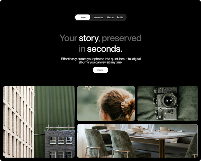
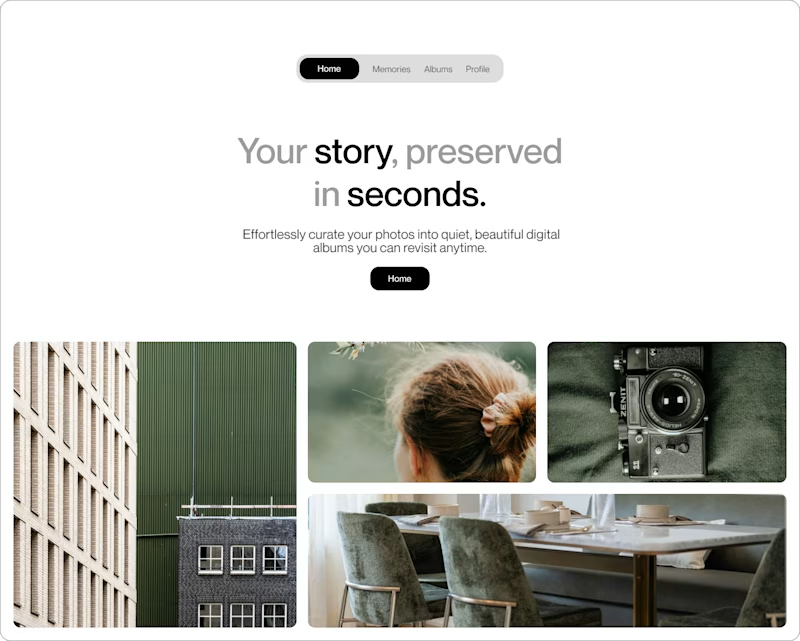
Building a new design layout for a personal memory archive platform.
Which version feels better for preserving your favorite moments?
0 voted
0%
3 voted
100%
3 votes
Closed
The archive framing is lovely—Dark Mode gives the memories a more intimate, cinematic feel, while the layout stays easy to scan. I’d make that contrast the key decision point.

My previous poll showed unexpected results (I am very grateful to everyone who took the time to vote and comment 🤍).
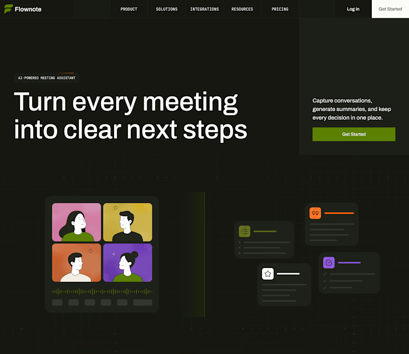
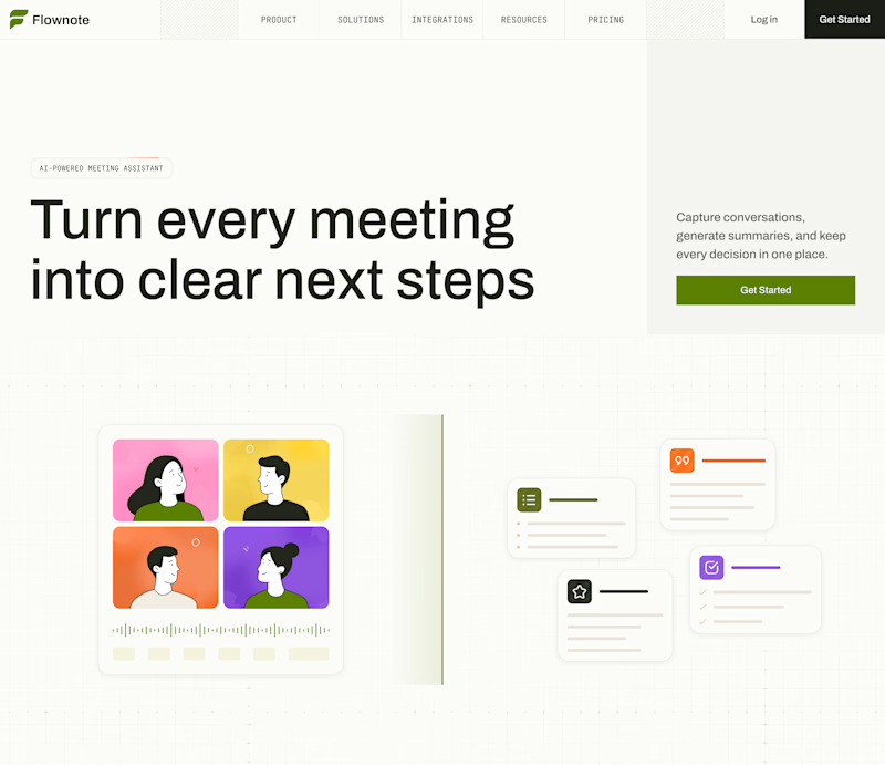
Now I am curious about your opinion on the color mode for this hero section. I definitely like a light theme. What about you?
By the way, I made a nice animation for this design. You can see it on my profile

28 voted
54%
24 voted
46%
52 votes
Closed

To be honest the dark mode looks really good

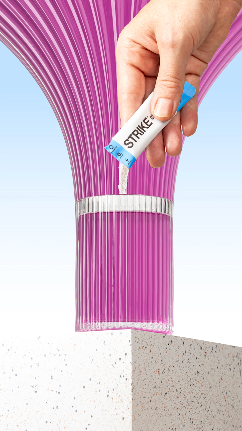
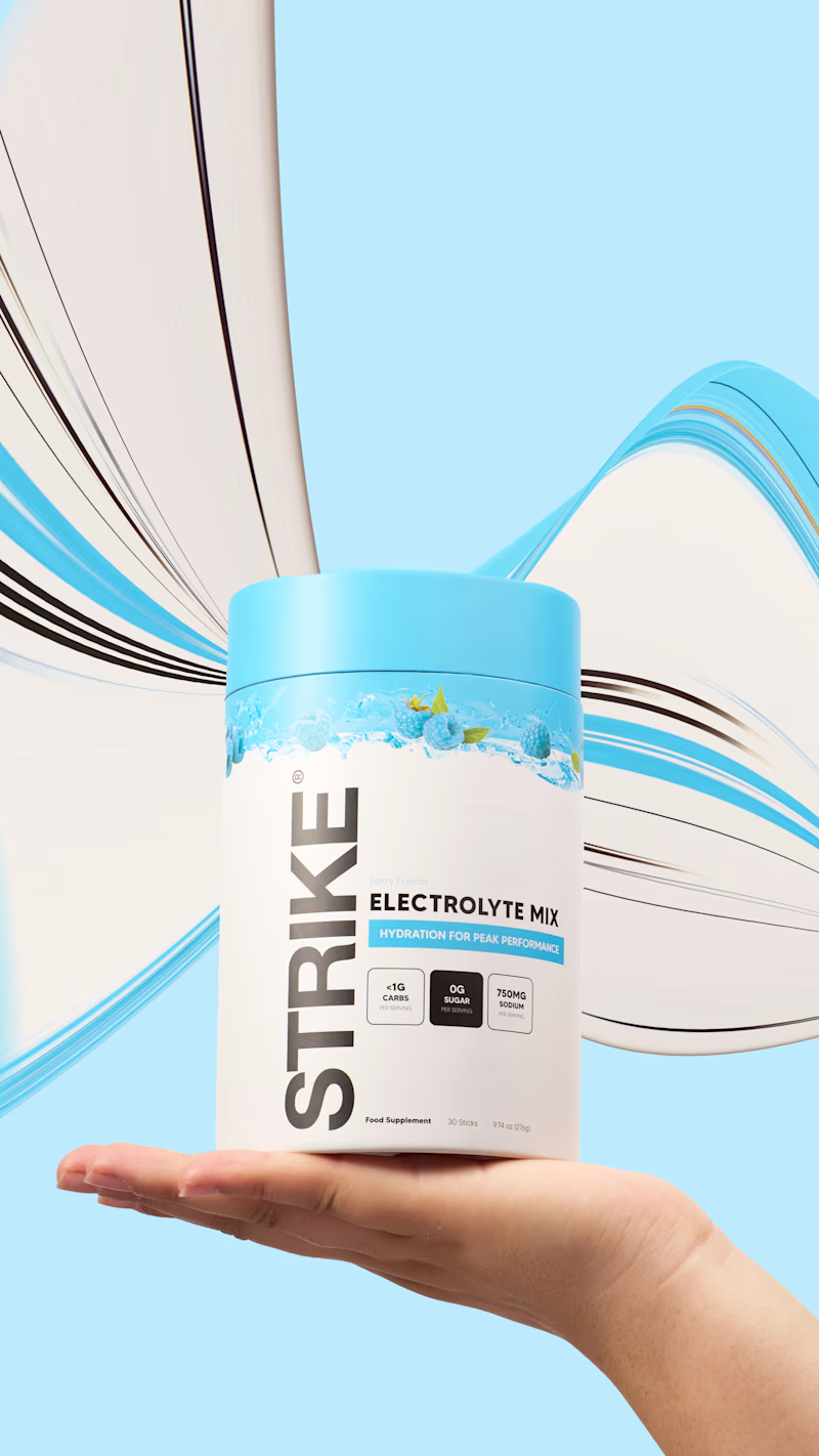
I tried the pixel-stretching trend on some packaging work recently, and I still can’t decide which version works better.

5 voted
29%
12 voted
71%
17 votes
Closed


the pink sachet looks so good. i pick sachet