The network for creativity
Join 1.25M professional creatives like you
Connect with clients, get discovered, and run your business 100% commission-free
Creatives on Contra have earned over $150M and we are just getting started
Back to feedPost

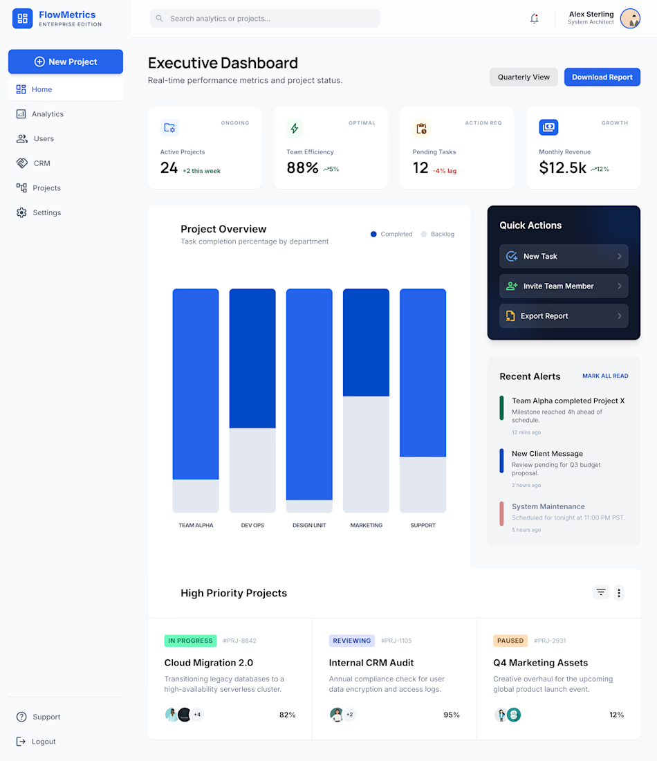
“Meet FlowMetrics Dashboard :- clean, intuitive, and built to turn complex data into clear insights."
The network for creativity
Join 1.25M professional creatives like you
Connect with clients, get discovered, and run your business 100% commission-free
Creatives on Contra have earned over $150M and we are just getting started

Challenges
View all


Related posts

Designed a modern Executive Business Dashboard.
Clean and data-driven UI with key metrics (Sales, Revenue, Profit, Retention), performance charts, product insights, and clear analytics for smarter business decisions.
smallbusinessdashboardbusinessdashboardProduct DesignWeb DesignAdobe After EffectsFigmaJitterUI Design


workflow editor dashboard


The new iPhone Duo might change how we think about responsive design. For years, most UX designers have thought about:
→ Mobile
→ Tablet
→ Desktop
Now we need to start thinking about:
→ Closed
→ Open
→ Landscape
→ Split view
→ Different content densities
And that changes how we design.
Here are 5 things UX designers should start doing:
1️⃣ Stop designing only for breakpoints. Think about how the experience behaves when the available space changes.
2️⃣ Design components that adapt. A product card doesn’t always need to look the same.
3️⃣ Rethink navigation. Bottom navigation worked extremely well for phones. But with larger and foldable layouts, side navigation and contextual controls become more relevant.
4️⃣ Design information hierarchy, not just layouts.
When you have more space, don’t simply make everything bigger.
Ask:
“What additional information becomes useful here?”
5️⃣ Prototype behavior, not just screens.
Your prototype should communicate what happens when the device opens, closes, rotates or gives the user more space.
The biggest lesson?
Responsive design is becoming adaptive experience design.
Basically “design an experience that makes sense in every state”
And I think this is where UX designers need to level up by asking “How should my product behave when the context changes?”
That’s the real future of responsive UX.
This is my opinion, do you agree?
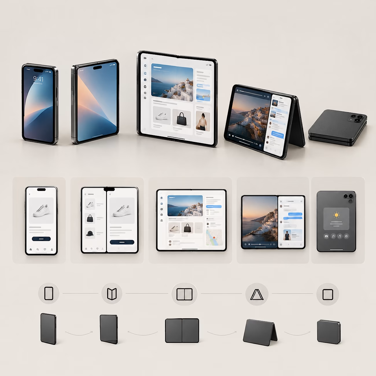

Mapping the product across closed, open, landscape, and split-view states makes the responsive model feel much more honest than a simple device checklist. The density shifts are where the real design challenge lives.