The network for creativity
Join 1.25M professional creatives like you
Connect with clients, get discovered, and run your business 100% commission-free
Creatives on Contra have earned over $150M and we are just getting started
Back to feedPost
What do you think of the navigation bar animation?
Work in progress - new Framer template.


It looks good

Thanksss!

Fantastic idea, but a little busy.
Great! Thank you for your opinion!
you are most welcome, buddy! Where did you create the motion?🙂
What do you mean motion? It’s all done in Framer :)

So crisp, clean, and wonderfully executed!
Thank you, Rajesh!

That looks interesting
Happy to hear it!

Nice
Thank you, Sekinat!

it looks so good
It means a lot, thanks!


Awesome work🔥👏👏
🤝🤗

Clean and clear. It is a best way for a Nav bar
Agree!

Hall of fame work!
One of the best compliments, thank you!


No offense, but personally I would have set the default state of Navbar to the animation one ( small looks so better to me )
Got it! Thank you for your opinion!

This looks awesome! ❤️🔥
Happy to hear it :)

Awesome love the motions
Thanks!


Looks great !
Appreciate!

The nav bar animation is great, do the images follow the user as they scroll the page?
Thanks! Yes, It follows scroll :)

Awesome!
Happy to hear it!

It looks good
Perfect!

Thank you!

It's an amazing idea
Thanks, Emmanuel!

Well done with the animation, Rokas
Ty, Aliu!

So creative 👏
Means a lot!

Great🔥
🙌✌️


Really smooth, love the motion on this.
Happy to hear it!

Nav bar animation feels good, the shrink on scroll is smooth and doesn't fight the hero. Agree with Mahmudul's comment though, the photo collage under the headline is doing a lot at once with that many overlapping images, might read cleaner with two or three larger shots instead...
Got it! Thank you for your opinion!

Looks amazing
Thanks, Pelumi!
The network for creativity
Join 1.25M professional creatives like you
Connect with clients, get discovered, and run your business 100% commission-free
Creatives on Contra have earned over $150M and we are just getting started





Related posts


there are tons of cool things in our latest template
just one of them: team section interaction
get it for free → https://startfrom.co/templates/lapse

This is amazingggg

Just created a Framer website preloader with 2 options to choose from. The difference is the sequence of what appears first and the reveal animation. I made two options because I can’t choose which is best lol. What’s your favorite, Option 1 or 2?
BTW if you want this for free (normally $12), like it on the Framer Marketplace (on this link) and comment here so I know, and I’ll send it to your DM.
20 voted
48%
22 voted
52%
42 votes
Closed

Option 1 feels better than Option 2 for me

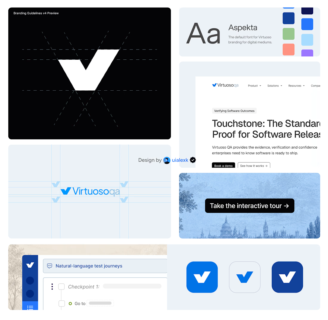
Branding v4 for Virtuoso
This design evolution, made an impact to the brand growth's by:
- Webflow to Framer migration of 150+ static pages and 500+ CMS
- Increasing website conversions
- Having consistent brand presence across digital mediums
- Increase brand awareness
Amazing!