The network for creativity
Join 1.25M professional creatives like you
Connect with clients, get discovered, and run your business 100% commission-free
Creatives on Contra have earned over $150M and we are just getting started
Back to feedPost





Smart use of AI. Backgrounds that stick to one red and black palette keep the whole set tied to the brand. Did you do much cleanup after generating?


This is exactly how AI should be used! Not replacing the brand but extending it. Custom backgrounds that actually match the identity is such a smart workflow - saves hours and keeps everything cohesive. Love this approach!
Most welcom♥️🔥

Keeping everything in that red and black palette is exactly the right call. It makes the AI work feel like brand design rather than decoration. How much cleanup did the generations need before they were usable?

Great job Stizzy 🎉🎉🔥🔥
Pardon Stizzy ❤️
The network for creativity
Join 1.25M professional creatives like you
Connect with clients, get discovered, and run your business 100% commission-free
Creatives on Contra have earned over $150M and we are just getting started






Related posts

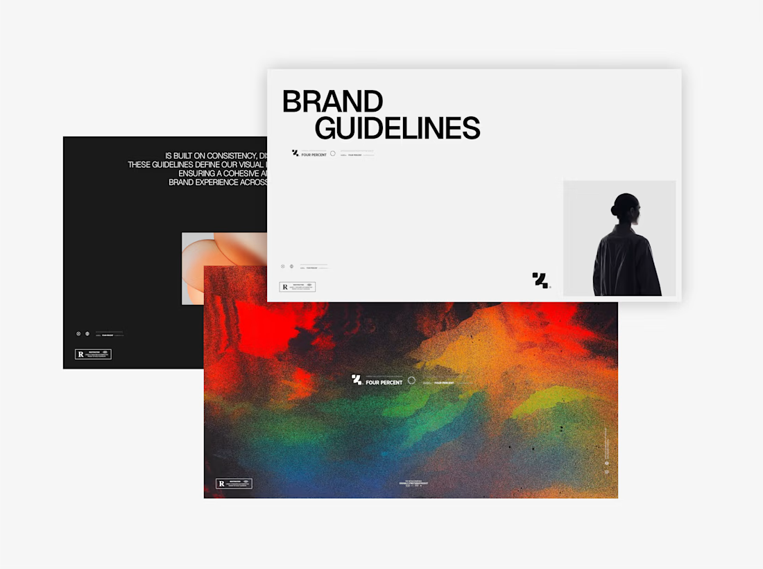
Four Percent — Visual Identity
Worked on the visual direction for Four Percent, creating a bold and modern identity inspired by American innovation. The project included the logo system, typography, graphic elements, apparel applications, and overall art direction.



Great work 👍

Every AI app makes you wait. Most show a boring spinner.
So I made a free "AI Generating" loading screen template. Swap the logo, image, text and colors.
Built with the SVGator MCP, and edited in the SVGator.
I learned that I can keep prompting in any coding agent and edit the animation too! Very cool!


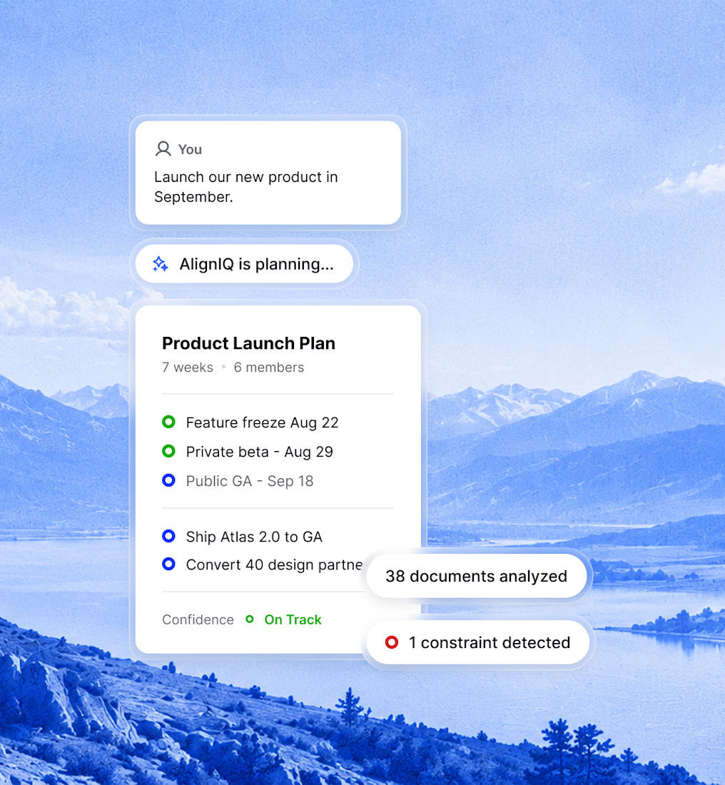
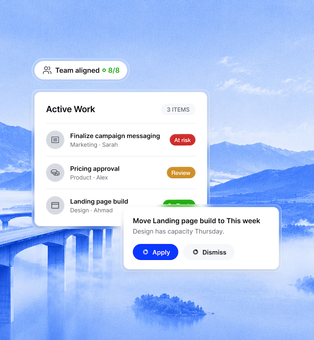


Letting the blue-duotone photography carry the atmosphere while the UI cards stay minimal is a nice balance, Ahmad. Every feature gets its own visual moment without the interface losing focus, which is hard to pull off.