The network for creativity
Join 1.25M professional creatives like you
Connect with clients, get discovered, and run your business 100% commission-free
Creatives on Contra have earned over $150M and we are just getting started
Back to feedPost

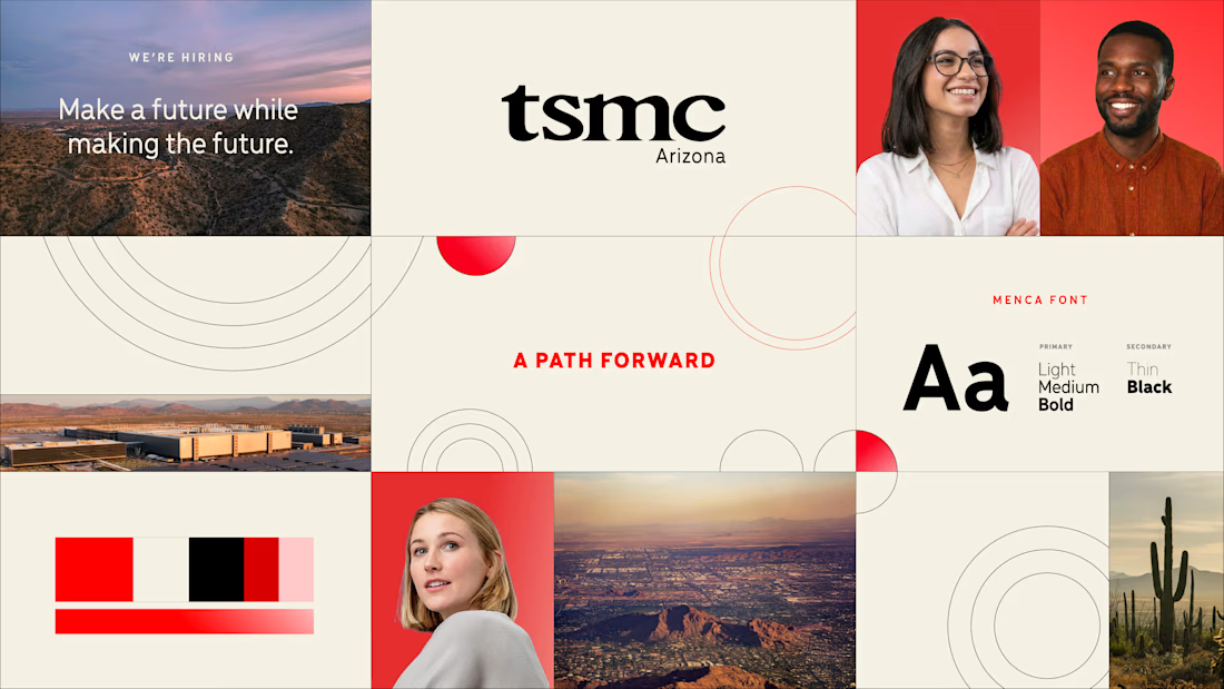
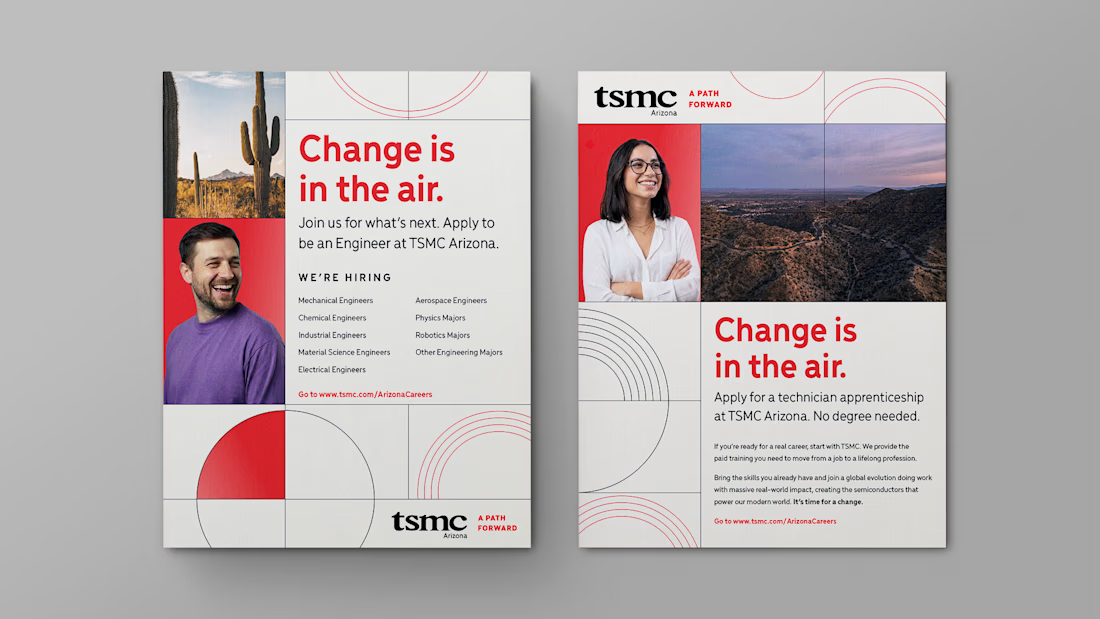
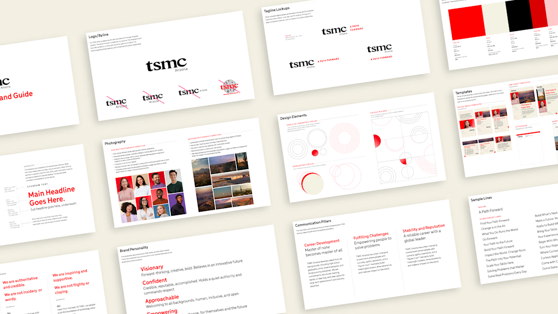
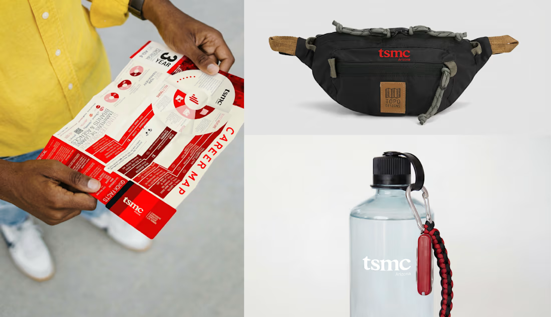
Just wrapped up an employer rebrand for TSMC, who is looking to boost recruiting for their Arizona location. https://www.cristinburton.com/tsmc
The network for creativity
Join 1.25M professional creatives like you
Connect with clients, get discovered, and run your business 100% commission-free
Creatives on Contra have earned over $150M and we are just getting started
Challenges
View all


Related posts

Recruitment is a people business. The brand should feel the same way.
Wayforce connects top talent with businesses and needed an identity that spoke to both sides at once. Sharp enough for the companies hiring. Human enough for the candidates being placed.
The mark does two things: reads as W, moves like a direction. Acid yellow that stands out in a category full of grey corporate sameness.
Not another recruitment agency. A force that knows where you’re headed.

This is wonderful man. love the branding


Repleo Hydration: a brand identity built on the shape of salt.
The hexagon evokes the crystalline form of sodium chloride, the hero ingredient. Premium enough for a CrossFit gym, approachable enough for a daily habit.
Whereas the stick packs are in production ahead of launch, check out the identity case study:
Full Case Study


salt crystal hexagon feels right for this. are the stick pack layouts locked yet
