The network for creativity
Join 1.25M professional creatives like you
Connect with clients, get discovered, and run your business 100% commission-free
Creatives on Contra have earned over $150M and we are just getting started
Back to feedPost
SOESOE visual identity balances minimal aesthetics with an inviting, modern personality. Designed to resonate with today’s style-conscious consumers, the branding emphasizes clean typography paired with a playful polka-dot pattern, subtly referencing natural milk droplets and classic dairy motifs.


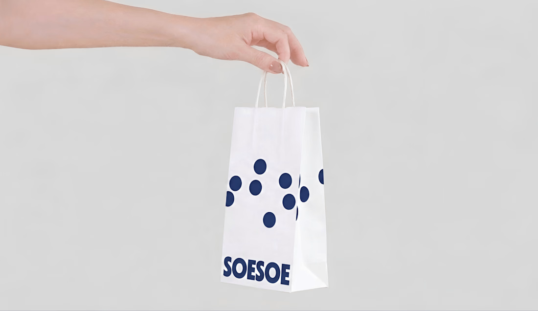

Dots are one of the few motifs that fail in both directions — shrink them and they flatten into texture or fight the press, blow them up and the reference slides from dairy to fashion. Curious how narrow a scale range you ended up locking for it across the pack sizes.

Good observation. We locked in a specific grid ratio relative to each pack size to keep it recognizable without losing the dairy context or flattening the texture. Appreciate the feedback!
The network for creativity
Join 1.25M professional creatives like you
Connect with clients, get discovered, and run your business 100% commission-free
Creatives on Contra have earned over $150M and we are just getting started

Challenges
View all


Related posts

Wonder -- Visual Expressions
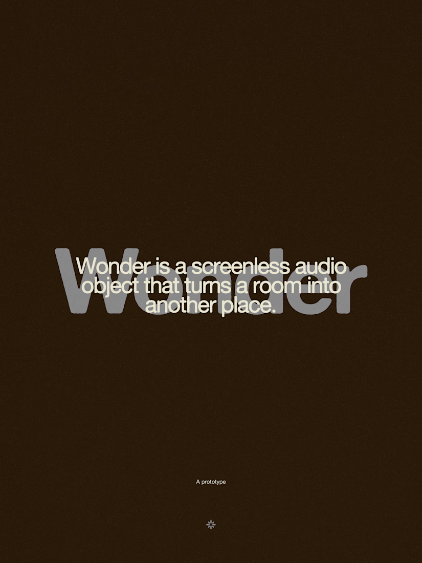
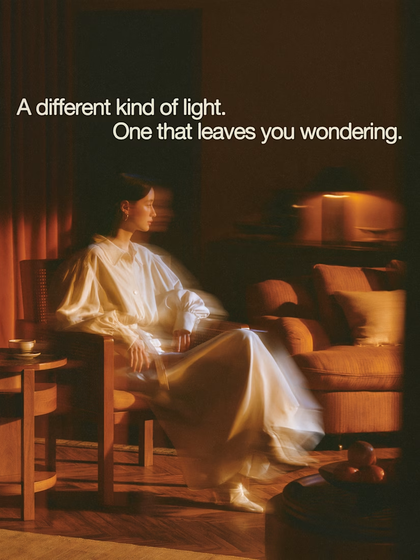


The restraint in the warm palette really lets the sound-object concept breathe—especially that shift from readable type to atmosphere.

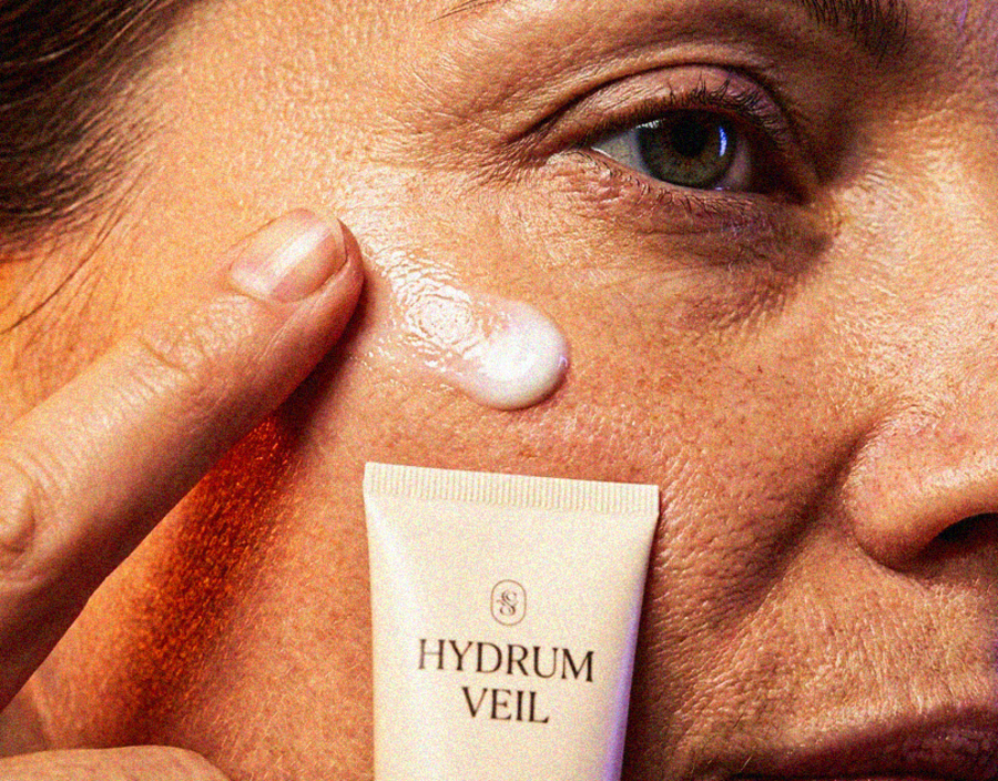
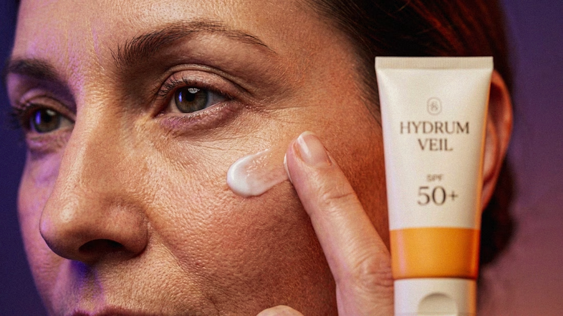
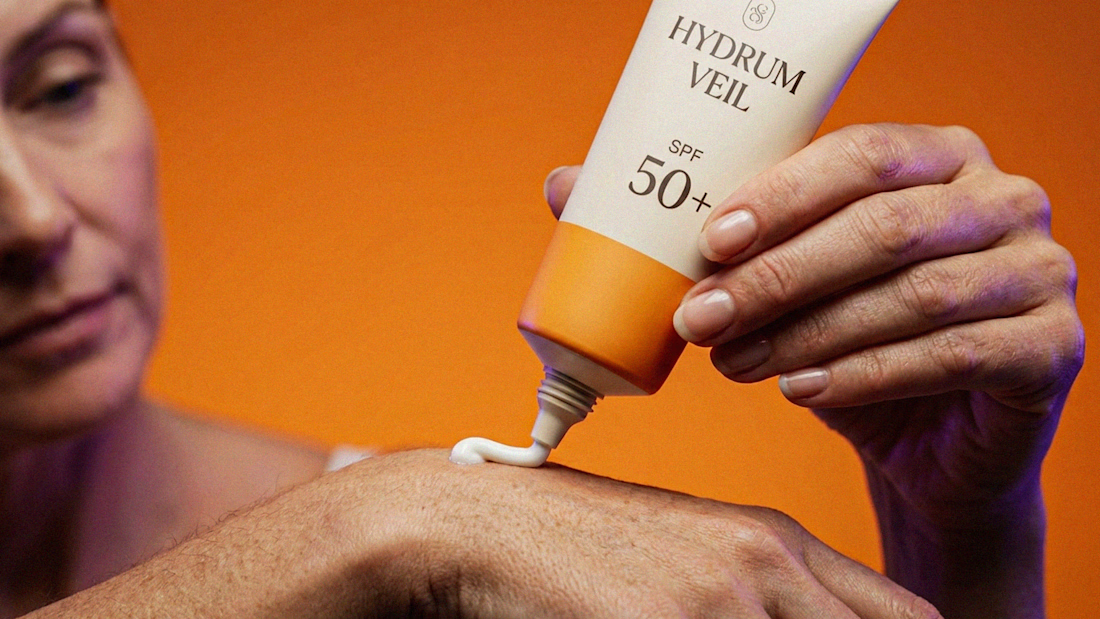
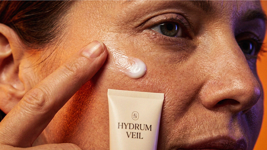
I Just Created HYDRUM VEIL 🔥
HYDRUM VEIL is a skincare brand built around a premium SPF 50+ sunscreen, developed as a complete brand identity, packaging design, and seasonal advertising campaign.
The project explores a question most seasonal beauty work gets wrong: how do you make a limited-edition campaign feel festive without making it feel cheap?
Instead of stacking decorative props, the campaign holds a strict visual system - vivid pumpkin orange, deep twilight violet, warm cream, and restrained black and lets a single product carry every frame.
Drop your replies in cmnts.....!!!!! 🙌
branddesignertastetestBrand DesignGraphic DesignPackaging DesignAdobe IllustratorAdobe PhotoshopClaude



VÆRON
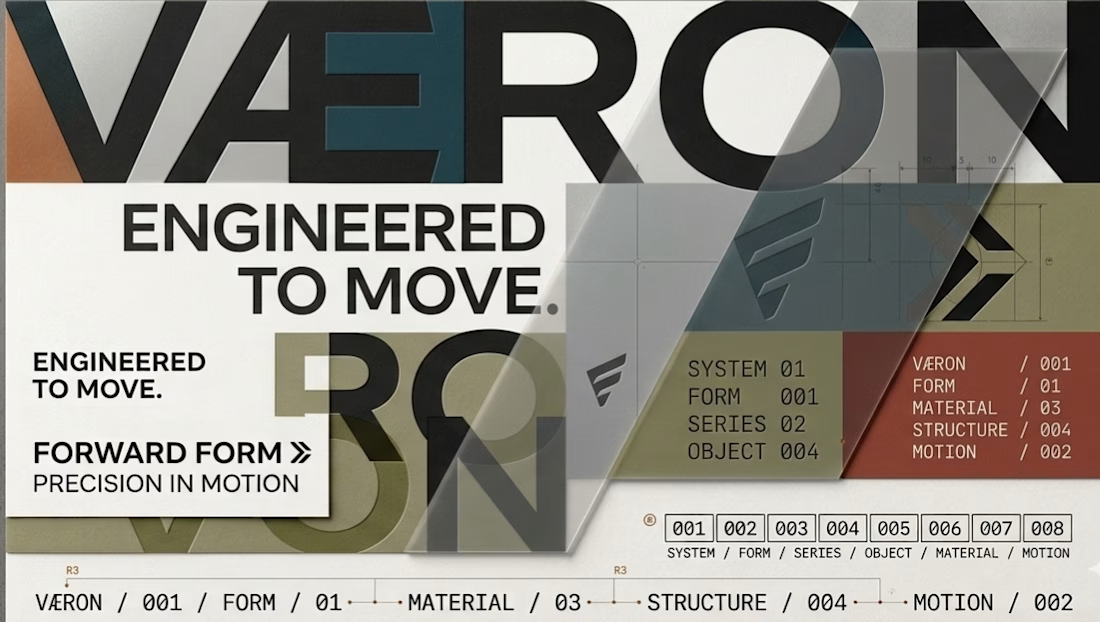
A complete visual identity exploration built around one central idea: FORWARD FORM — a design language where fashion, architecture, engineering and movement converge.
Rather than designing a logo in isolation, I developed VÆRON as a connected brand system, where every decision has a purpose.
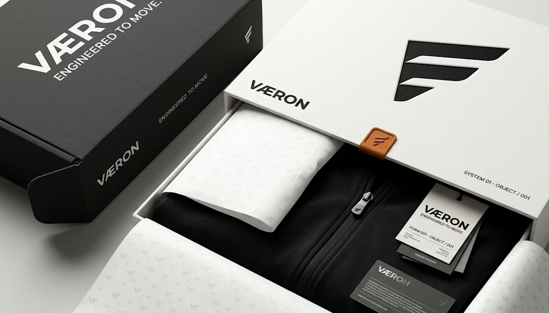
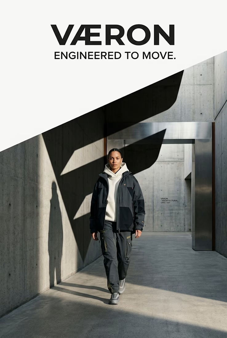
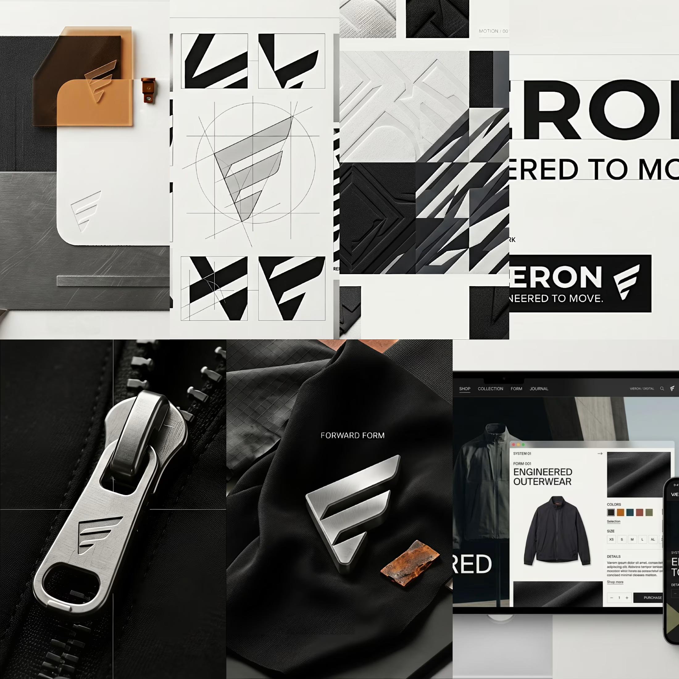
From the Æ construction and typography to the geometric language, material direction, color architecture, garment design, hardware, packaging, digital experience and campaign world — every layer was developed to function as part of one recognizable visual universe.
The creative direction balances contemporary streetwear with quiet luxury, using engineered silhouettes, tactile materials, architectural forms and controlled color to create a distinctive identity with both character and restraint.
The goal was simple: build a brand that remains recognizable even when the logo is removed.
Concept → Identity → Graphic System → Material → Garment → Packaging → Digital → Campaign
This project represents my approach to brand identity, creative direction, AI-assisted visual development, image editing, fashion visualisation, art direction and detail-driven design.
VÆRON
ENGINEERED TO MOVE.
Want to see the thinking behind the visuals?
Explore the full case study in my portfolio — from the initial concept and identity system to the final brand world.
Open to creative collaborations, freelance projects and brand identity opportunities.


Creative