The network for creativity
Join 1.25M professional creatives like you
Connect with clients, get discovered, and run your business 100% commission-free
Creatives on Contra have earned over $150M and we are just getting started
Back to feedPost
Can a construction brand convey both strength and elegance?
Interconnected serif letters echo architectural structures, while vivid yellow and black create a bold contrast.
What’s your first impression: construction, architecture, or something else?
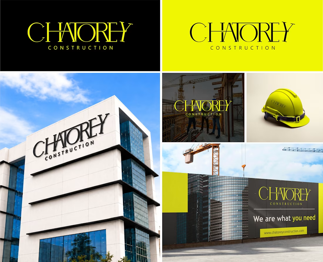


Thanks for sharing your take! Yellow and black were chosen for that strong visual impact, and the architectural impression ties in with the structural inspiration behind the lettering.
The network for creativity
Join 1.25M professional creatives like you
Connect with clients, get discovered, and run your business 100% commission-free
Creatives on Contra have earned over $150M and we are just getting started
Related posts


The green gradient gives Zentro a calm, premium feel. Is that the main brand color?

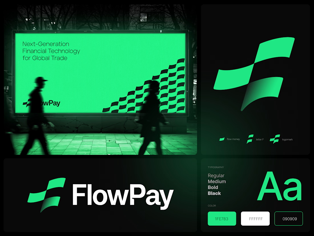
FlowPay — Abstract F Logo, Fintech Branding
Available for a new project.
Get in touch to bring your logo design, branding project
vision to life with a professional touch.
💼 Open for work! Click 'Get in touch' below.
🔗 View full services: https://dribbble.com/graytive_branding/services



Premium Brand Identity & Visual Asset Ecosystem
We specialize in building modern, custom brand identities engineered to grab attention in crowded global marketplaces. This project highlights our comprehensive process—from initial sketch and concept layout to the delivery of high-resolution, print-ready custom packaging models and corporate stationery.
Key Deliverables:
Bespoke typographic logo and vector files
Full brand guidelines detailing line work, geometric constraints, and color palette
3D luxury packaging mockups including labels, custom boxes, and collateral textures
Clean digital assets optimized for social platforms and landing pages
Your vision. Our design. Let's make your brand stand out from the competition.
🎯


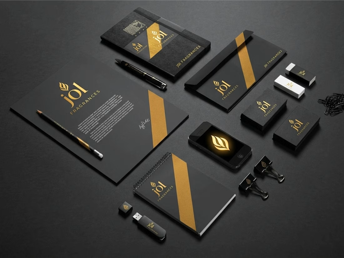

Did you test other angles for those gold bands, Murad?