The network for creativity
Join 1.25M professional creatives like you
Connect with clients, get discovered, and run your business 100% commission-free
Creatives on Contra have earned over $150M and we are just getting started
Back to feedPost

When I design a website, I focus on one thing: what does the visitor need to see, feel, and understand to take the next step?
For this fitness coach website, I wanted the experience to feel simple and motivating.
The moment someone lands on the page, it should feel like: “Yeah, this is it.”
Every section, interaction, and detail was designed around that feeling.


The network for creativity
Join 1.25M professional creatives like you
Connect with clients, get discovered, and run your business 100% commission-free
Creatives on Contra have earned over $150M and we are just getting started



Related posts


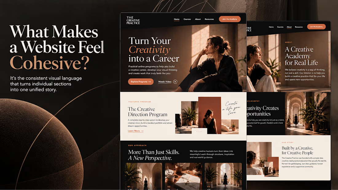
What makes a website feel cohesive?
It’s not just the colors.
It’s not just the typography.
And it’s definitely not about making every section look the same.
A cohesive website is built when every visual decision feels like part of the same story, from typography and imagery to spacing, buttons, cards, and even the smallest details.
The goal isn’t repetition.
It’s creating a visual language that people recognize and remember.
That’s when a website starts to feel like a brand, not just a collection of sections.

Well put, Serge. Consistent spacing, buttons and cards do more for that feeling than making sections match, and they are usually the first things to drift as a site grows.


Amazing design!


A beautiful kitchen deserves a website that inspires people to imagine what's possible.
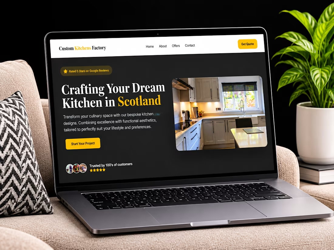
I'm excited to share my website design and development project for Custom Kitchens Factory, a bespoke kitchen design and installation company based in Scotland.
The goal was to create a professional, visually engaging online experience that showcases the company's craftsmanship, communicates its services, and turns visitors' inspiration into genuine project enquiries.
Some key focuses of the project:
Clean, modern website design.
Clear presentation of kitchen design and renovation services.
Project showcases that inspire potential customers.
Strong content structure and intuitive navigation.
Trust-building elements and customer testimonials.
A streamlined consultation and quote enquiry journey.
Responsive development with Webflow.
I believe a great business website should not just explain what a company does, it should help potential customers picture the value of working with them.
I'd love to hear your thoughts!
When choosing a kitchen design company, what influences your decision most: the quality of previous projects, the design process, customer reviews, or the overall experience?
Let's discuss in the comments. 👇
#WebDesign #Webflow #WebflowDevelopment #WebsiteDesign #UXDesign #UIDesign #KitchenDesign #InteriorDesign #HomeRenovation #WebDesigner #Contra


professional design