The network for creativity
Join 1.25M professional creatives like you
Connect with clients, get discovered, and run your business 100% commission-free
Creatives on Contra have earned over $150M and we are just getting started
Back to feedPost
A concept landing page designed for a fictional 24-hour gym with two locations in Santa Barbara and Carpinteria. Built to demonstrate conversion-focused web design — clear CTAs, bold layout, and a membership-first flow. The kind of page a real gym would actually need.
"This is a concept project built to demonstrate design skills. Available for real client work."


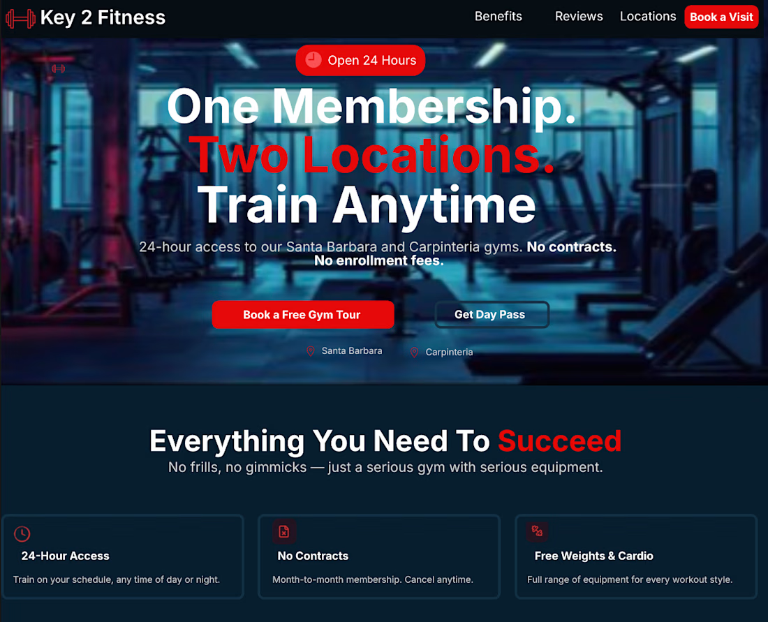
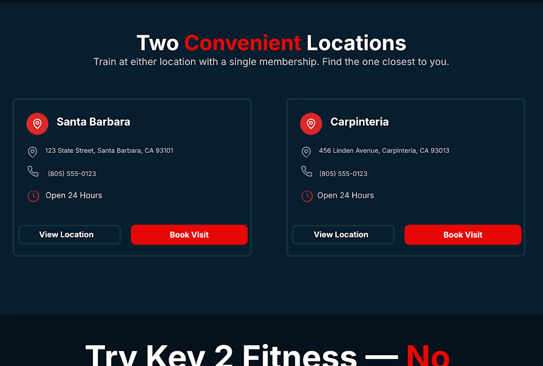
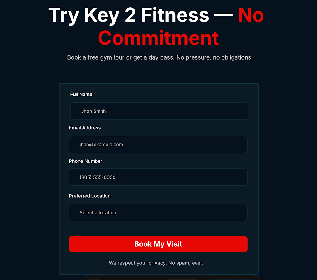
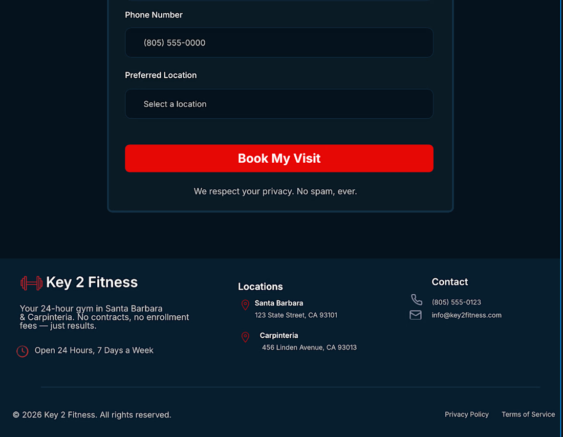

Membership-first flow is the right call for gyms — clear CTA hierarchy beats fancy visuals every time. This feels like something a real local business could actually use.

That's exactly what I was going for — gyms don't need to impress, they need to convert. Appreciate you taking the time to look at it, means a lot coming from someone who clearly gets design. 🙏
The network for creativity
Join 1.25M professional creatives like you
Connect with clients, get discovered, and run your business 100% commission-free
Creatives on Contra have earned over $150M and we are just getting started







Related posts


Every element feels perfectly placed! 👏


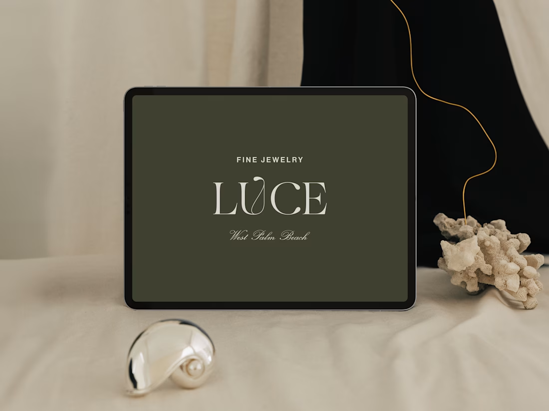
Introducing LUCE, a fresh chapter in four generations of fine jewelry.
Earthy greens, expressive typography, and thoughtful packaging bring warmth and personality to a brand rooted in heritage.
I worked with LUCE across brand strategy, visual identity, packaging experience, and full Shopify website design and development, bringing every detail into one cohesive world.


NEAT
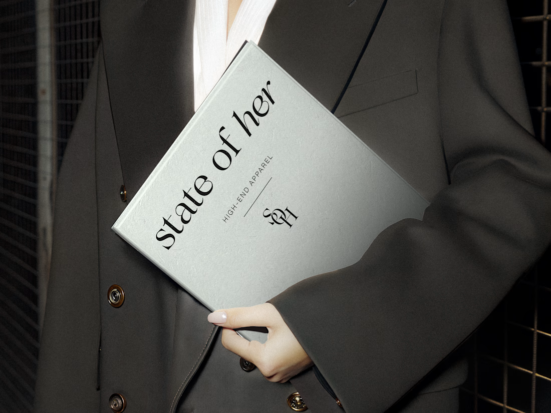
Introducing State of Her, a womenswear brand made for every state of her life.
Custom typography, sculptural monograms, and a softly grounded palette come together in an identity that balances confidence with ease.