The network for creativity
Join 1.25M professional creatives like you
Connect with clients, get discovered, and run your business 100% commission-free
Creatives on Contra have earned over $150M and we are just getting started
Back to feedPost

I have been doing brand typography for my own projects lately, sharing three pieces I'm proud of.
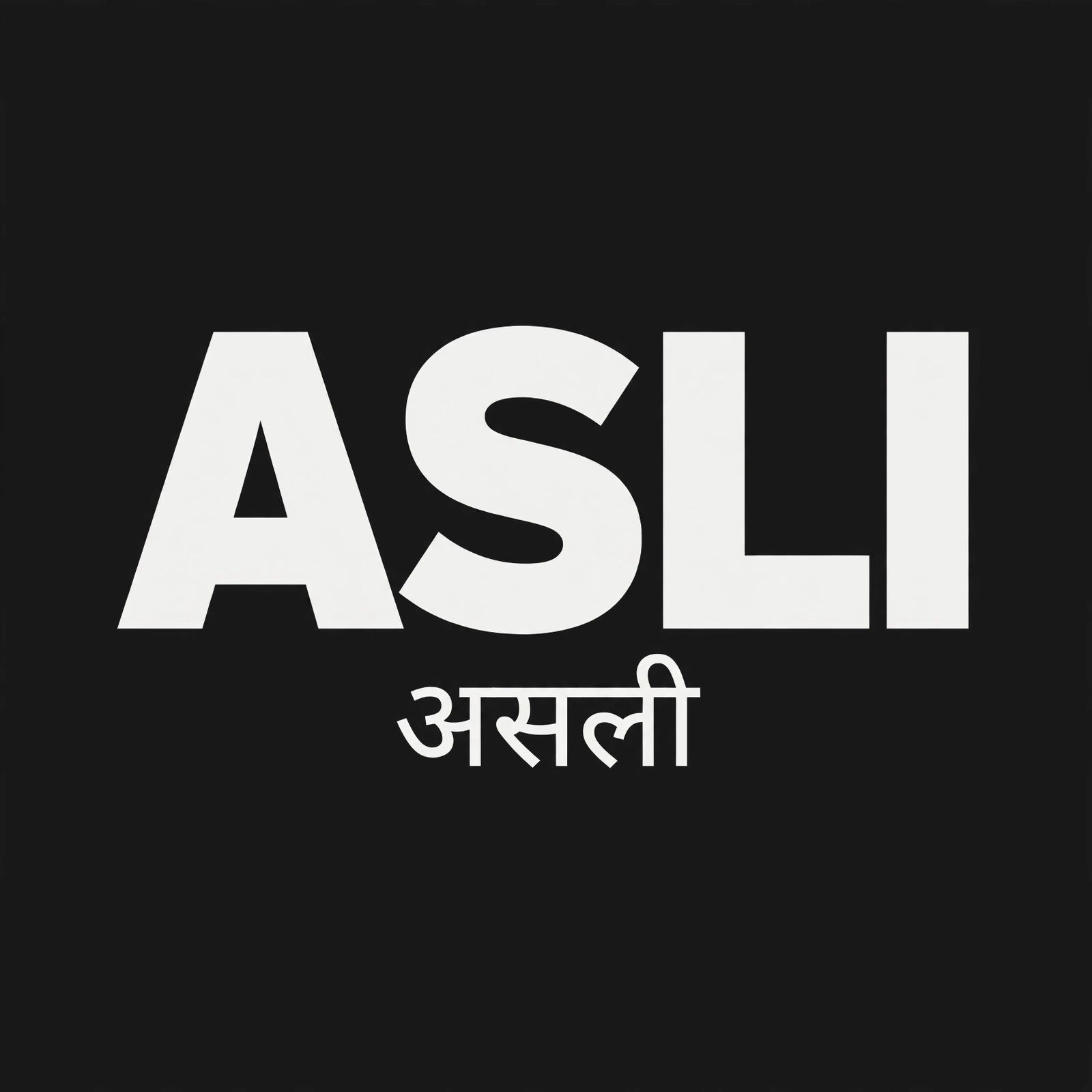
1. ASLI (असली, "real") — my custom streetwear studio. The whole brand hangs on the type: heavy condensed Latin caps with असली sitting underneath at matching visual weight. No "translation in small print" energy.
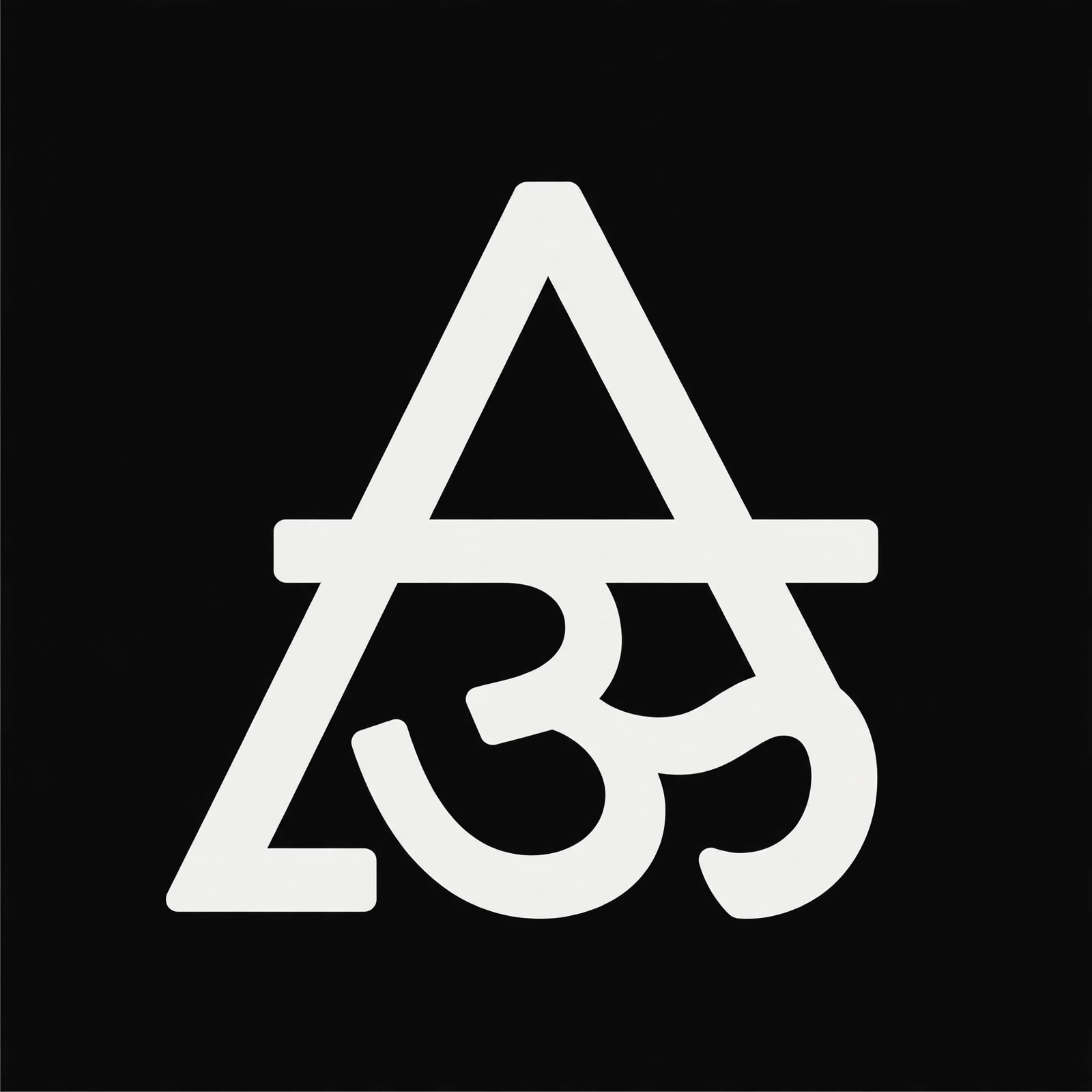
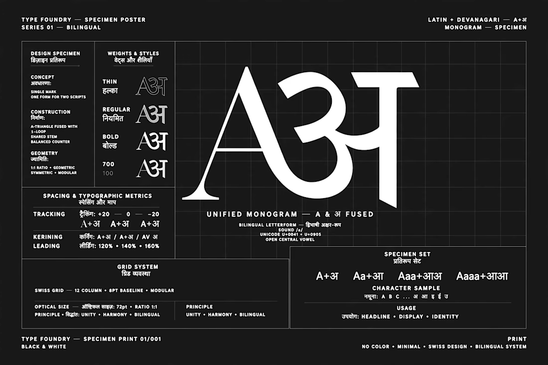
2. The monogram — Latin A fused with Devanagari अ. Two scripts, one letterform. This was the fun puzzle: the two scripts have totally different optical centers, so a mathematically centered lockup still looks off-balance. Tuned it by eye until it read as one mark.
3. Editorial study — didone serif forms, column grids, ink-on-paper texture. The quiet side of my typography brain.
More type-led work of mine:
→ PortfolioForge — editorial paper-and-ink redesign, 10 themes, 6 type pairings: https://portfolioforge-delta.vercel.app
→ Hotel Sheela Shree Plaza — editorial-cinematic site: https://hotel-sheela-shree-plaza.vercel.app
Anyone else here designing bilingually with Devanagari + Latin? Would love to see how you handle lockups.
The network for creativity
Join 1.25M professional creatives like you
Connect with clients, get discovered, and run your business 100% commission-free
Creatives on Contra have earned over $150M and we are just getting started







Related posts

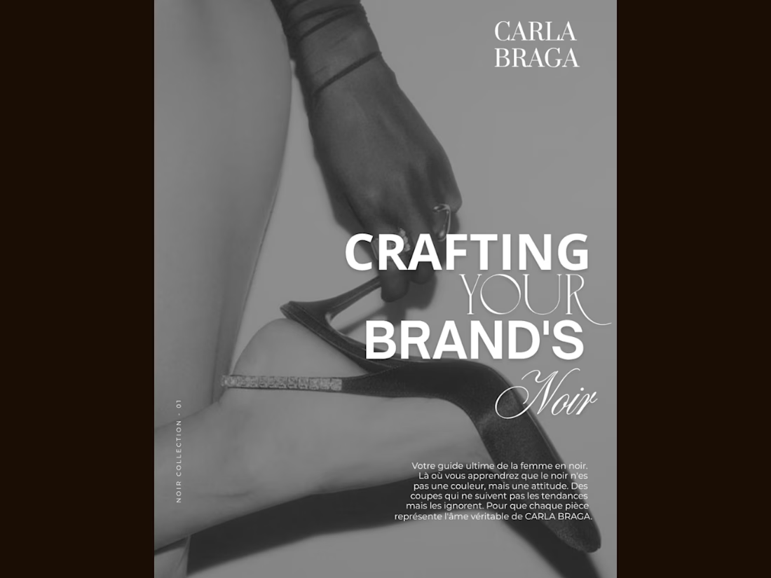
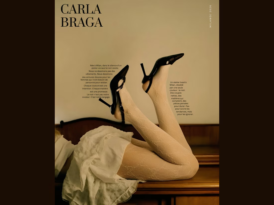
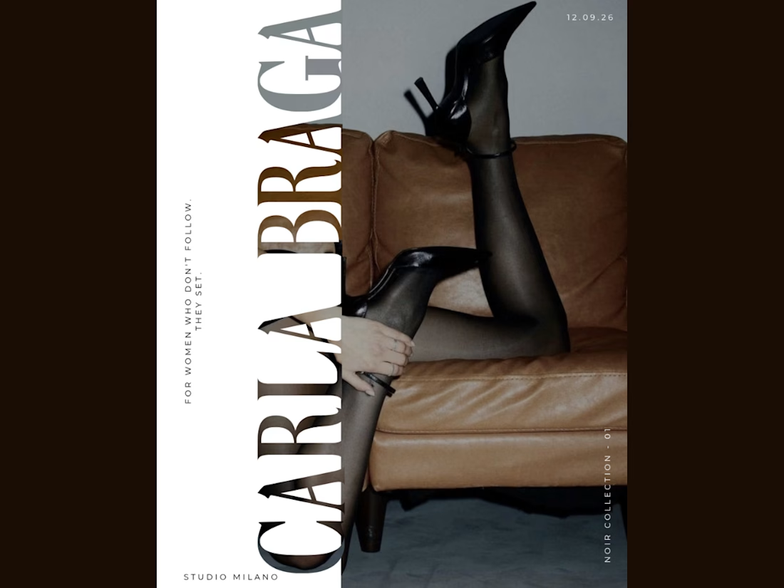
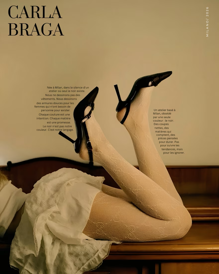
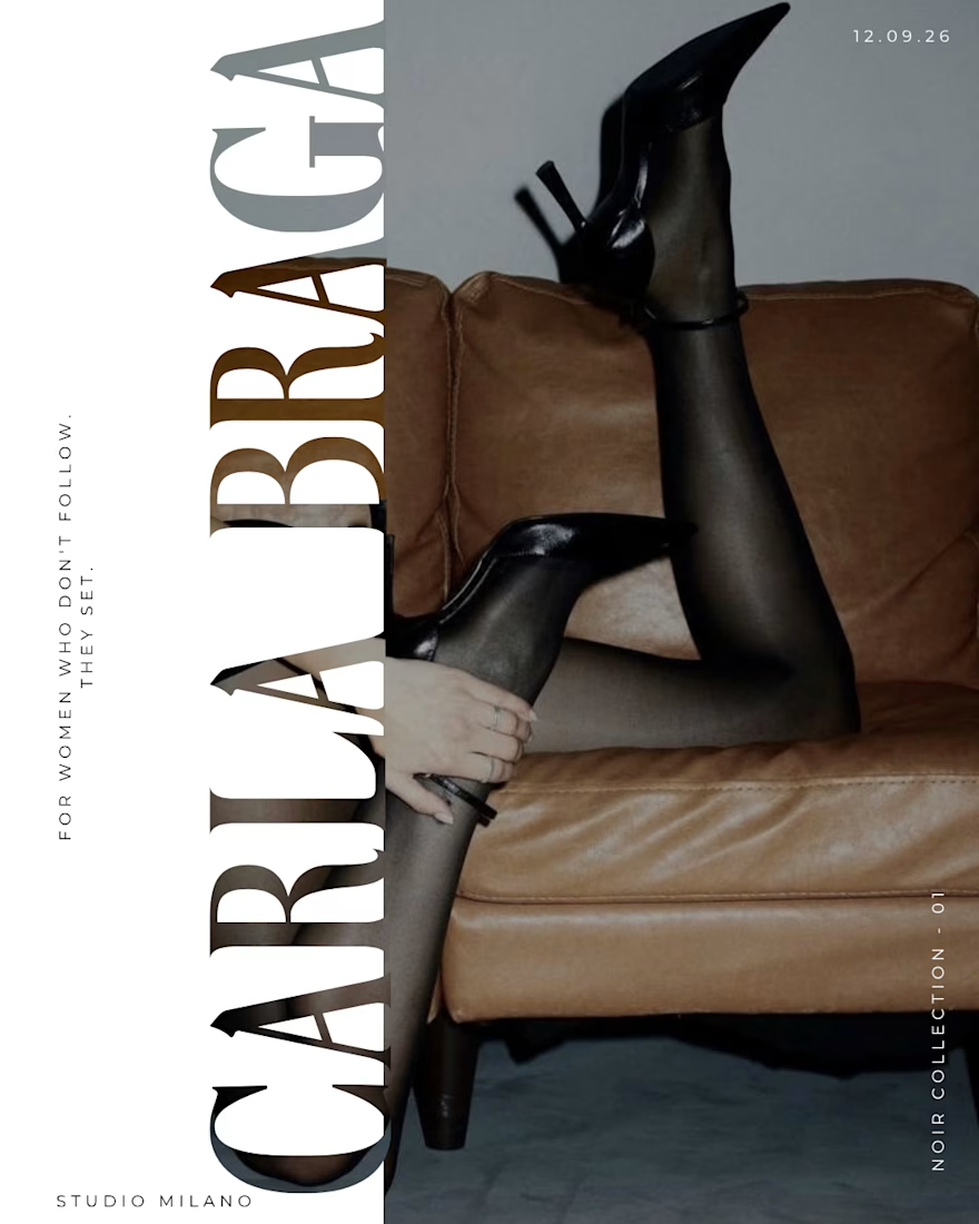
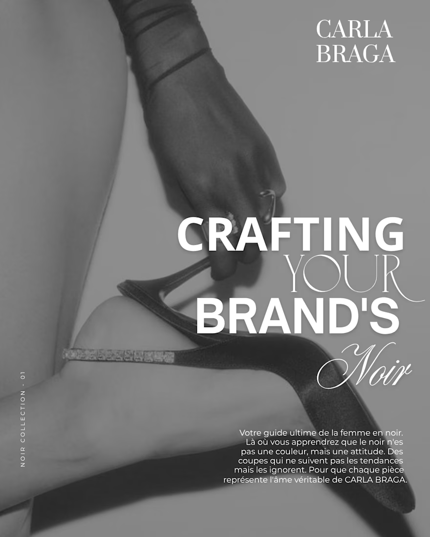
An editorial poster series I designed for CARLA BRAGA, exploring fashion through bold typography, vintage tones, and monochrome imagery. Each layout takes a different approach—from text following the contours of the image to oversized vertical lettering and layered font combinations. Black heels connect the series visually, while warm browns, soft neutrals, and spacious compositions create a cohesive luxury feel. Created in Canva with a focus on typography, contrast, and visual storytelling.


BEAUTIFUL WORK.
An editorial poster series I designed for CARLA BRAGA, exploring fashion through bold typography, vintage tones, and monochrome imagery. Each layout takes a different approach—from text following the contours of the image to oversized vertical lettering and layered font combinations. Black heels connect the series visually, while warm browns, soft neutrals, and spacious compositions create a cohesive luxury feel. Created in Canva with a focus on typography, contrast, and visual storytelling.


Light or dark—which Kajabi library would you choose?
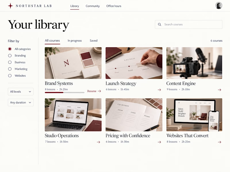
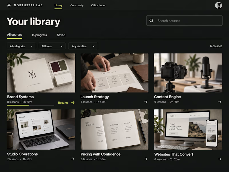
Two concepts for Northstar Lab, a fictional creative education brand. Same courses, two ways to browse:
A — Light Editorial: warm tones, serif type, and sidebar filters.
B — Dark Studio: charcoal, chartreuse accents, and compact dropdown filters.
Which would you rather learn in—and why?

27 voted
56%
21 voted
44%
48 votes
Closed

Clean and professional. I prefer the light editorial style.