The network for creativity
Join 1.25M professional creatives like you
Connect with clients, get discovered, and run your business 100% commission-free
Creatives on Contra have earned over $150M and we are just getting started
Back to feedPost
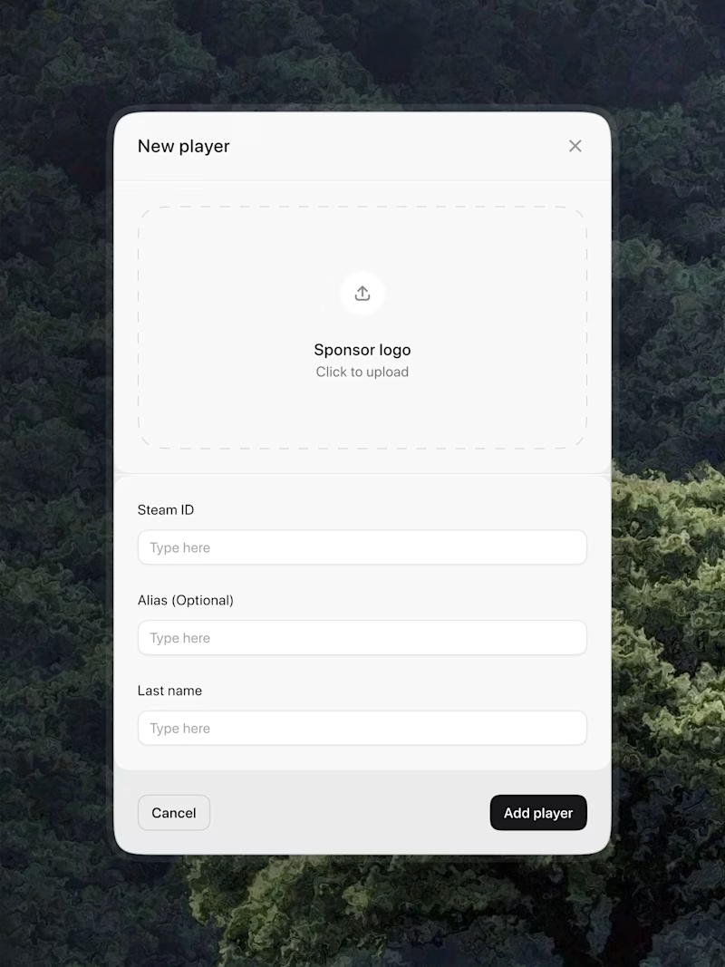
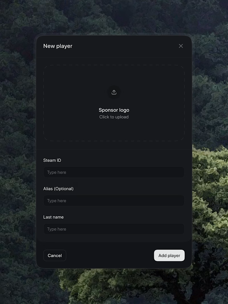
Taste Test
nice work , i will prefer the light
Love the dark mode one!
Light mode
Both looks good 👍
I will go for the black mode!
I prefer dark theme
option 2 for me, dark mode looks more refined. spacing is on point either way
Both look good, but the light option greatly improves readability due to the contrast.
Both looks good. i choose auto that set according the phone mood.😍
White look clean
White is brighter. Great work
Light one looks better to me for this one!
The network for creativity
Join 1.25M professional creatives like you
Connect with clients, get discovered, and run your business 100% commission-free
Creatives on Contra have earned over $150M and we are just getting started
Related posts
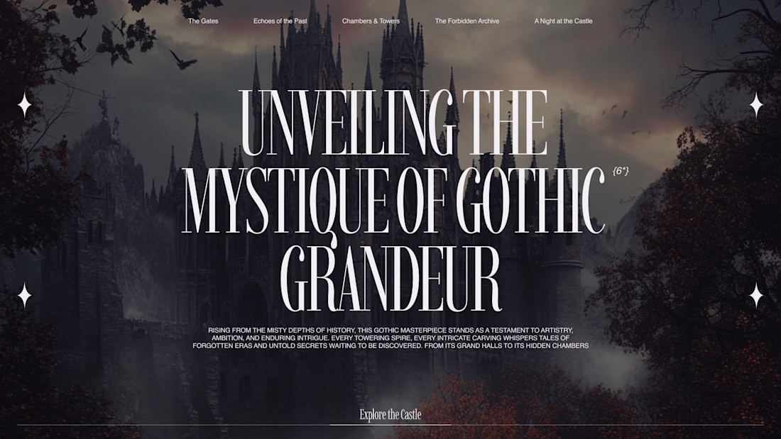
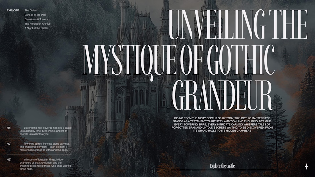
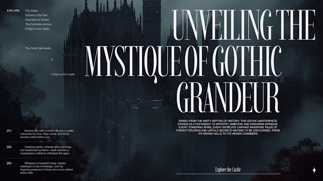
Recently I started exploring more Gothic-inspired web aesthetics and darker visual directions.
Most of my work is usually connected to modern business websites or product-focused interfaces, so working with a completely different mood felt refreshing. The whole process forces you to think differently as a designer. You stop relying on the same visual habits and begin focusing much more on atmosphere, typography, scale, visual pressure, and the feeling the layout creates while scrolling.
I think this is one of the reasons why it’s important to occasionally step outside of the usual “safe” styles. When you work only with standard startup aesthetics for too long, your visual thinking can become predictable without you even noticing it.
Even though projects like this are rare in actual client work, I still enjoy exploring them from time to time. They help me experiment more freely and sharpen my understanding of visual storytelling and art direction.
Curious what you think about this direction.
Stunning!
A feels beautiful. B feels built.
I’ve been thinking about the shift from soft editorial branding into sharper, more systematic identity work, especially for product-led companies.
Both can be tasteful. But one feels more ready for where modern brands are heading.
Where does your taste land?
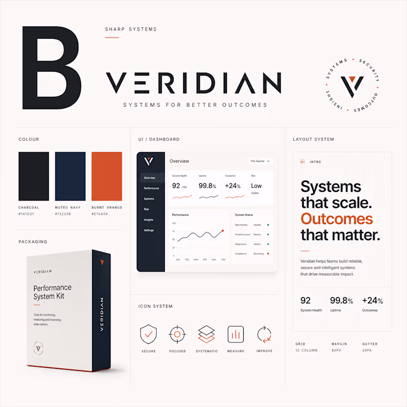
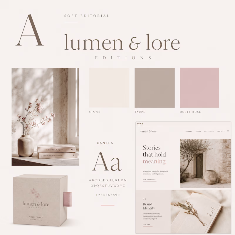
3 votes
Ends in 1d
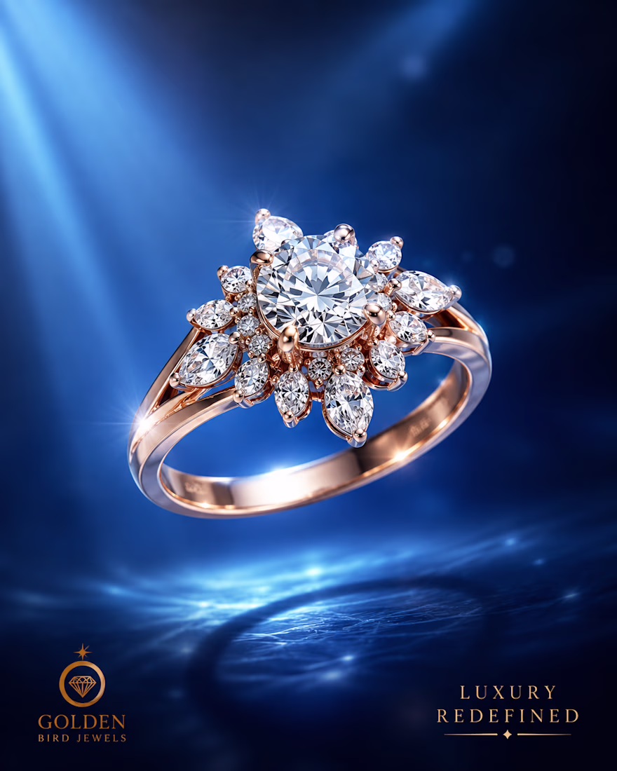
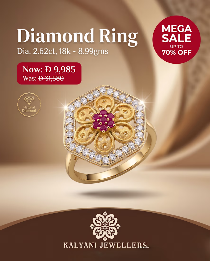
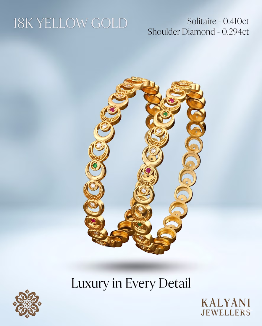
Just finished working on a jewelry brand design project and loved bringing the brand vision to life
From luxury aesthetics to clean visuals, every design was created to make the brand feel elegant, premium, and memorable.
Which style catches your attention more in jewelry: minimal luxury or bold glam?
Feedback and thoughts are always welcome
Trending
Claude
Claude has entered the design space. How are you using Claude Design?
Contra University
Learn from expert creatives how to earn more using next-gen AI tools.
creativeaiflow
Creative AI workflows are evolving. What tools do you use, and what are their strengths and weaknesses?
portfolioreview
The best portfolios tell a story, not just show a grid. Share yours for feedback.
freelancerlife
Freelancer life is wins, pivots, and everything in between. What’s yours right now?