The network for creativity
Join 1.25M professional creatives like you
Connect with clients, get discovered, and run your business 100% commission-free
Creatives on Contra have earned over $150M and we are just getting started
Back to feedPost

A first look at a website we're designing and building in Webflow.
Designed and built in code and running natively in Webflow, reusable across the site.
it reacts to mouse hover (not captured on this video)


The node-based hover preview is a great way to hint at the interaction without overexplaining it. I like that the system looks reusable too—the motion feels like part of the site architecture, not a one-off flourish.

Building this natively in Webflow rather than faking it with a Lottie embed is the harder route but it shows, the hover reactivity alone tells me it's real code underneath. How's performance holding up with that many nodes reacting live?

Native in Webflow and reusable across the site is the part that matters here, a lot of these hover grid effects end up as one off Lottie files nobody can touch again. Curious what the hover state actually does.


the little blue hover block is cool.
The network for creativity
Join 1.25M professional creatives like you
Connect with clients, get discovered, and run your business 100% commission-free
Creatives on Contra have earned over $150M and we are just getting started





Related posts

Booking a fitting shouldn’t take more messages than the alteration itself.
Meet Tivora Atelier, a fictional clothing alterations studio in Bucharest. The problem: a solo owner spends too much time asking every customer the same questions and coordinating appointments by hand.
I designed and built a booking experience in @Lovable that takes a customer from “Can I book?” to a confirmed fitting. They share garment details, choose an available time and receive a confirmation email. They can add the fitting to their calendar or use a private link to manage it later.
On the other side, the owner has one view for appointments, garment notes and availability.
This is an exploratory demo, not a real booking service. The video walks through the customer and owner experiences in under a minute.
Explore the public project: https://tivoraatelier.lovable.app/
#lovablechallenge


Great job, Anca

Swiss-inspired web design exploration. Which one would you go with?
11 voted
37%
19 voted
63%
30 votes
Closed

expanded for user convinience

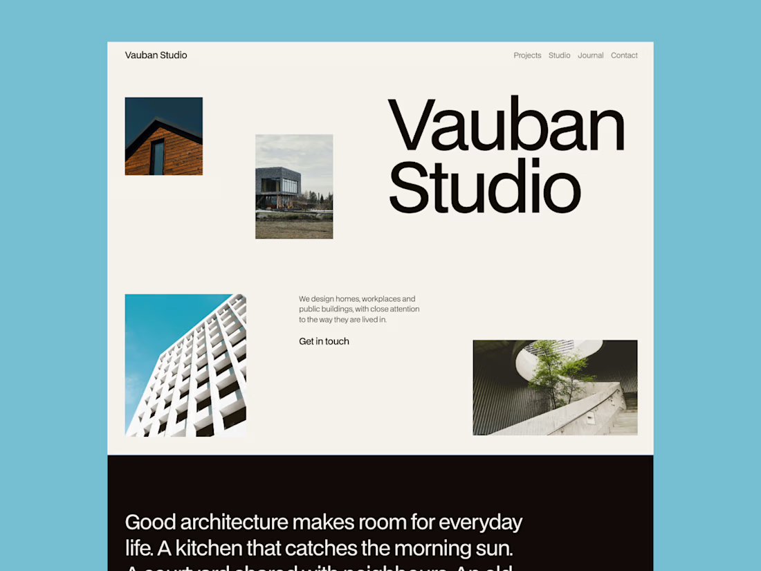
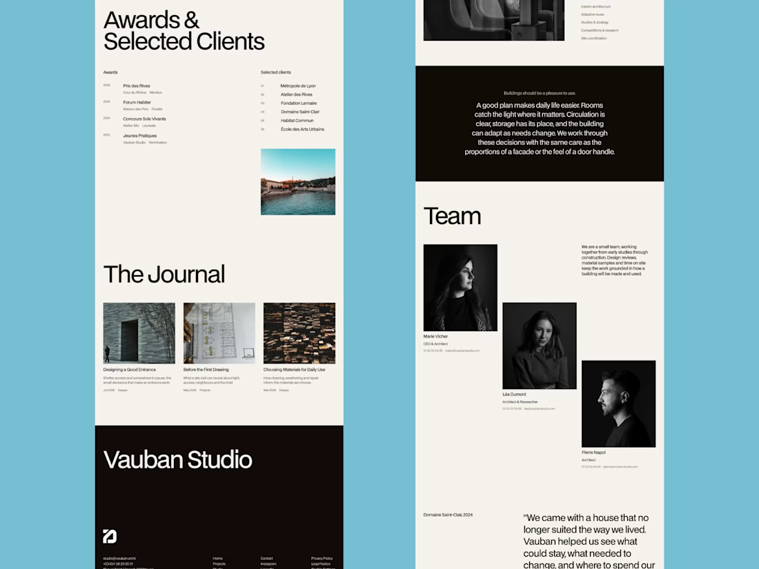
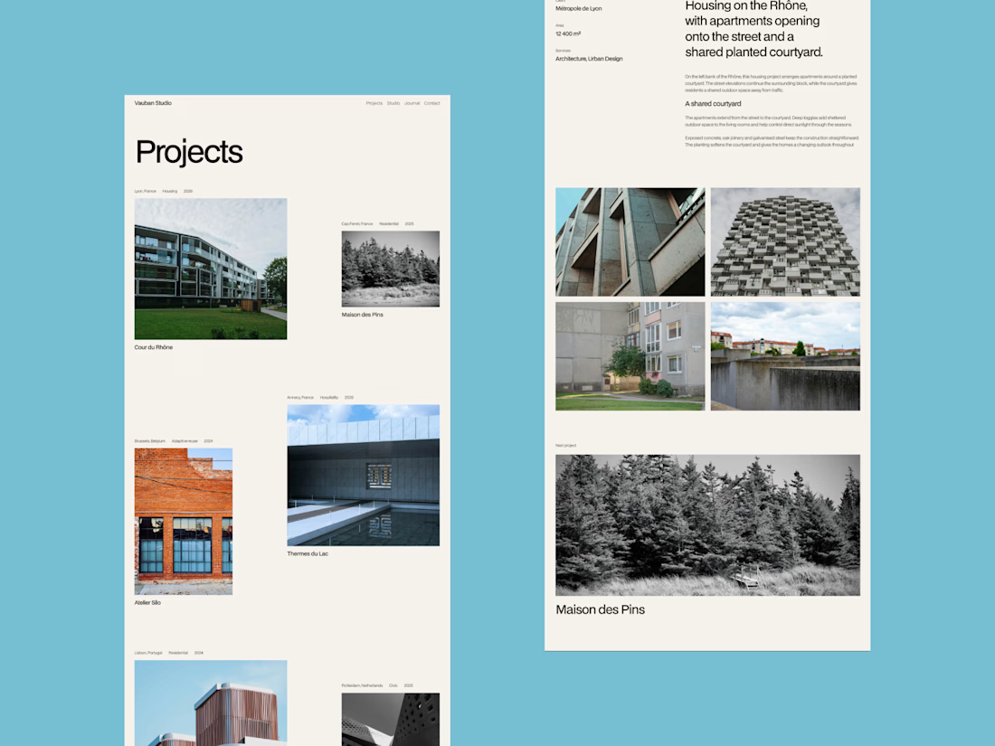
Meet my latest website template, Vauban, tailored for architecture studios.
Built around an editorial grid and Swiss typography, it puts projects at the center while giving the studio itself a clear presence.
Available as a Framer template.

That blue background around the grid is a bold choice. Makes the photography pop.