The network for creativity
Join 1.25M professional creatives like you
Connect with clients, get discovered, and run your business 100% commission-free
Creatives on Contra have earned over $150M and we are just getting started
Back to feedPost

I just published a template on framer. This is a redesign of my initial template. I need genuine feedback from you guys. I'm here to learn my mistakes. So point out everything you see wrong as a web designer. I'm new to designing so help me out here.
Here's the link:https://www.framer.com/community/marketplace/templates/matchioo-matcha-cafe/


The network for creativity
Join 1.25M professional creatives like you
Connect with clients, get discovered, and run your business 100% commission-free
Creatives on Contra have earned over $150M and we are just getting started

Challenges
View all


Related posts

A portfolio doesn't need more space.
It needs to use space differently.
With OVERLAP, projects don't need their own isolated sections. They can share space, create depth and become part of a larger composition.
It's not about fitting more content on screen.
It's about creating relationships between what you show.
Less separation. More composition.

Love this take. Overlapping projects to create depth vs just stacking sections - way more intentional.


Should a flower shop ever go black and white?
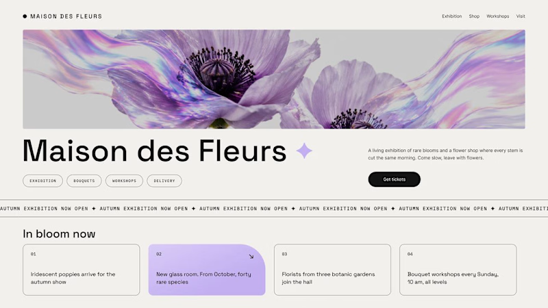
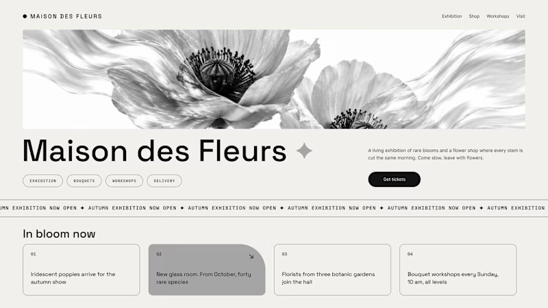
Same flower house, same layout. We only took the color out.
1. Full color. The iridescent petals do the selling: lilac, pink, a little shimmer. The photo is the brand, and every accent on the page borrows from it.
2. Monochrome. No color at all. Shape, texture and typography have to carry everything, and the page suddenly reads like a gallery catalogue.
Color sells the flower. Monochrome sells the exhibition.
Which one would get you through the door?
67 voted
91%
7 voted
9%
74 votes
Closed

The problem with monochrome is that, throughout computer history, it has conditioned users to associate gray and monochrome with being disabled, dysfunctional, or something to ignore and avoid.


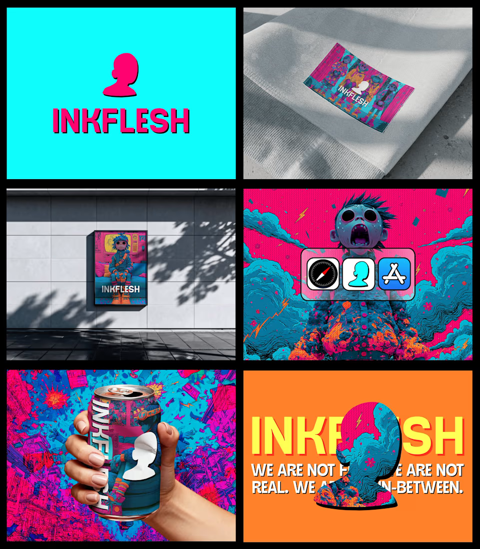
In my INKFLESH identity work, the wordmark runs off the can's curve and gets partly hidden behind artwork on posters. That crop asks the rest of the identity to carry more recognition. The mark has a job when the name is only partly there.