The network for creativity
Join 1.25M professional creatives like you
Connect with clients, get discovered, and run your business 100% commission-free
Creatives on Contra have earned over $150M and we are just getting started
Back to feedPost

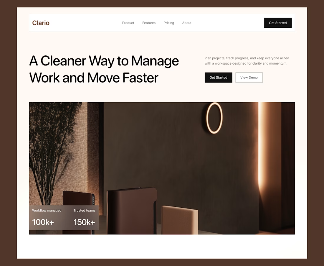
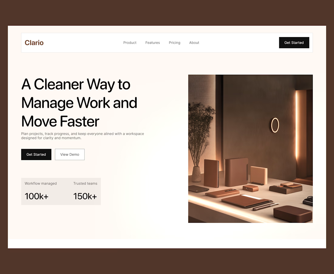
Explored two variations of the same hero section
Which of them is your best pick?

The network for creativity
Join 1.25M professional creatives like you
Connect with clients, get discovered, and run your business 100% commission-free
Creatives on Contra have earned over $150M and we are just getting started





Related posts


Very nice

I just released FAR ENOUGH, a free Framer template for luxury travel. 🌴
Minimal on the surface, a lot of motion underneath:
→ an endless drag-to-explore masonry grid
→ a 3D Instagram carousel
→ a scroll-driven curtain gallery
→ an image trail that follows your cursor
→ light and dark mode with one click
10 pages, 4 CMS collections, fully responsive, with a reduced-motion fallback. Every animation is editable in the properties panel, no code needed.
Made for travel studios, villas, retreats and anyone who wants a site that feels far away in the best way.
Free on the Framer Marketplace: https://www.framer.com/marketplace/templates/far-enough/
Live preview: https://farenough.framer.website
#Framer #FramerTemplate #WebDesign #FreeTemplate

Nice website bro

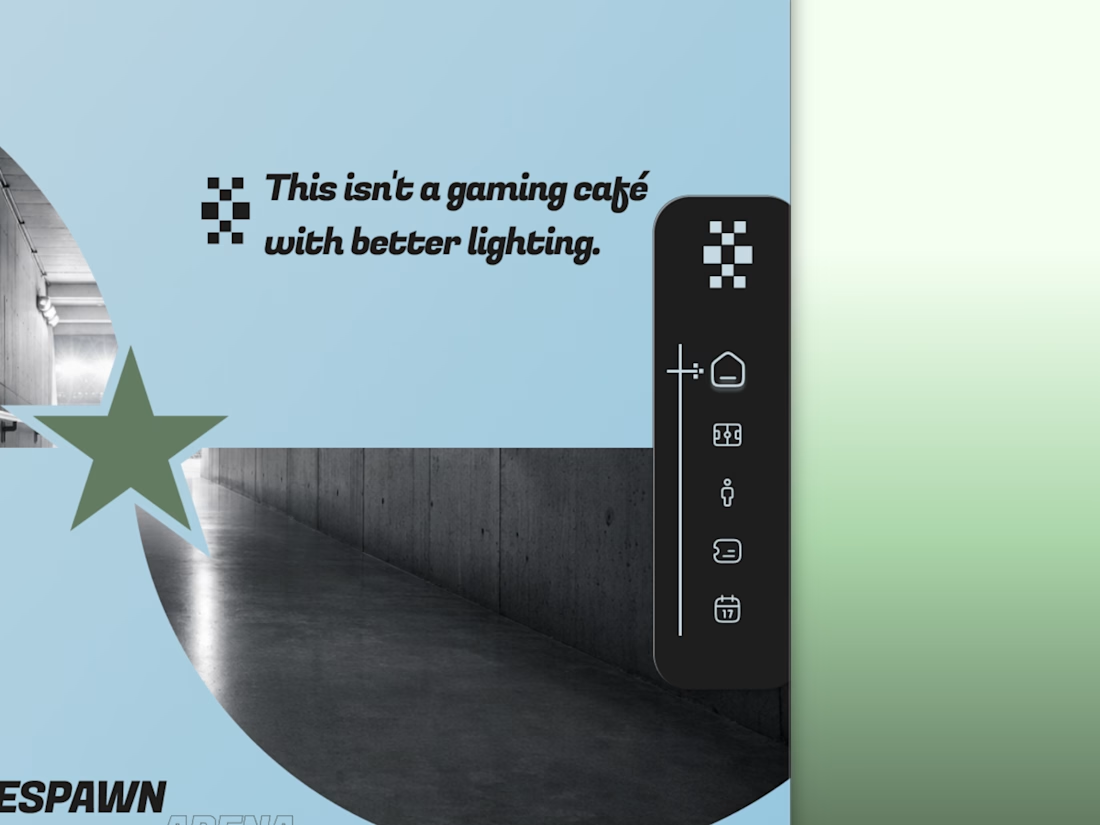
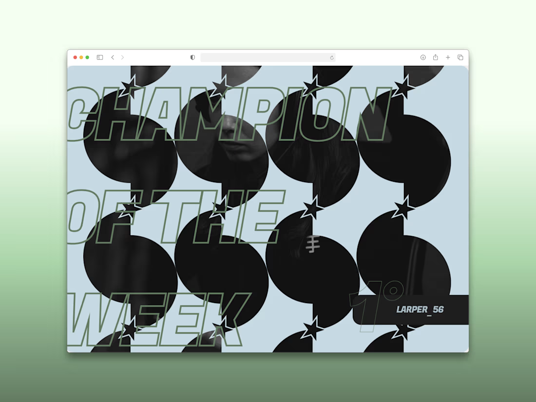
Every esports brand reaches for neon and a mascot.
RESPAWN ARENA reaches for a scoreboard.
Case study on the stadium-grade identity — typography, system, the whole build — dropping soon.