The network for creativity
Join 1.25M professional creatives like you
Connect with clients, get discovered, and run your business 100% commission-free
Creatives on Contra have earned over $150M and we are just getting started
Back to feedPost

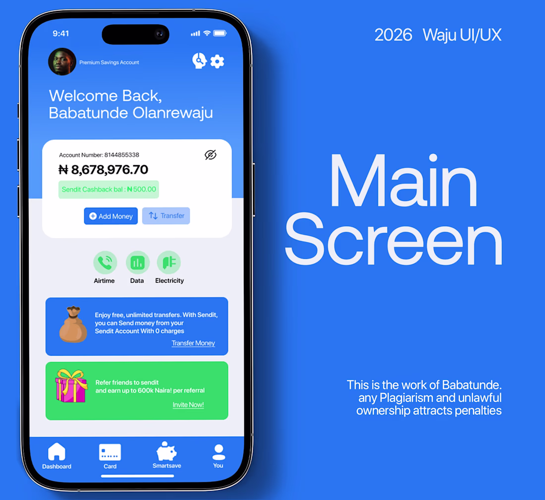
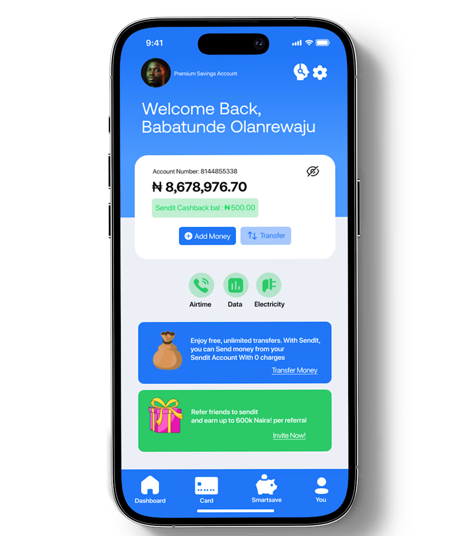
Most fintech users judge your company's app by the screen where they see their money. Here is how i transformed a busy UI design into a new, and cleaner interface.
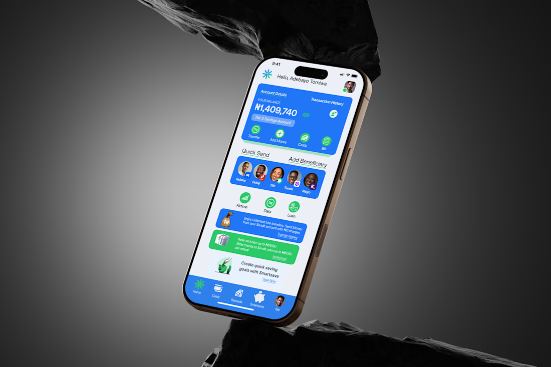
The original version (last slide) it felt rowdy, Too much going on, too many visual distractions, and I was not proud of it.
When users open their account screen, they’re not looking to be impressed. They’re looking for reassurance, Clarity, and Control. So, I reworked it.
The new screen is cleaner. Clear balance visibility, better spacing, and stronger hierarchy. This isn’t about aesthetics. It’s about trust. If a Fintech app can’t make users feel safe on the screen where their money stays, everything else falls apart.
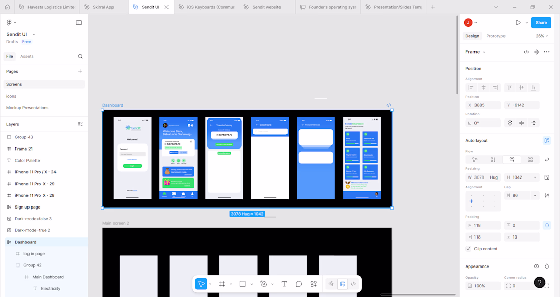
I would be sharing more of the screens to show my process.
I'm Olanrewaju, a UI/UX designer. I design to create positive user experience.


The network for creativity
Join 1.25M professional creatives like you
Connect with clients, get discovered, and run your business 100% commission-free
Creatives on Contra have earned over $150M and we are just getting started


Trending
maxearnings
The next frontier of payments is live on Contra. How are you maximizing revenue?
freelancerlife
Freelancer life is wins, pivots, and everything in between. What’s yours right now?
aidesignflow
AI tools are redefining how designer work. What does your workflow look like?
micrographics
Micrographics started as utility - barcodes, packaging, instruction labels. How would you use them?
aivideo
AI video tools are moving at warp speed. What tools are you using?