The network for creativity
Join 1.25M professional creatives like you
Connect with clients, get discovered, and run your business 100% commission-free
Creatives on Contra have earned over $150M and we are just getting started
Back to feedPost

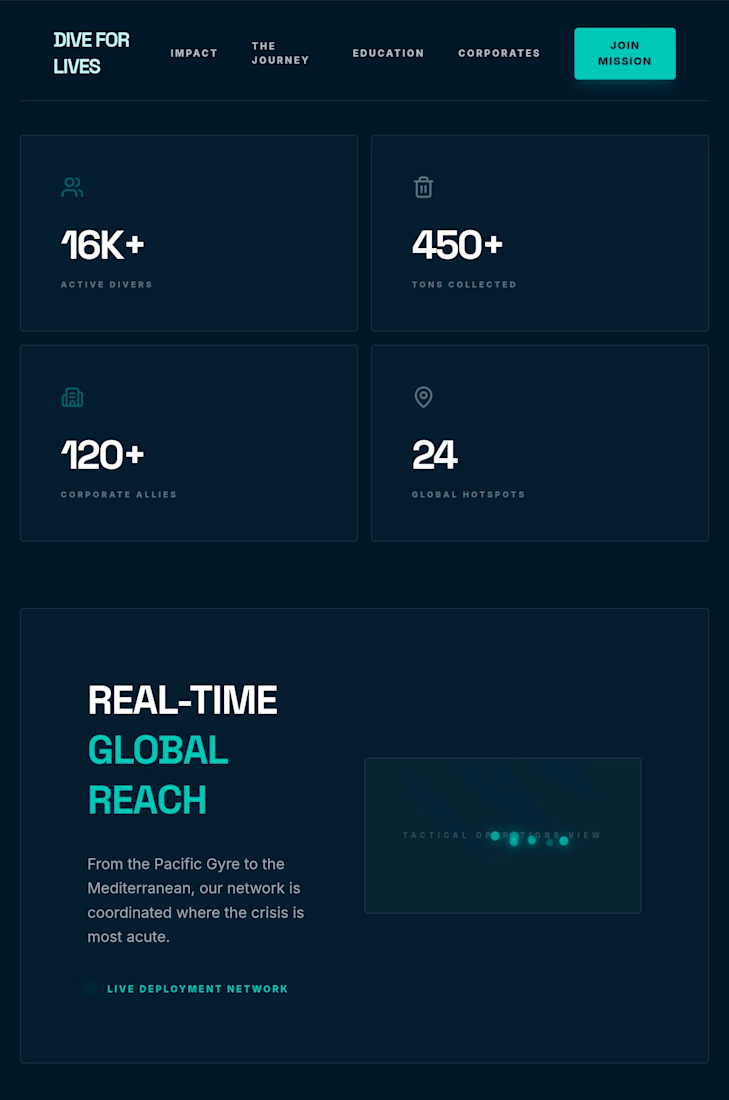
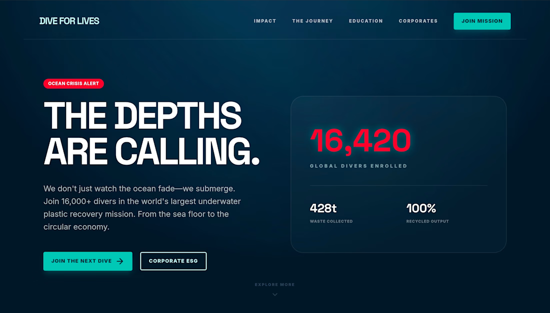
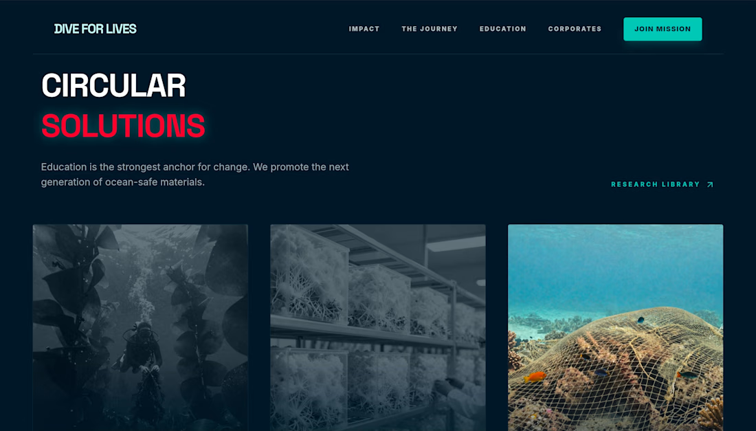
Dive for Lives — Immersive Impact Landing Page
A powerful, deep-sea themed landing page designed to drive engagement for environmental causes. This project showcases high-impact typography, data visualization elements, and a sophisticated dark aesthetic.


The network for creativity
Join 1.25M professional creatives like you
Connect with clients, get discovered, and run your business 100% commission-free
Creatives on Contra have earned over $150M and we are just getting started

Challenges
View all


Related posts

Designed a clean, premium website concept for Arave — a modern digital watch brand. Focused on strong visuals, product storytelling, and a minimal, technical feel.
Would love to hear your thoughts — what do you think I could improve in this project?


"Built to be taken apart" reframes repairability as the premium feature, not a compromise - most watch sites hide the mechanism, this one leads with it.

I usually don't stop at 3 breakpoints when building a website.
Most people think about: Mobile, Tablet, Laptop
I like adding one more: Desktop
Because what looks great at 1440px can feel completely different at 1920px...
- The layout gets too wide.
- Spacing starts feeling off.
- Content loses its balance.
So I like testing the system across: Mobile → Tablet → Laptop → Desktop
Not because every website needs exactly 4 breakpoints. But because responsive design isn't about making a few screen sizes work.
It's about making the whole system work.
Follow Rushabh for more website fundamentals, experiments, and things I learn while building for the web.
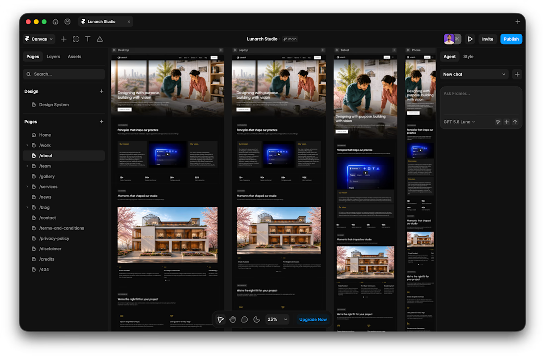

Wide screens expose spacing issues that laptop previews can hide.

Built this over a weekend as an experiment with AI-assisted design and development.
Duo Case is an absurd concept for turning two iPhones into a very unofficial foldable iPhone. The goal was to see how far AI could accelerate the process while keeping creative direction, design decisions and final execution in human hands.


A weekend build that looks this polished is wild. Where did AI actually save you the most time here, the concepting or the production grind?