The network for creativity
Join 1.25M professional creatives like you
Connect with clients, get discovered, and run your business 100% commission-free
Creatives on Contra have earned over $150M and we are just getting started
Back to feedPost

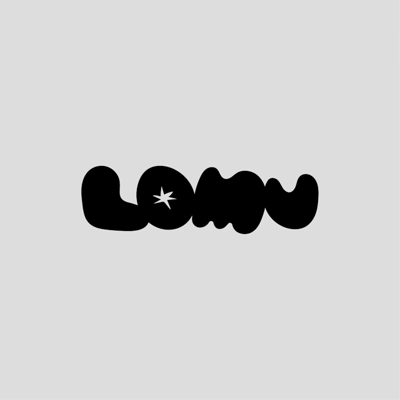
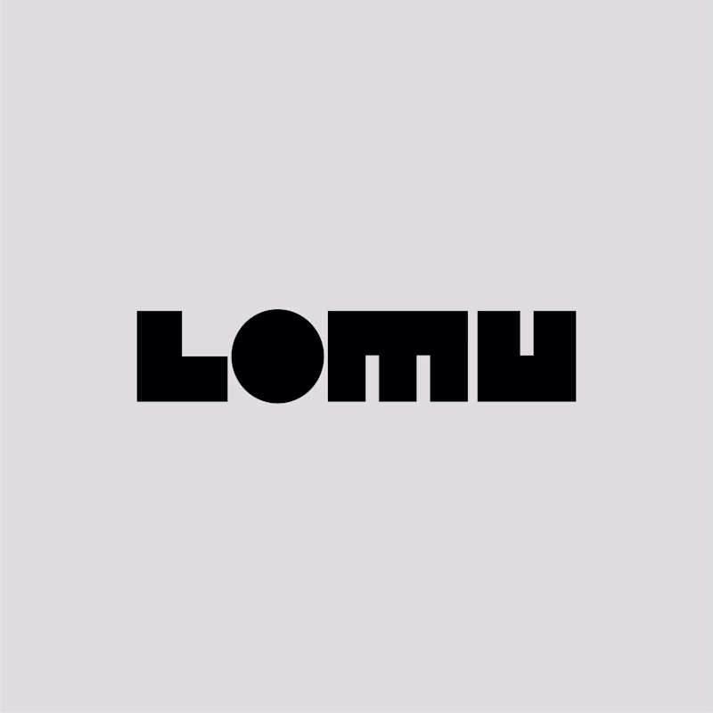
Both are nice—minimal, clean, and catchy, and easy to identify in any adaptation. But if you ask me to choose, I would pick the second one because the first has a snack/chips concept, especially visible in the “U” letter shape.
The second one is fantastic and better than the first, and it fits perfectly with a photo booth–related brand

Two concepts for LOMU, a modern, minimal photobooth brand. Each one delivers a different feel and attitude.
Which one do you prefer, and why? Your choice helps me lock the right direction fast.
85 voted
55%
69 voted
45%
154 votes
Closed
The network for creativity
Join 1.25M professional creatives like you
Connect with clients, get discovered, and run your business 100% commission-free
Creatives on Contra have earned over $150M and we are just getting started


Trending
maxearnings
The next frontier of payments is live on Contra. How are you maximizing revenue?
micrographics
Micrographics started as utility - barcodes, packaging, instruction labels. How would you use them?
aidesignflow
AI tools are redefining how designer work. What does your workflow look like?
aivideo
AI video tools are moving at warp speed. What tools are you using?
whennotai
As AI accelerates, creative judgment matters more. What part of your work stays human?