The network for creativity
Join 1.25M professional creatives like you
Connect with clients, get discovered, and run your business 100% commission-free
Creatives on Contra have earned over $150M and we are just getting started
Back to feedPost

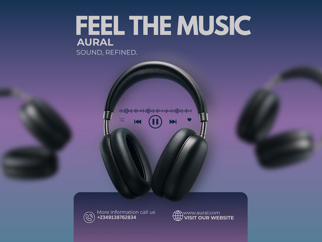
AURAL — Social Media Design
A social media promotional design for AURAL, focused on bold typography, product presentation, visual hierarchy, and creating a strong, engaging visual for digital audiences.


The network for creativity
Join 1.25M professional creatives like you
Connect with clients, get discovered, and run your business 100% commission-free
Creatives on Contra have earned over $150M and we are just getting started





Related posts

How minimal can a fintech website get before it starts losing personality?
Version 01 of a recent Verlo Finance exploration.
Focused on strong type, clarity and keeping everything else out of the way.
Would you keep it this minimal?


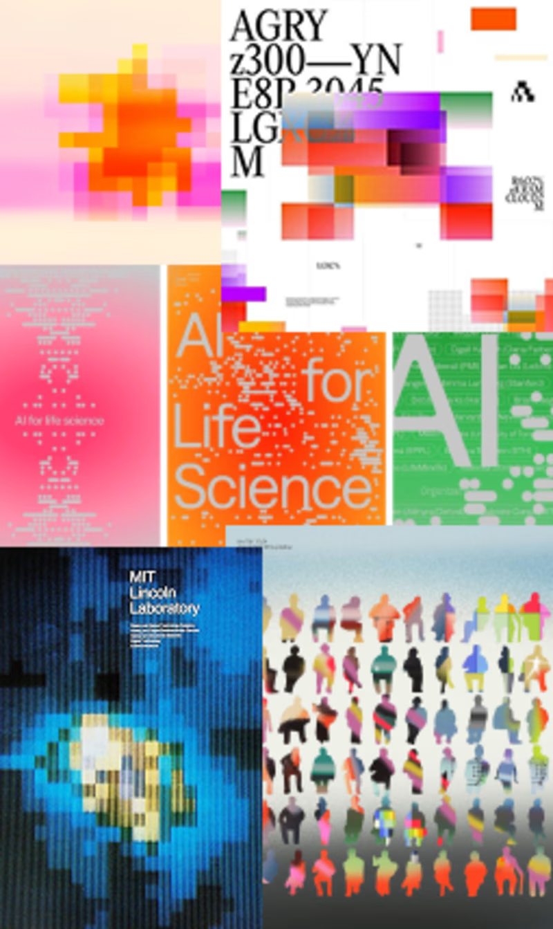
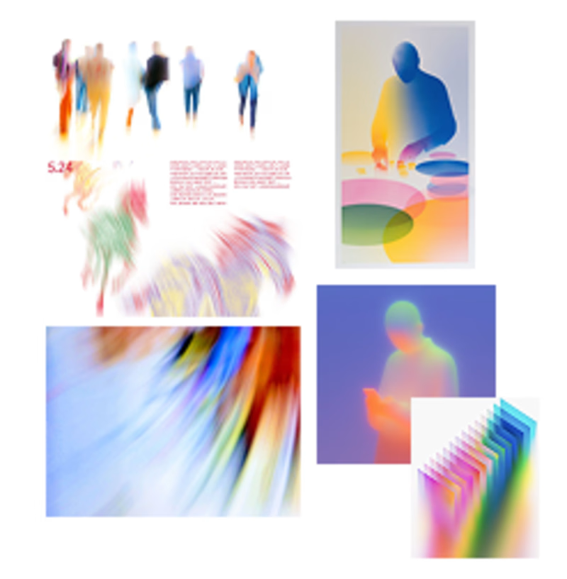
Exploring the visual mood for a new brand identity. Which direction feels more distinctive and has more potential to grow into a recognizable brand system?
2 voted
40%
3 voted
60%
5 votes
Closed

Fluid is actually more easy to eyes ⭐ also because it have gradient colour, to be good second one needs less contrasting colours

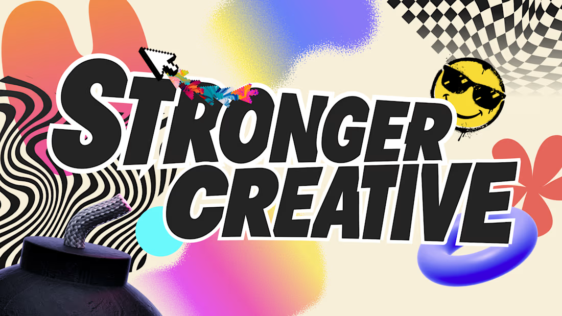

The warped checker and zebra swirls behind that chunky type are so much fun. What's the frame going to be used for, a thumbnail series or something bigger?