The network for creativity
Join 1.25M professional creatives like you
Connect with clients, get discovered, and run your business 100% commission-free
Creatives on Contra have earned over $150M and we are just getting started


The network for creativity
Join 1.25M professional creatives like you
Connect with clients, get discovered, and run your business 100% commission-free
Creatives on Contra have earned over $150M and we are just getting started
Related posts

A little more about the inspiration behind Tindara.
I wanted the identity to have a connection to Tindari, Sicily. The Madonna di Tindari statue was the starting point for the symbol, while Sicilian decorative patterns inspired the graphics around it.
For the colors, I chose mustard yellow, deep green, and burgundy, balanced with cream. I wanted to bring some of that warmth and richness into the packaging, while keeping the different elements comfortable together.
For me, these references are what give the project its character and sense of place.



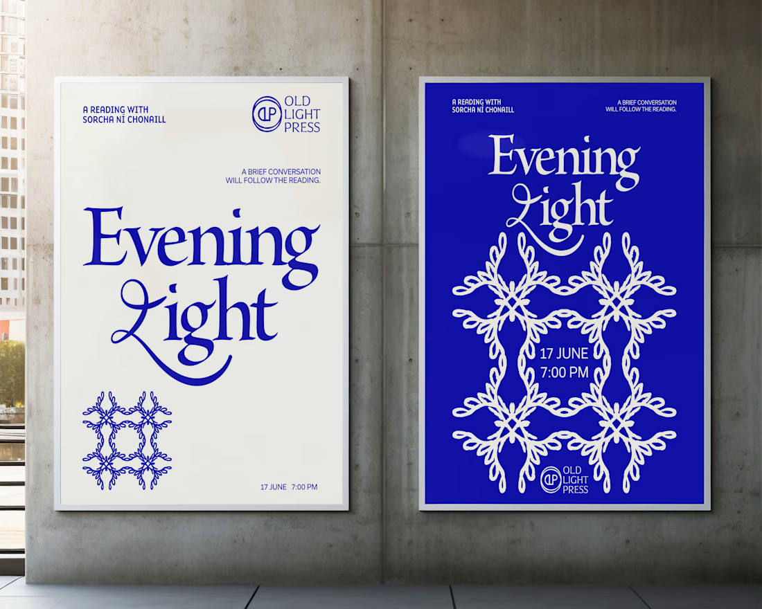
Brand identity concept for Old Light Press.


I love that all of your projects have a whimsy vibe 💖

Premium Brand Identity & Bold Packaging
Take a look at this newly completed brand identity and packaging design project! I focused on clean lines, high-contrast layouts, and powerful typography to create an unforgettable premium aesthetic.
Whether you need a standout logo system, custom brand guidelines, or luxury structural packaging assets, I build visual solutions that drive real business impact.
🚀 Ready to transform your brand identity? Send a message today to collaborate on your design needs!


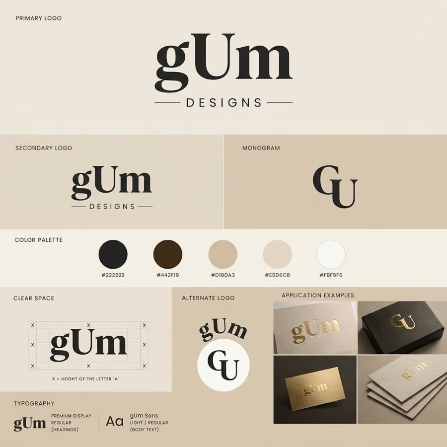

The clear-space diagram tied to the height of the letter A and the gold foil on the cards make this feel like a proper system, not just a logo. One challenge: the wordmark is gUm with a lowercase g, but the monogram reads GU, so the M drops out. Was that deliberate? A monogram...