The network for creativity
Join 1.25M professional creatives like you
Connect with clients, get discovered, and run your business 100% commission-free
Creatives on Contra have earned over $150M and we are just getting started
Back to feedPost
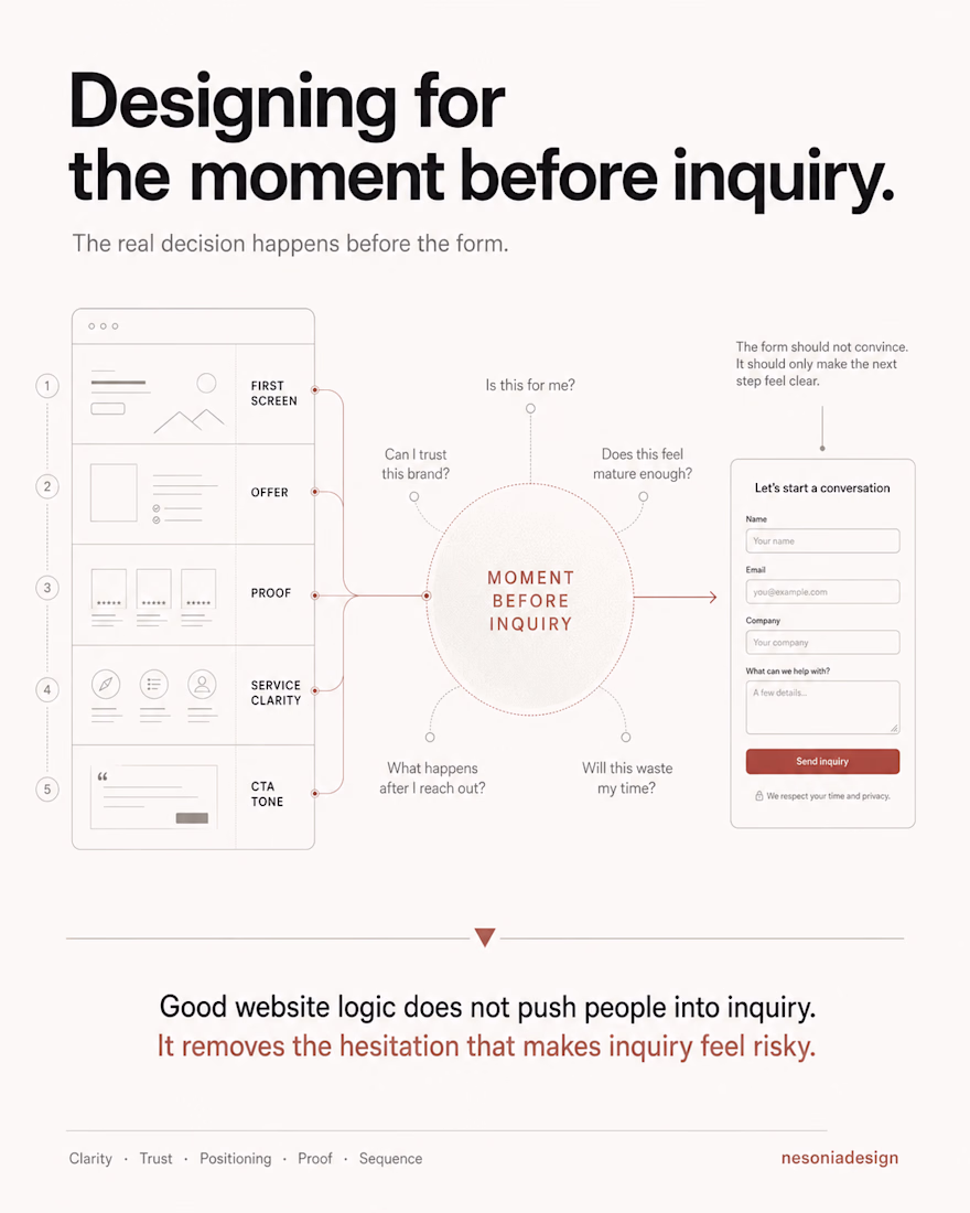
Designing for the moment before inquiry.
Most websites treat the inquiry form as the conversion point.
But the real decision usually happens earlier.
Before a person writes a message.
Before they book a call.
Before they leave their contact details.
There is a quiet moment where they ask themselves:
Is this for me?
Can I trust this brand?
Does this company feel mature enough?
What happens after I reach out?
Will this next step waste my time, pressure me, or create risk?
That moment matters.
Especially for premium brands and B2B companies, where the website is not selling an instant impulse action.
It is asking someone to start a conversation.
And before someone starts a conversation, they need enough clarity to feel safe doing it.
This is why I do not design contact sections as isolated blocks at the bottom of the page.
The inquiry moment is built through the entire website.
Through the first screen.
Through the offer structure.
Through proof.
Through positioning.
Through the way services are explained.
Through the order of information.
Through the tone of the CTA.
By the time a visitor reaches the contact point, the page should have already answered the most important doubts.
The form should not have to convince them.
It should only make the next step feel clear.
Good website logic does not push people into inquiry.
It removes the hesitation that makes inquiry feel risky.
The network for creativity
Join 1.25M professional creatives like you
Connect with clients, get discovered, and run your business 100% commission-free
Creatives on Contra have earned over $150M and we are just getting started
Related posts
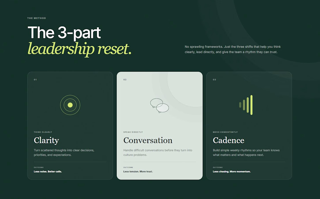
Coach websites do not need to explain the whole brain on the homepage.
This concept uses 3 words:
Clarity.
Conversation.
Cadence.
Easy to remember, trust and talk about on a sales call.
Modern and intuitive
congratulations
Built my website so people don't have to ask what I do.
Still got asked what I do... maybe I need a bigger font. 😅
Trending
Claude
Claude has entered the design space. How are you using Claude Design?
Contra University
Learn from expert creatives how to earn more using next-gen AI tools.
fifaworldcup2026
The World Cup is here and the whole world's watching. How are you designing for the world stage?
creativeaiflow
Creative AI workflows are evolving. What tools do you use, and what are their strengths and weaknesses?
freelancerlife
Freelancer life is wins, pivots, and everything in between. What’s yours right now?