The network for creativity
Join 1.25M professional creatives like you
Connect with clients, get discovered, and run your business 100% commission-free
Creatives on Contra have earned over $150M and we are just getting started
Back to feedPost

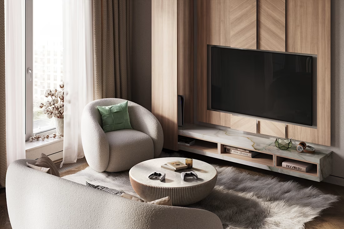
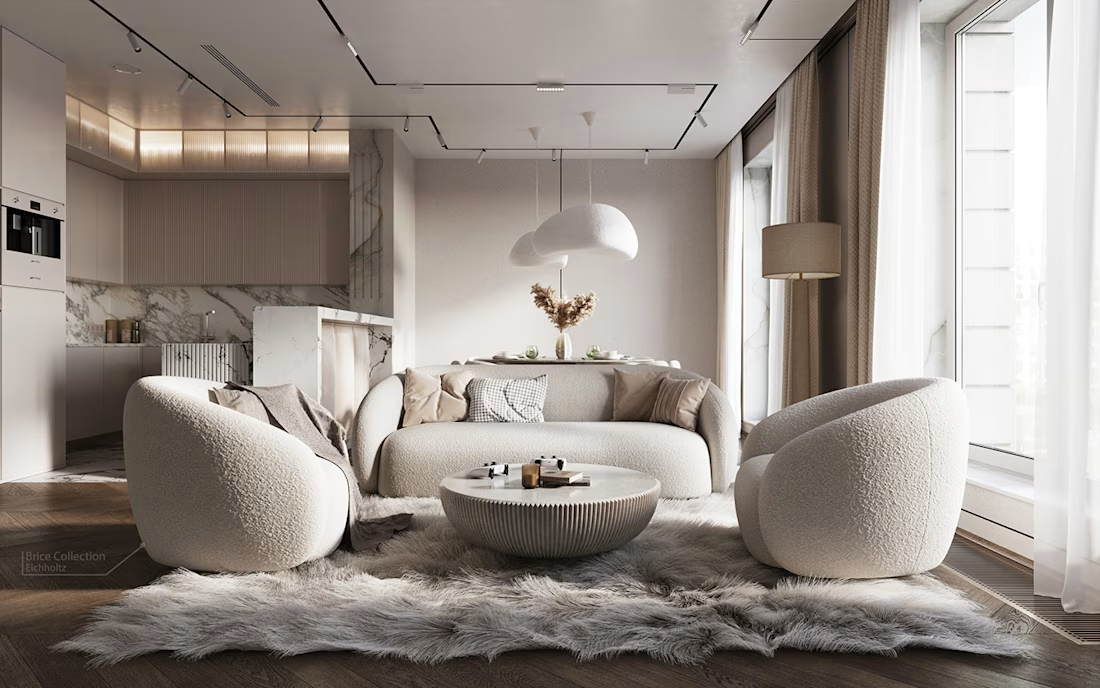
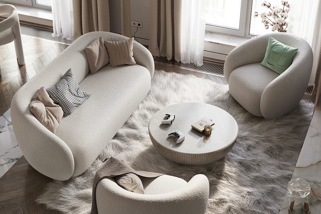
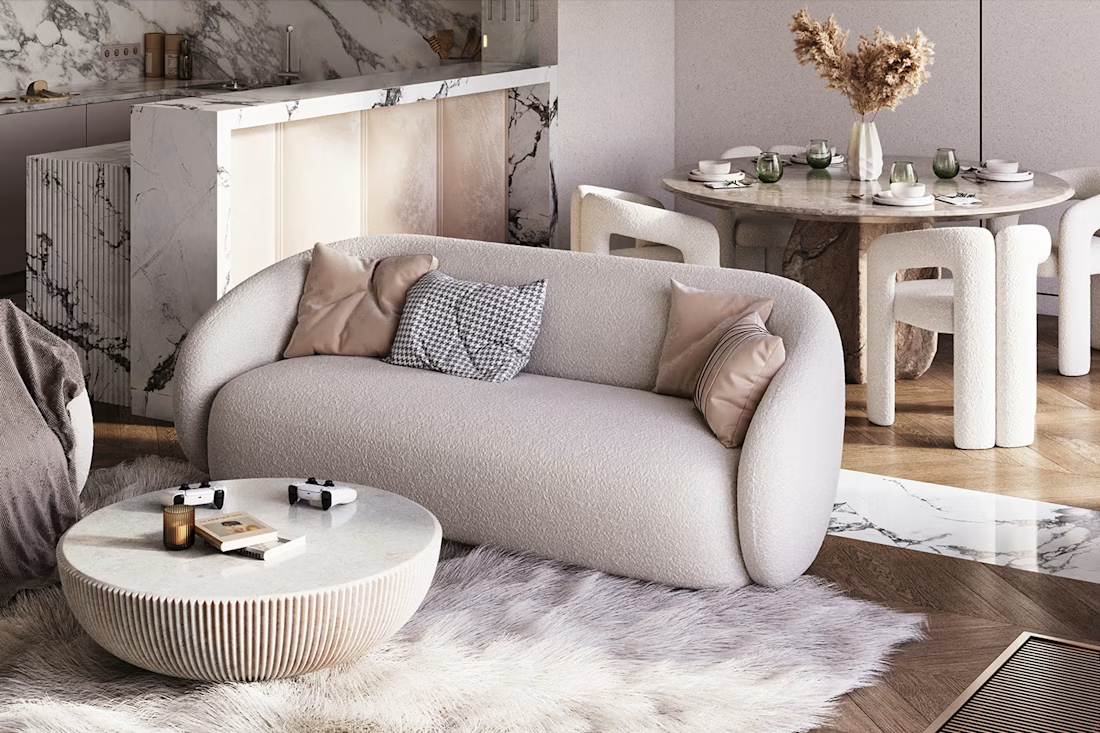
A new living room concept, brought to life in 3D.
This project explores a refined residential interior where comfort and visual character work together. My aim was to create a space that feels inviting while maintaining a strong, cohesive design identity.
#InteriorVisualization #3DRendering #ResidentialDesign


The network for creativity
Join 1.25M professional creatives like you
Connect with clients, get discovered, and run your business 100% commission-free
Creatives on Contra have earned over $150M and we are just getting started











Related posts

A natural and premium packaging concept inspired by the purity of wildflower honey and the beauty of nature. The design combines warm honey tones, textured paper, bold typography, and a clean label layout to create an authentic, handcrafted feel.

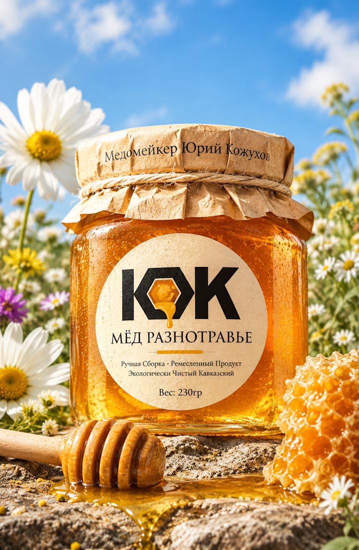

The honey drop sitting inside the O of the wordmark is a delightful detail, Umar. Textured paper plus that bold type really sells the handcrafted feel. This would stand out beautifully on a shelf.

Pakeging Design Brand Design Product Design


Imagining you book your flight while experiencing
Meet Contrail.
Complex data into beautiful visuals in 3d.
Demo: https://flights-gr8r.vercel.app


Booking a flight with a 3D plane in the search is a fun idea. The dark UI makes the model stand out well.