The network for creativity
Join 1.25M professional creatives like you
Connect with clients, get discovered, and run your business 100% commission-free
Creatives on Contra have earned over $150M and we are just getting started
Back to feedPost
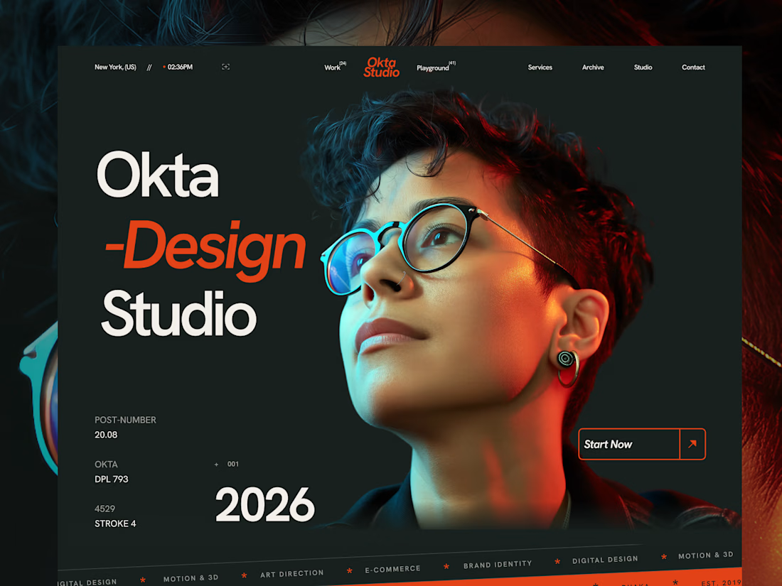
A website that doesn’t just showcase your work — it makes people remember it, just like our new Framer Template Okta.
What do you think — would you use Okta for your creative studio?
Get it for free: https://framer.com/community/marketplace/templates/okta-studio/




Thanks

That red accent on Design cutting through the dark background is doing exactly what the caption promises, it's the kind of detail people screenshot. Would use it for a studio in a heartbeat.
Thanks
That red accent on Design cutting through the dark background is doing exactly what the caption promises, it's the kind of detail people screenshot. Would use it for a studio in a heartbeat.
The network for creativity
Join 1.25M professional creatives like you
Connect with clients, get discovered, and run your business 100% commission-free
Creatives on Contra have earned over $150M and we are just getting started





Related posts


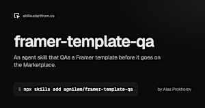
I made a free agent skill for Framer template creators. It QAs a template before it goes on the Marketplace: checks the editor project, the live site on every breakpoint, and SEO and AEO, fixes clear issues, and adds a getting-started guide for buyers.
Install: npx skills add agnilem/framer-template-qa
skills.startfrom.co

skills.startfrom.co
framer-template-qa, an agent skill by Alex Prokhorov
An agent skill that QAs a Framer template before it goes on the Framer Marketplace.

this helps a lot! thank you for sharing 🔥


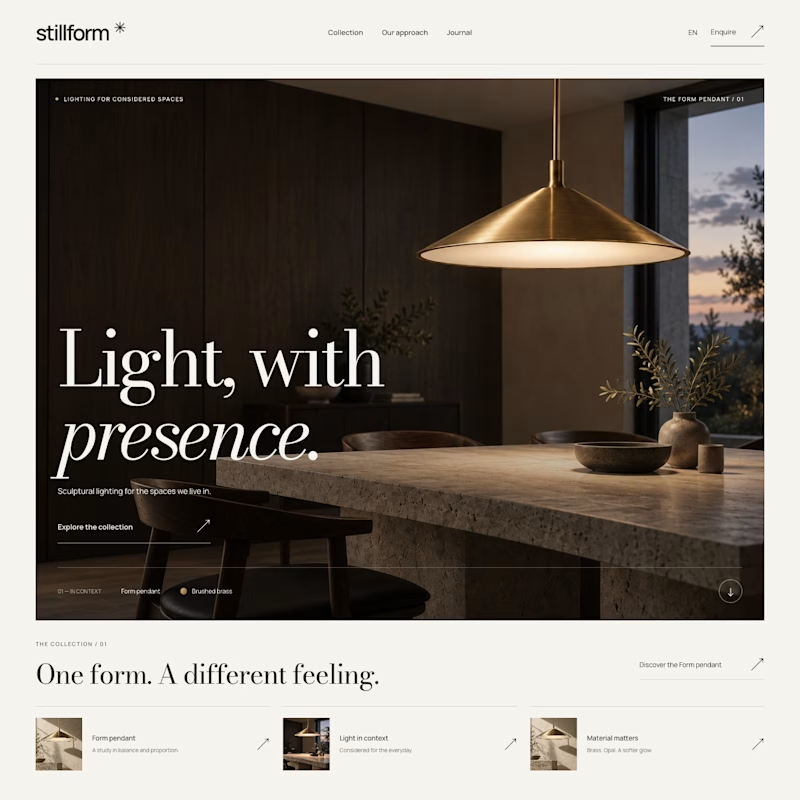
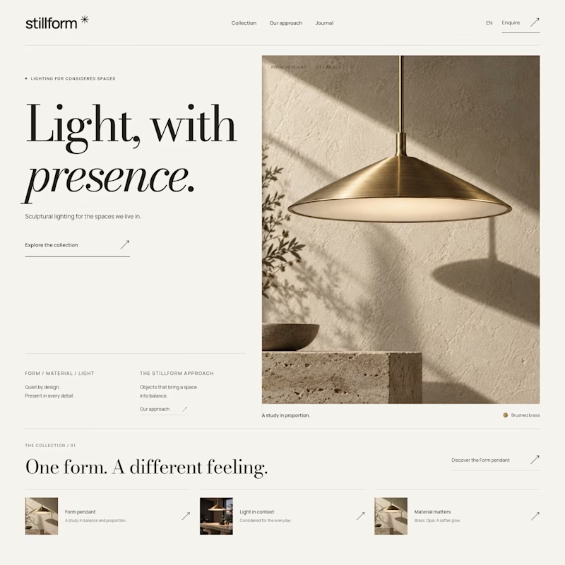

Atmospheric, and it was the photography that decided it. A lamp is a product you buy for what it does to a room, so seeing the warm glow pooling across a dark surface sells the feeling before the layout even registers. Sculptural is gorgeous but shows the object, Atmospheric shows the outcome.

I want to share an internal tool we use at Ander.Agency to QA our websites.
It’s great for collaborating with the team, clients, and even AI!
You can connect to it via MCP and ask Claude to manage and resolve all the reported comments for you.
It’s honestly mind-blowing. Trust me!
https://getpulpo.dev/

Nice tool it looks practical ❤️❤️